27 Best Interior Paint Colors to Transform Your Home in 2025
Choosing the perfect paint color transforms your space more dramatically than almost any other design decision.
The right wall color sets the mood, creates visual interest, and serves as the backdrop for your entire decorating scheme.
With thousands of options available, narrowing down your choices can feel overwhelming.
Color selection impacts not only aesthetics but also how you feel in your space—affecting everything from energy levels to perceived temperature.
These 27 expert-recommended interior paint colors represent the best options for creating beautiful, livable spaces that reflect current trends while maintaining timeless appeal.
1: Swiss Coffee (Benjamin Moore OC-45)
This warm off-white creates a soft, welcoming atmosphere without the starkness of pure white.
It provides the perfect neutral backdrop for any design style, from traditional to contemporary.
You’ll notice subtle creamy undertones that prevent it from feeling cold or institutional.
This versatility makes it ideal for open floor plans where you need a consistent color to flow through connected spaces.
Its light-reflecting properties brighten rooms with limited natural light while maintaining a cozy, inviting feeling.
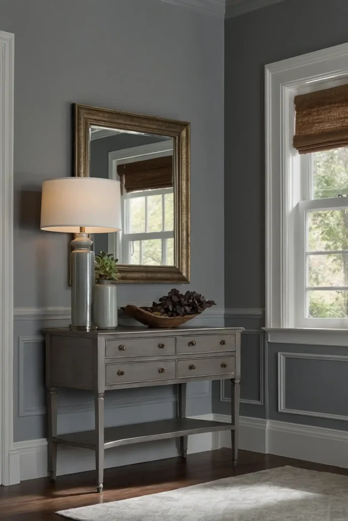
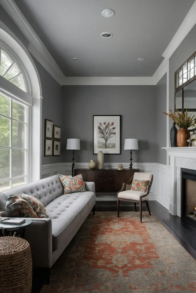
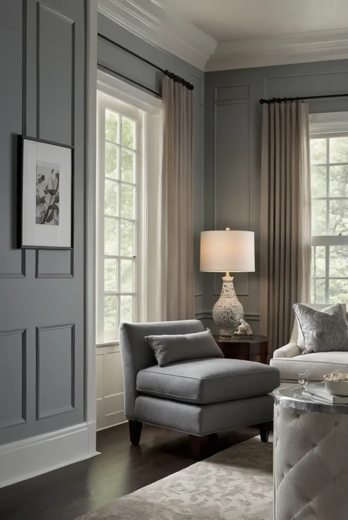
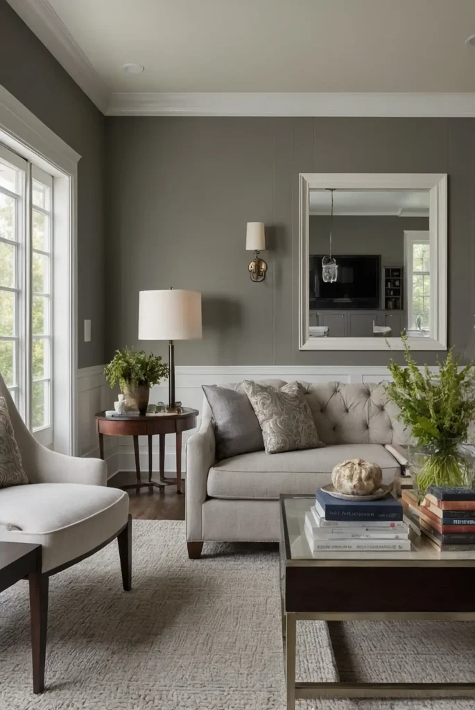
2: Agreeable Gray (Sherwin-Williams SW 7029)
This perfect greige (gray-beige hybrid) delivers warmth and sophistication to any room. Its balanced undertones prevent it from reading too cool or too yellow, making it remarkably versatile.
You’ll appreciate how it shifts subtly throughout the day, adapting beautifully to both natural and artificial lighting.
This chameleon-like quality makes it ideal for north-facing rooms that need warmth.
Pair it with either crisp white or cream trim for a refined, cohesive look that works in any space.
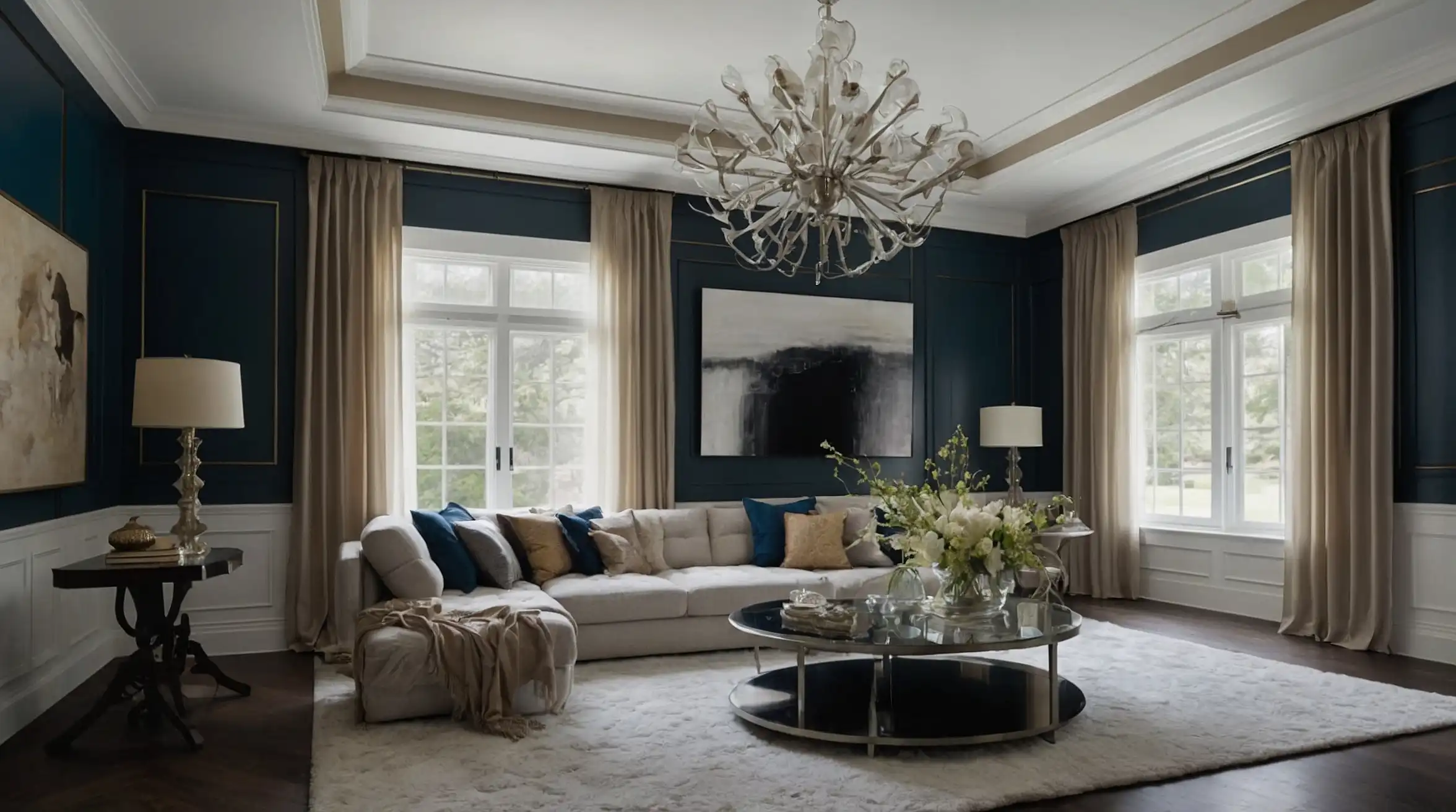
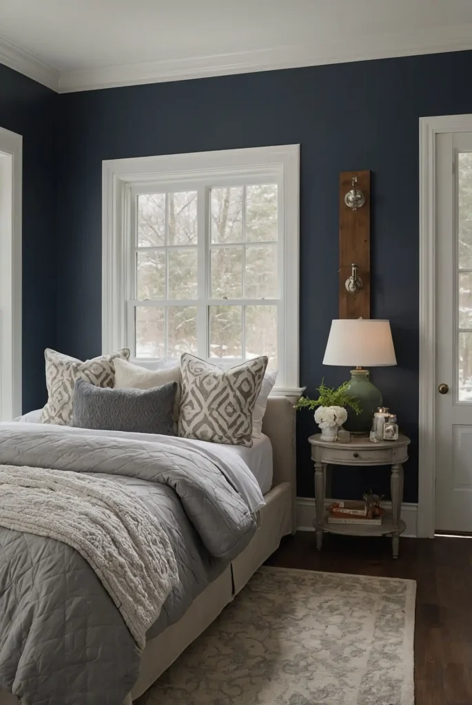
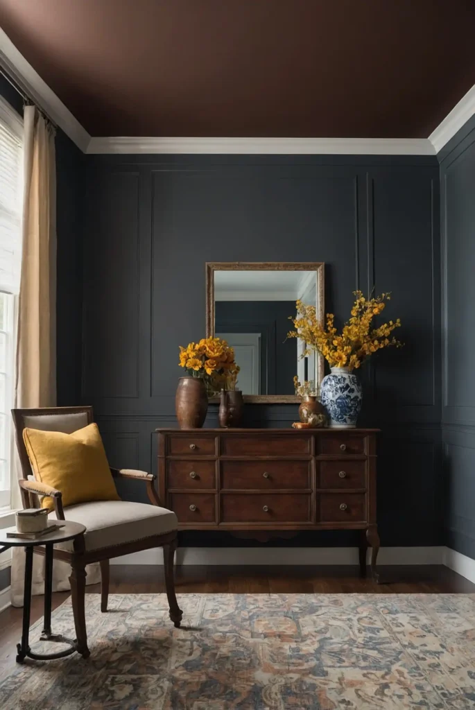
3: Hale Navy (Benjamin Moore HC-154)
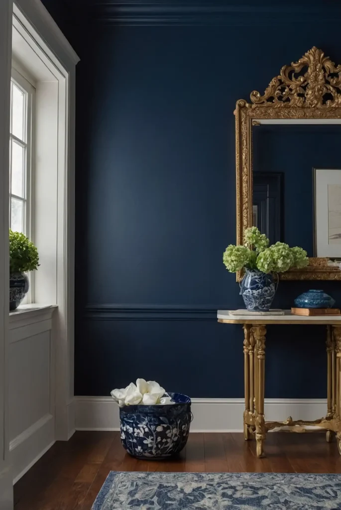
This rich, saturated navy creates dramatic impact without overwhelming your space.
It delivers the perfect balance of sophistication and coziness, especially in dining rooms and libraries.
You’ll notice how it recedes visually to create the illusion of expanded space despite its depth.
This counterintuitive effect makes it surprisingly successful even in smaller rooms.
The timeless blue-black undertones coordinate beautifully with most color schemes, functioning almost as a neutral in design applications.
4: Pale Oak (Benjamin Moore OC-20)
This delicate warm neutral blends subtle gray and beige undertones to create spaces that feel both fresh and inviting.
It provides more depth and interest than plain white without dominating your décor.
You’ll appreciate its chameleon-like quality that shifts beautifully in different lighting conditions.
This adaptability makes it ideal for rooms with varying light throughout the day.
Its subtle warmth counteracts cool northern light while remaining light enough for smaller spaces.
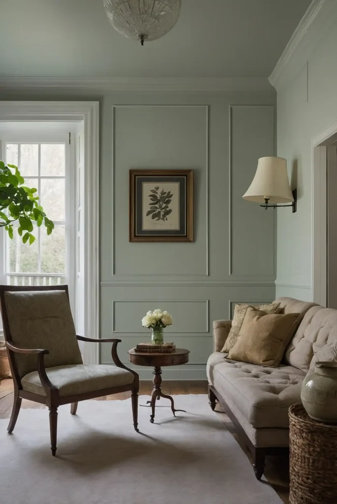
5: Sage Green (Farrow & Ball Lichen)
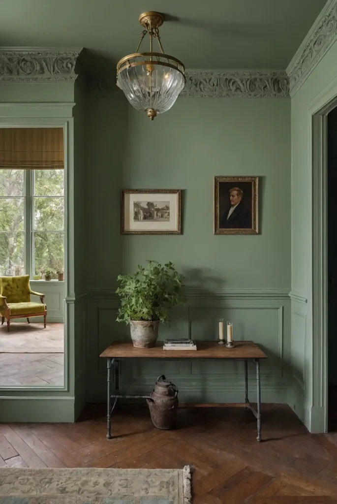
This muted, earthy green creates a connection to nature that instantly calms and grounds any space.
It provides subtle color while functioning essentially as a neutral in most design schemes.
You’ll notice how it enhances natural materials like wood and stone, making it perfect for transitional spaces.
The gray undertones prevent it from feeling overly trendy or dated.
This versatile shade works beautifully in kitchens, bedrooms, and living spaces where you want a gentle, organic presence.
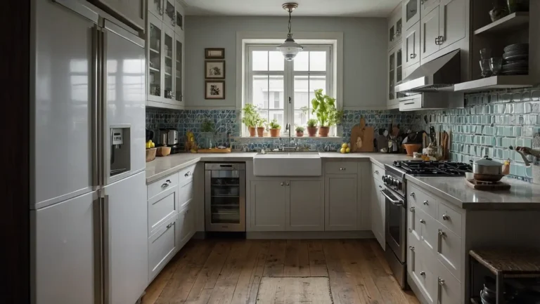
6: Alabaster (Sherwin-Williams SW 7008)
This soft, creamy white delivers warmth without obvious yellow undertones, creating bright, welcoming spaces.
It provides the perfect blank canvas that adapts to your changing décor preferences.
You’ll appreciate its light-reflective quality that brightens rooms while maintaining a soft, sophisticated appearance.
This versatility makes it ideal for both traditional and modern interiors.
Pair it with other whites for subtle dimension or bolder accent colors for dramatic contrast.
7: Classic Gray (Benjamin Moore OC-23)
This whisper-soft warm gray creates subtle sophistication without overwhelming your space.
It delivers noticeable color without dominating your décor, making it ideal for whole-house applications.
You’ll notice how it enhances architectural details while allowing furniture and art to take center stage. This supportive quality makes it perfect for gallery-style spaces.
Its balanced undertones prevent it from shifting dramatically in different lighting conditions, maintaining consistent beauty throughout the day.
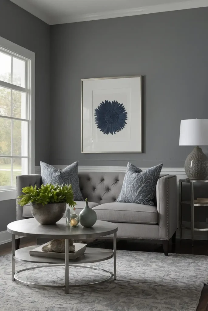
8: Repose Gray (Sherwin-Williams SW 7015)
This versatile mid-tone gray creates defined walls with its perfect balance of warm and cool undertones.
It provides enough depth for visual interest while remaining light enough for most spaces.
You’ll appreciate how it coordinates beautifully with both cool and warm accent colors.
This flexibility allows you to update your décor without repainting your walls.
Its true gray character avoids the purple or blue shifts that plague many gray paints, making it consistently attractive in any lighting.
9: Benjamin Moore White Dove (OC-17)
This perennial designer favorite delivers the perfect soft white with subtle warmth that never yellows.
It creates bright, fresh spaces without the harsh quality of starker whites.
You’ll notice its almost luminous quality in natural light, adding dimension to walls without obvious color.
This subtlety makes it ideal for traditional homes with historical architectural details.
Its versatility allows it to work beautifully as both a wall and trim color for seamless sophistication.
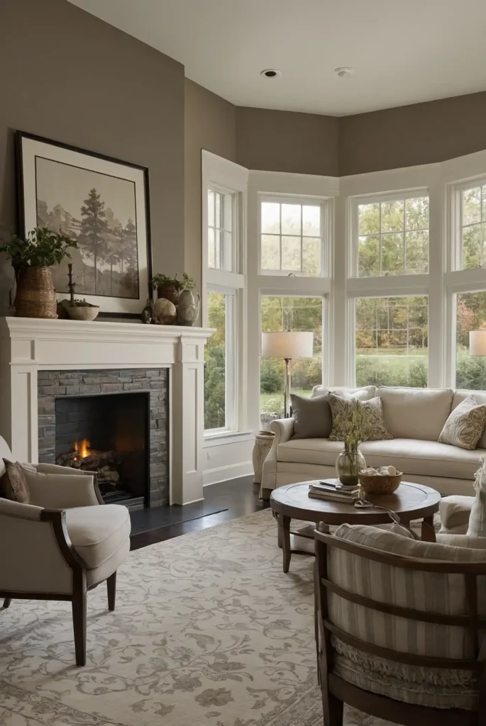
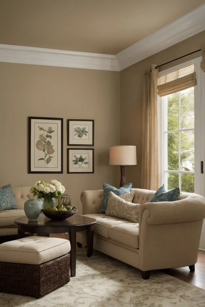
10: Accessible Beige (Sherwin-Williams SW 7036)
This balanced light beige creates warm, inviting spaces with its perfect neutral undertones.
It provides more depth than white without the obvious yellow tones that can make beiges feel dated.
You’ll appreciate how it grounds your space while allowing colorful furnishings and art to shine.
This supportive quality makes it ideal for rooms with statement furniture pieces.
Its versatility allows it to transition beautifully between adjoining spaces with different lighting conditions.
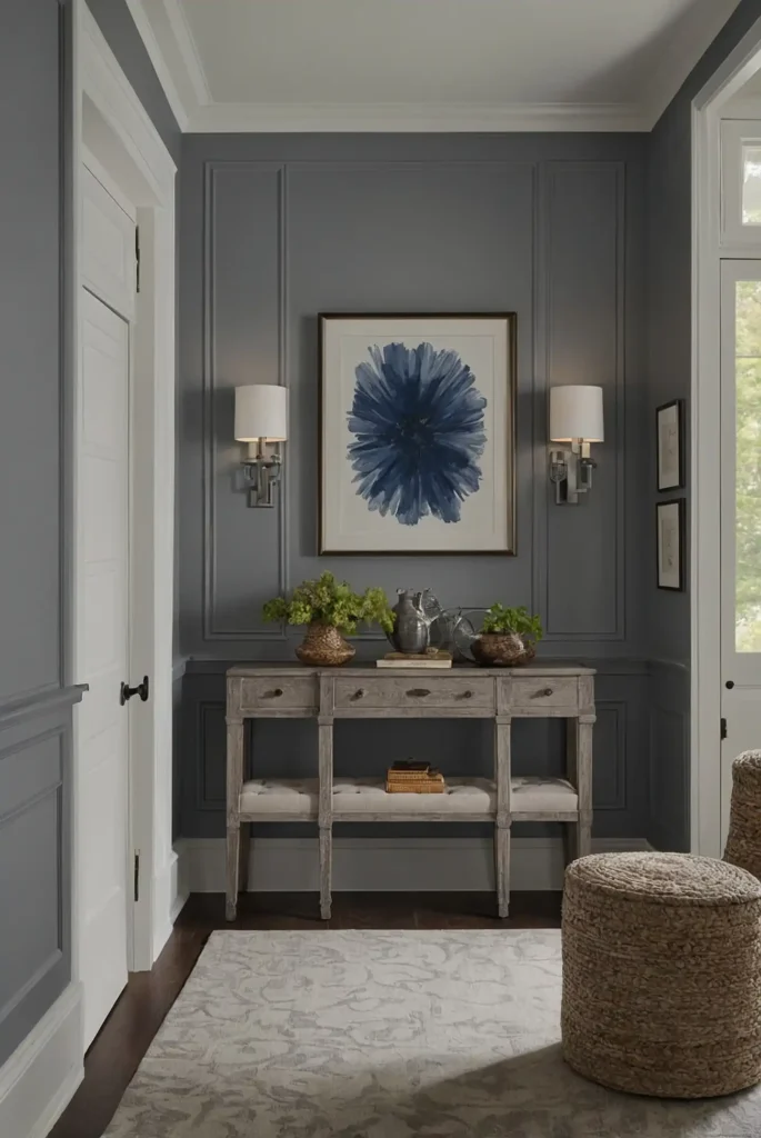
11: Stonington Gray (Benjamin Moore HC-170)
This classic light gray creates sophisticated spaces with its perfect balance of warm and cool undertones.
It delivers noticeable color depth without dominating your décor scheme.
You’ll notice how beautifully it pairs with marble, making it ideal for kitchens and bathrooms.
The subtle cool lean creates a fresh, clean feeling without appearing sterile.
Its timeless quality ensures it won’t feel dated as trends shift, making it a safe choice for larger spaces.
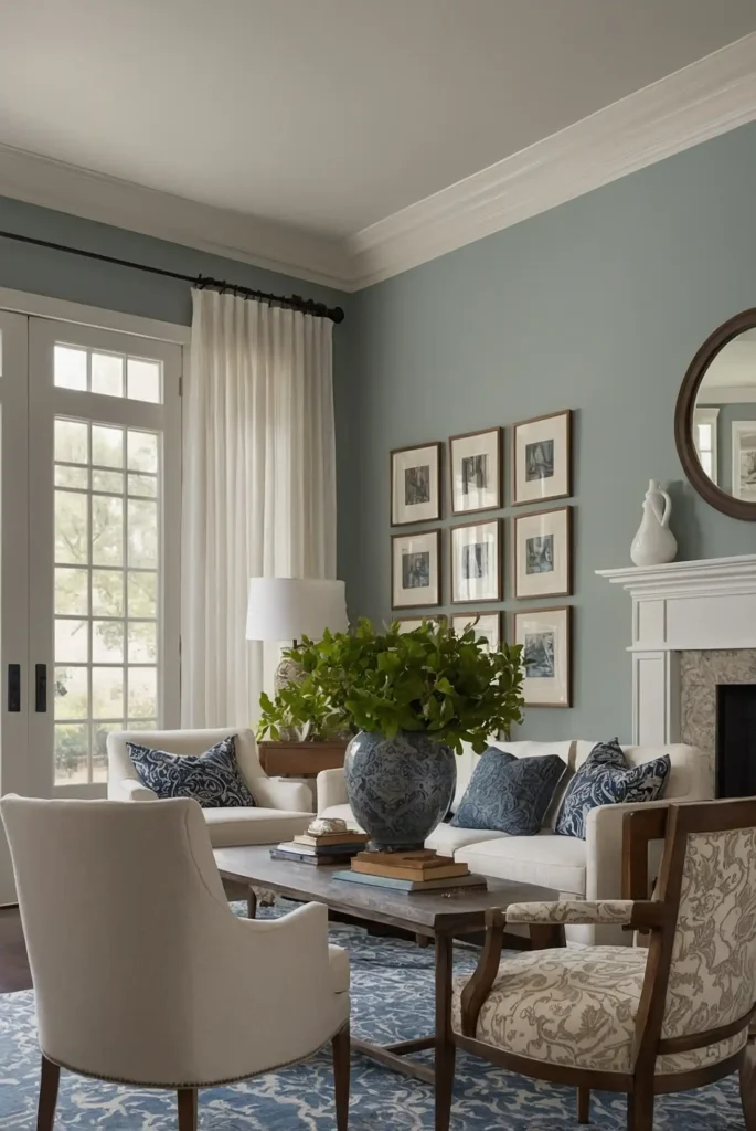
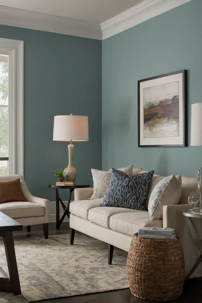
12: Sea Salt (Sherwin-Williams SW 6204)
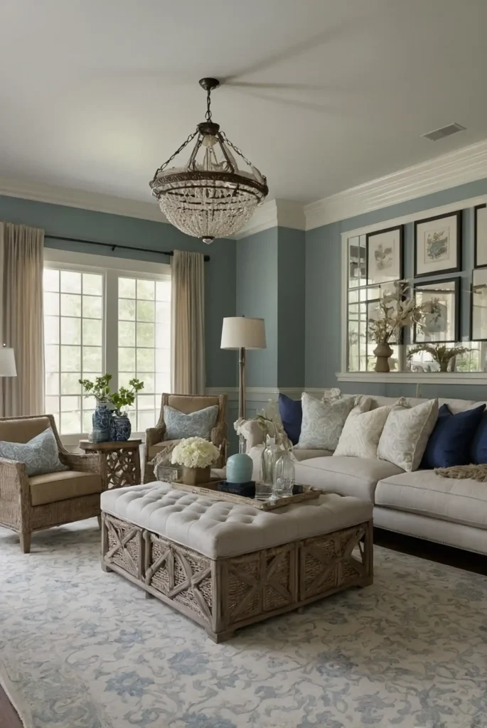
This ethereal blue-green-gray creates tranquil, spa-like spaces that instantly calm and refresh.
It provides subtle color that shifts beautifully throughout the day, sometimes appearing more blue, sometimes more green.
You’ll appreciate its connection to nature that brings the outdoors in without making an obvious color statement.
This versatility makes it perfect for bathrooms, bedrooms, and sunrooms.
Pair it with natural materials and textures for a coastal-inspired retreat in any room.
13: Revere Pewter (Benjamin Moore HC-172)
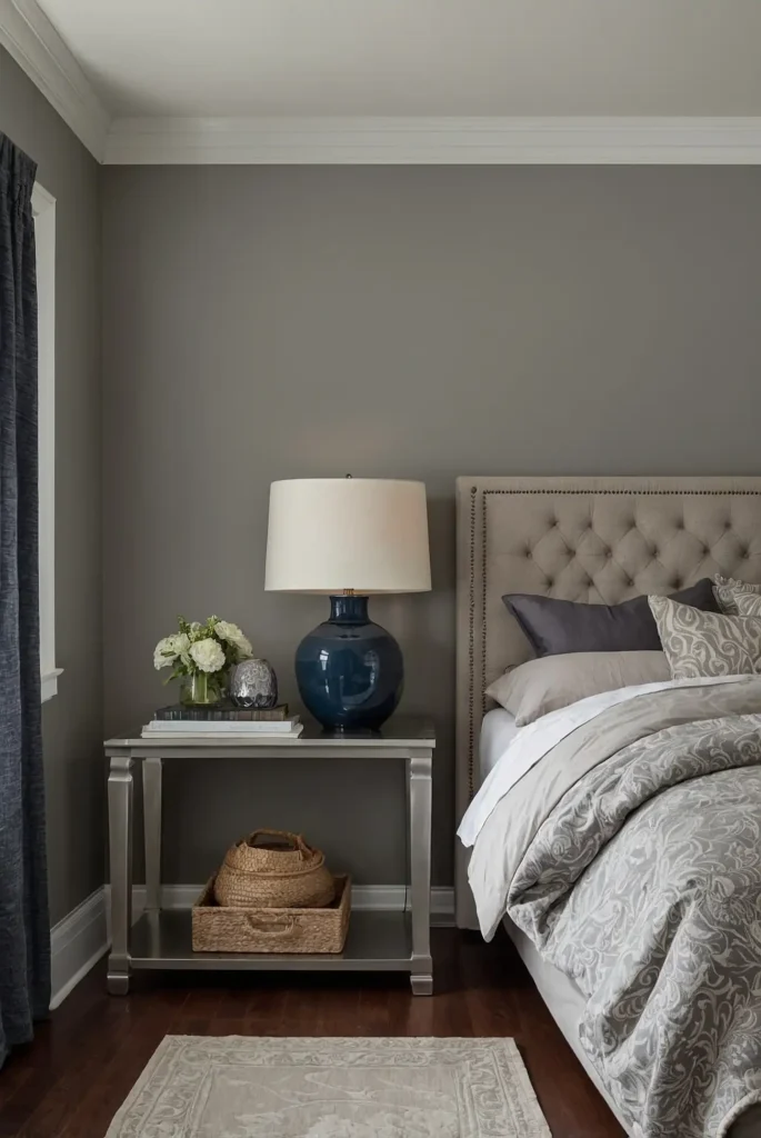
This classic greige creates warm, sophisticated spaces with its perfect balance of gray and beige undertones.
It provides enough depth to define your walls without feeling heavy or dark.
You’ll notice how it grounds furniture groupings while maintaining an open, airy feeling.
This versatility makes it ideal for defining zones in open-concept floor plans.
Its consistent appearance in varying light conditions prevents the dramatic shifts that can make other neutrals challenging.
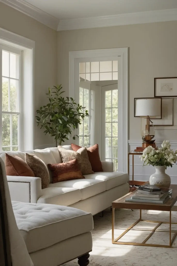
14: Simply White (Benjamin Moore OC-117)
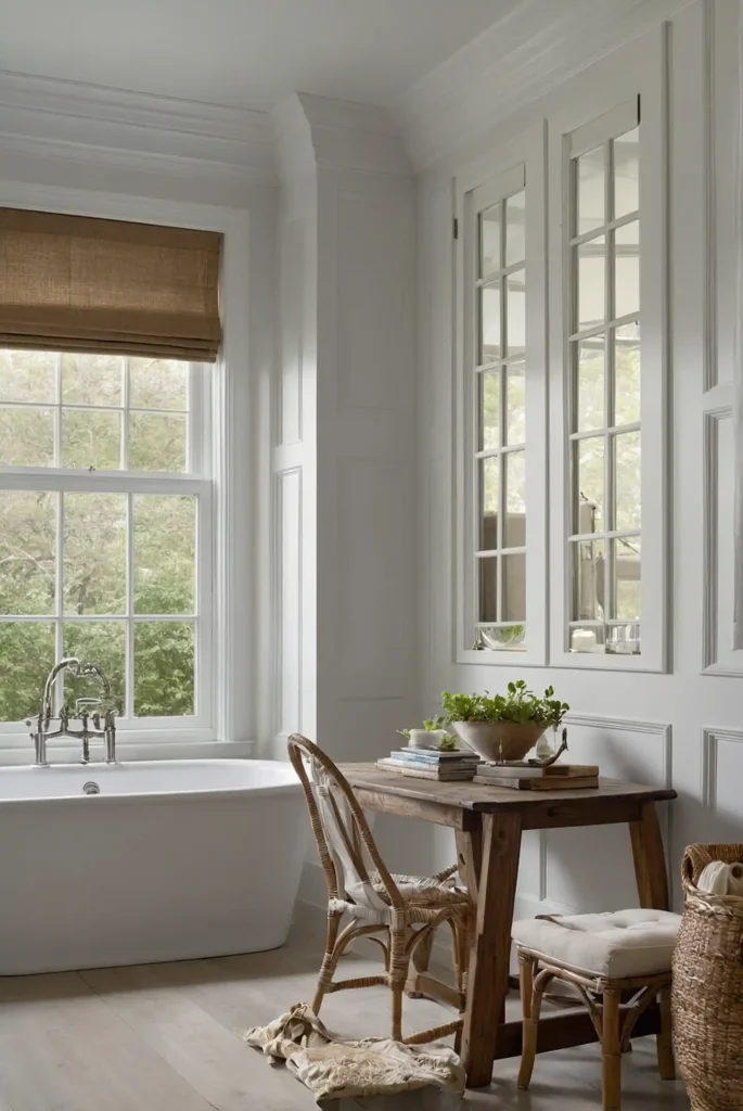
This bright, clean white creates fresh, contemporary spaces with its perfect balance of warmth and brightness.
It delivers crisp definition without the cold, stark quality of pure whites.
You’ll appreciate how it maximizes natural light, making spaces feel larger and more open.
This expansive quality makes it ideal for smaller rooms or spaces with limited windows.
Its versatility allows it to work beautifully in both modern and traditional environments, adapting to your specific décor style.
15: Edgecomb Gray (Benjamin Moore HC-173)
This sophisticated light greige creates warm, welcoming spaces without obvious beige or yellow undertones.
It delivers noticeable color while functioning essentially as a neutral in most design schemes.
You’ll notice how it enhances both cool and warm accent colors, making it exceptionally versatile.
This adaptability allows you to update your accessories without repainting your walls.
Its balanced undertones maintain consistent beauty throughout varying light conditions, creating seamless flow between rooms.
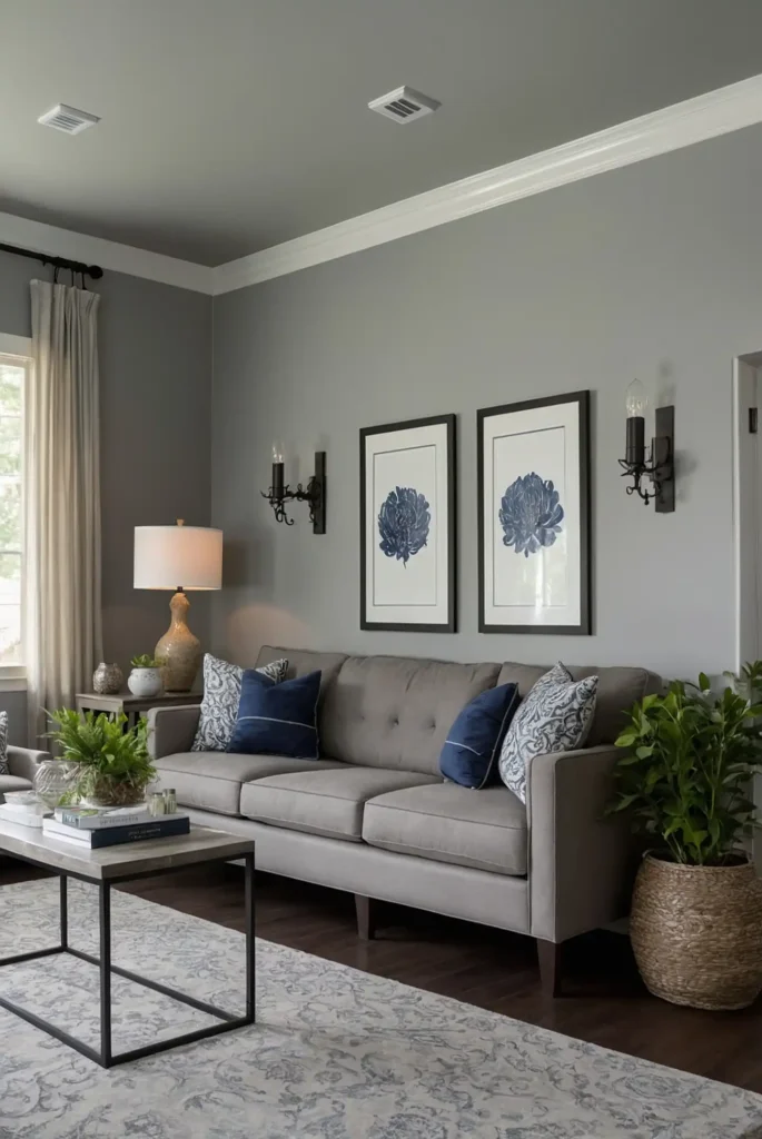
16: Mindful Gray (Sherwin-Williams SW 7016)
This rich mid-tone gray creates defined spaces with its true gray character that avoids obvious undertones.
It provides substantial color depth while maintaining enough lightness for most rooms.
You’ll appreciate how it anchors furniture groupings while creating sophisticated backdrops for artwork.
This supportive quality makes it ideal for rooms where you want walls to make a subtle statement.
Pair it with white trim for crisp contrast or greige trim for a more subtle, monochromatic look.
17: Chantilly Lace (Benjamin Moore OC-65)
This crisp, clean white creates bright, gallery-like spaces with its pure quality that lacks obvious undertones.
It provides maximum light reflection without the cold, institutional feeling of some whites.
You’ll notice how it showcases colorful art and furnishings beautifully, functioning like a perfect museum wall.
This neutrality makes it ideal for contemporary homes with architectural interest.
Its consistent appearance in varying light conditions makes it exceptionally reliable for whole-house applications.
18: Pale Smoke (Benjamin Moore 1584)
This ethereal blue-gray creates serene, sophisticated spaces with its subtle color presence.
It delivers gentle color without overwhelming your décor or making an obvious statement.
You’ll appreciate how it shifts subtly throughout the day, sometimes appearing more blue, sometimes more gray.
This chameleon-like quality creates visual interest that evolves with changing light.
Its soothing quality makes it ideal for bedrooms and bathrooms where you want to create relaxing retreats.
19: Agreeable Beige (Sherwin-Williams SW 7027)
This versatile warm neutral creates inviting spaces with its balanced beige character that avoids obvious yellow undertones.
It provides noticeable warmth while functioning essentially as a neutral.
You’ll notice how it grounds furniture groupings while maintaining an open, airy feeling.
This perfect balance makes it ideal for family rooms and gathering spaces.
Its consistent appearance in varying light conditions creates seamless transitions between connecting rooms.
20: Gray Owl (Benjamin Moore 2137-60)
This versatile light gray with subtle green undertones creates fresh, sophisticated spaces.
It delivers noticeable color without overwhelming your décor, making it ideal for larger, open areas.
You’ll appreciate how it shifts subtly with changing light, sometimes appearing more green, sometimes more gray.
This subtle variation adds interest to your walls without obvious color statements.
Its connection to nature makes it particularly successful in homes with views to the outdoors.
21: Balboa Mist (Benjamin Moore OC-27)
This ethereal light gray with subtle lavender undertones creates serene, sophisticated spaces.
It delivers whisper-soft color that shifts beautifully throughout the day, adding visual interest.
You’ll notice its chameleon-like quality that adapts to your existing furnishings, making it exceptionally versatile.
This adaptability allows you to update your décor without repainting walls.
Its subtle depth provides more interest than white while maintaining an open, airy feeling even in smaller spaces.
22: Snowbound (Sherwin-Williams SW 7004)
This soft white with subtle warm undertones creates bright, welcoming spaces without obvious yellow or pink shifts.
It provides crisp definition while maintaining a soft, sophisticated appearance.
You’ll appreciate how it brightens rooms while avoiding the stark, clinical quality of cooler whites.
This balanced character makes it ideal for both modern and traditional homes.
Its consistent appearance in varying light conditions makes it reliable for whole-house applications where seamless flow matters.
23: Iron Ore (Sherwin-Williams SW 7069)
This rich charcoal creates dramatic impact with its deep, sophisticated character.
It provides substantial depth while avoiding the harshness of pure black, making it more livable for interior spaces.
You’ll notice how it recedes visually, creating the illusion of expanded space despite its depth.
This counterintuitive effect makes it successful even on all four walls of appropriately sized rooms.
Use it for dramatic accent walls or in well-lit rooms where the depth creates cozy sophistication.
24: Pale Powder (Farrow & Ball 204)
This delicate blue-green creates tranquil, spa-like spaces with its subtle historic character.
It delivers gentle color that shifts beautifully throughout the day, creating visual interest.
You’ll appreciate its connection to nature that brings the outdoors in without making an obvious color statement.
This versatility makes it perfect for bedrooms and bathrooms.
Its refined quality adds sophistication to traditional spaces while providing unexpected softness in contemporary ones.
25: Paper White (Benjamin Moore 1590)
This crisp gray-white creates bright, contemporary spaces with its subtle cool undertones.
It provides definition without the starkness of pure whites, making it more livable in northern exposures.
You’ll notice how it showcases art and furnishings beautifully, functioning like a perfect gallery wall.
This supportive quality makes it ideal for homes with statement furniture or artwork.
Its consistent appearance in varying light conditions makes it reliable for connecting spaces.
26: Naval (Sherwin-Williams SW 6244)
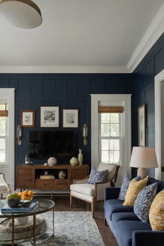
This rich navy blue creates dramatic sophistication with its perfect balance of depth and livability.
It provides substantial color presence while functioning essentially as a neutral with most color schemes.
You’ll appreciate how it recedes visually, making spaces feel larger despite the depth of color.
This quality makes it surprisingly successful even in smaller rooms or dining areas.
Its timeless quality ensures it won’t feel dated as trends shift, making it a safe choice for statement walls.
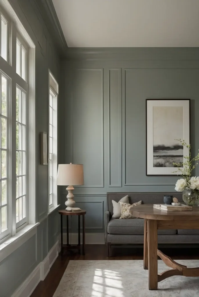
27: Slate Tile (Benjamin Moore 1592)
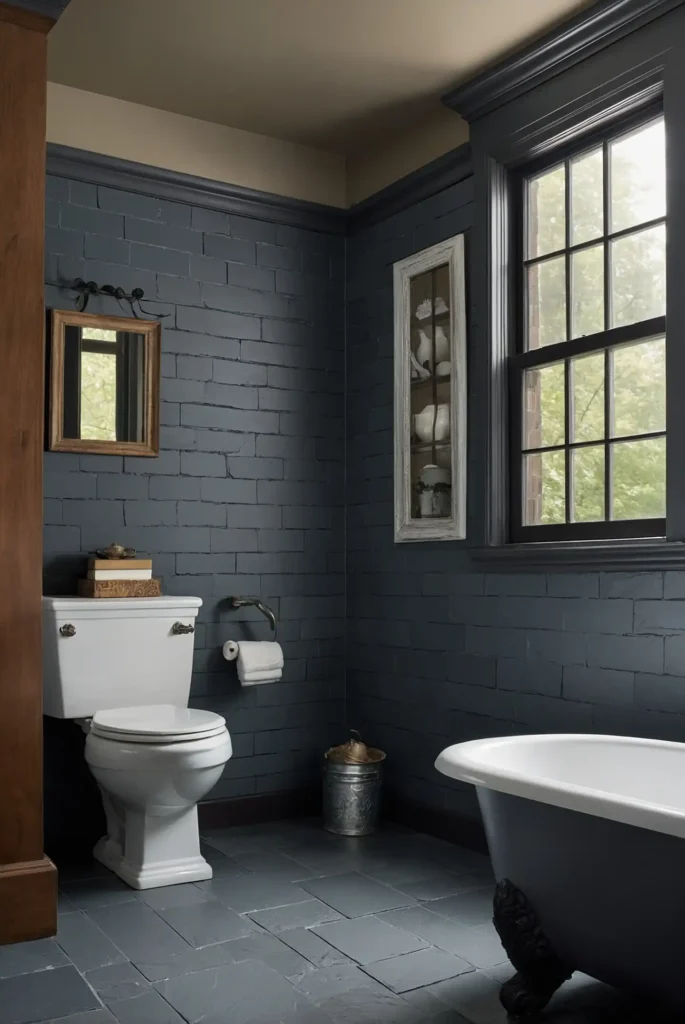
This sophisticated blue-gray creates serene, grounded spaces with its complex undertones.
It delivers noticeable color depth while maintaining enough neutrality to coordinate with varied décor styles.
You’ll notice how it shifts beautifully in different lighting conditions, sometimes appearing more blue, sometimes more gray.
This subtle variation adds visual interest without overwhelming your space.
Its balanced character makes it ideal for bedrooms and living spaces where you want subtle color presence without obvious trendiness.
Conclusion
The perfect paint color transforms ordinary rooms into extraordinary spaces that reflect your personality and enhance your daily experience.
Choose colors that speak to you while considering your home’s unique lighting, architecture, and your desired emotional impact.