27 Brilliant Paint Colors That Will Brighten Your Dark and Low-Light Rooms
Choosing the right paint color for rooms with limited natural light can transform them from dark and dreary to bright and inviting.
Low-light spaces present unique challenges that the perfect paint color can help overcome.
Color psychology plays a significant role in how we perceive space, with some hues naturally reflecting more light while others absorb it.
The right choice can make your room feel larger, brighter, and more welcoming despite limited windows or northern exposure.
Ready to bring new life to your darker spaces?
These 27 expert-recommended paint colors will help you maximize light reflection and create the illusion of brightness in even the most challenging rooms in your home.
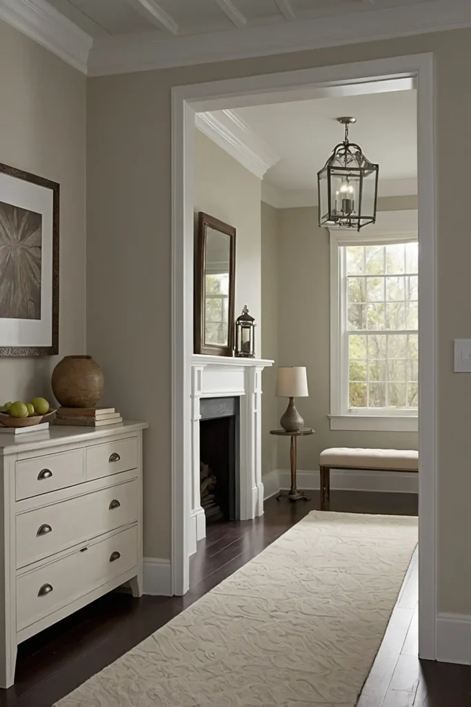
1: Pale Buttercream
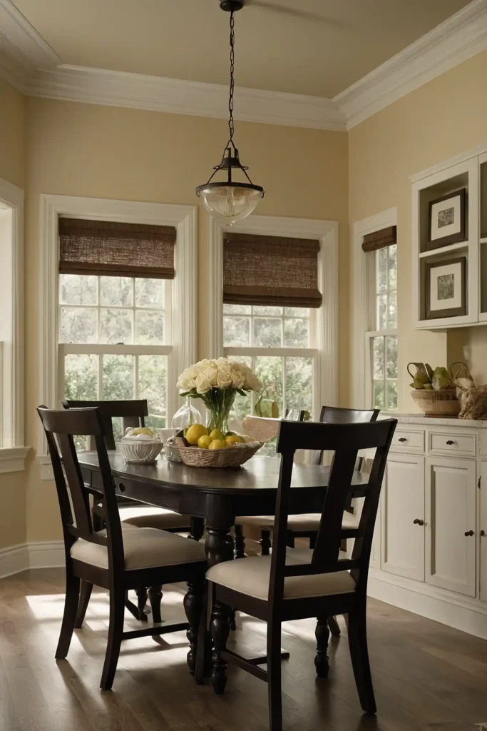
Brighten dark corners with creamy buttercream that offers warmth without yellow intensity.
This soft neutral reflects available light while creating a subtle glow that mimics sunshine.
Add white trim and light fixtures with warm bulbs to enhance the brightening effect.
This versatile color works in any room with limited light while providing a more sophisticated alternative to stark white.
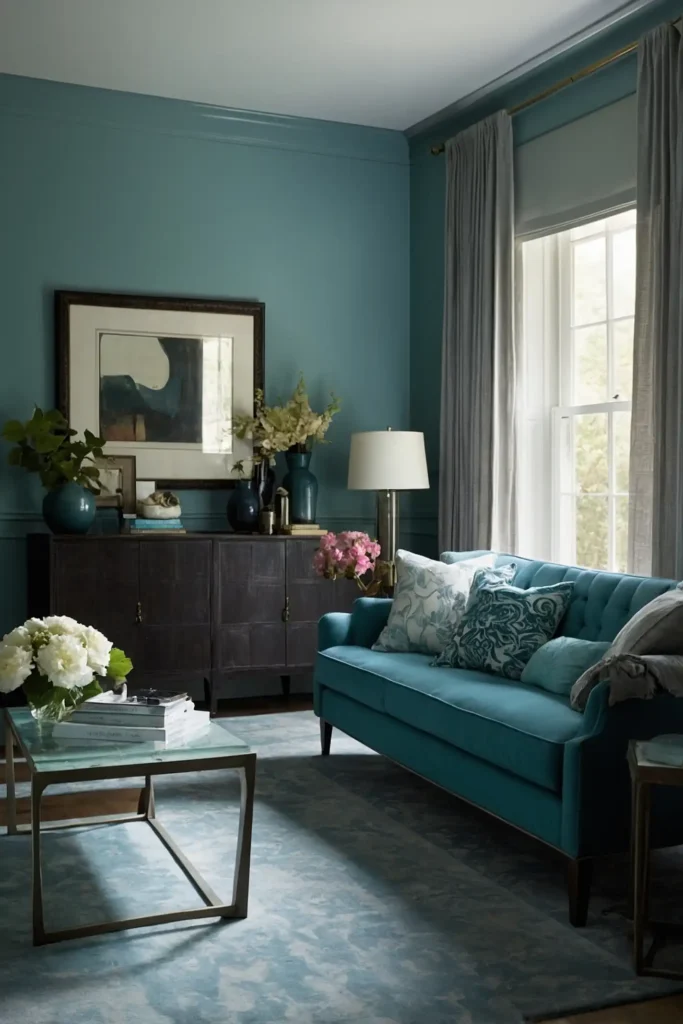
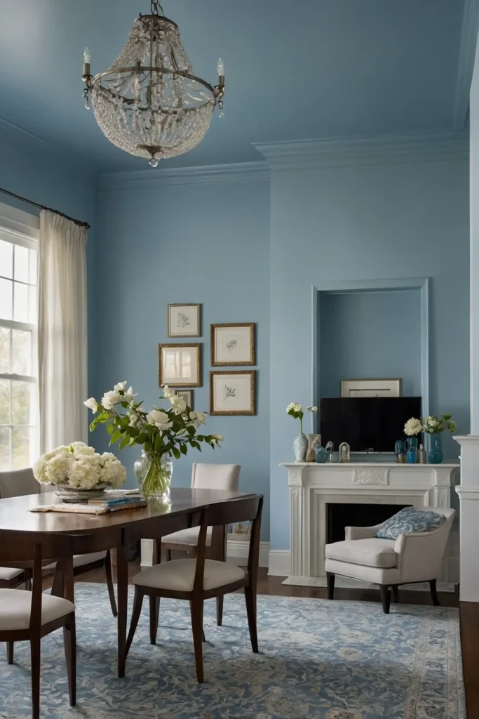
2: Silvery Blue
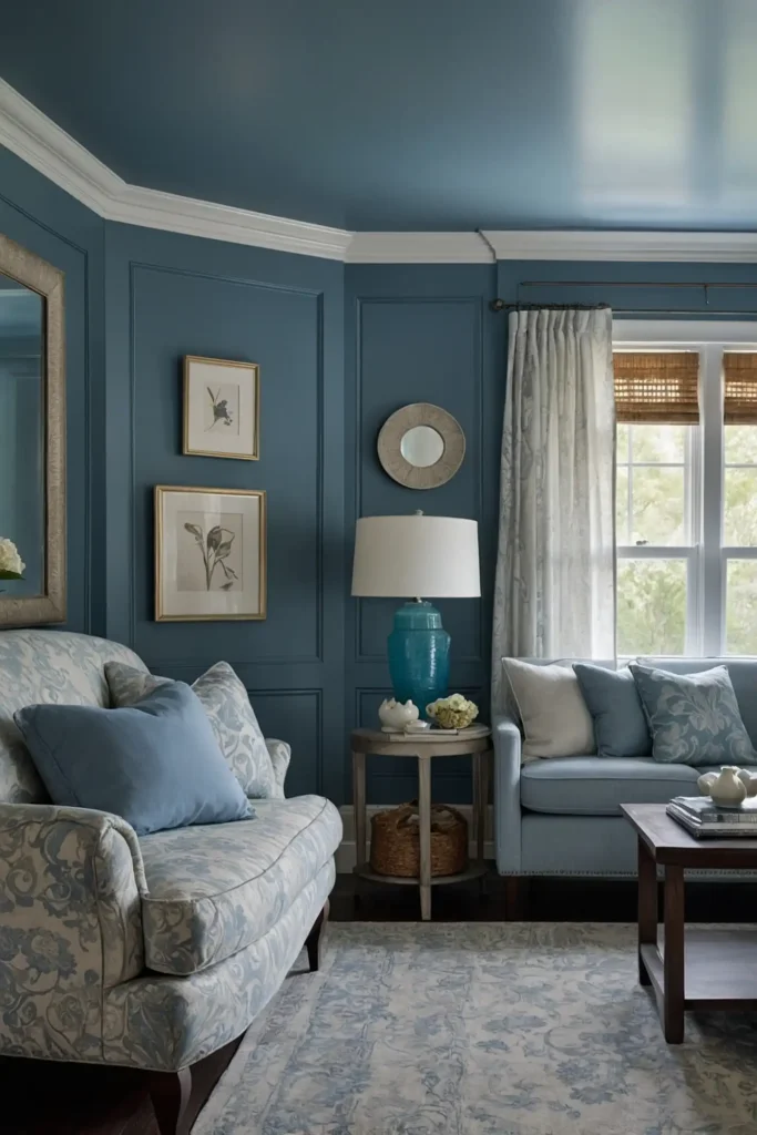
Create an airy feeling with silvery blue that reflects light beautifully.
This cool-toned hue contains enough gray to prevent it from appearing too saturated in limited light.
Pair with crisp white trim and mirrors to maximize brightness.
This refreshing color tricks the eye into perceiving more space and light while adding subtle color interest to darker rooms.
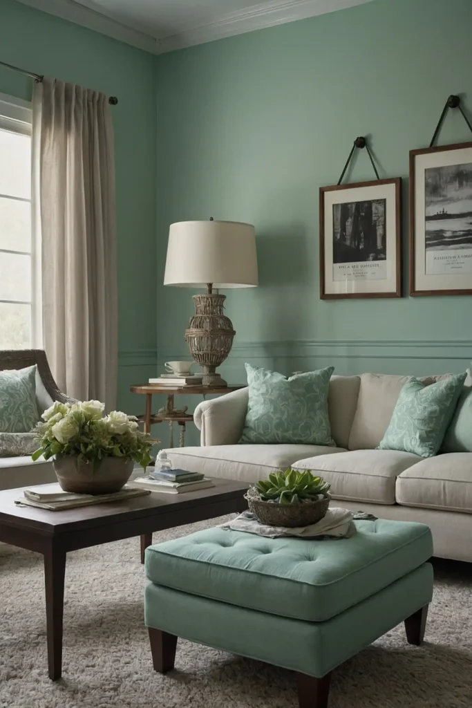
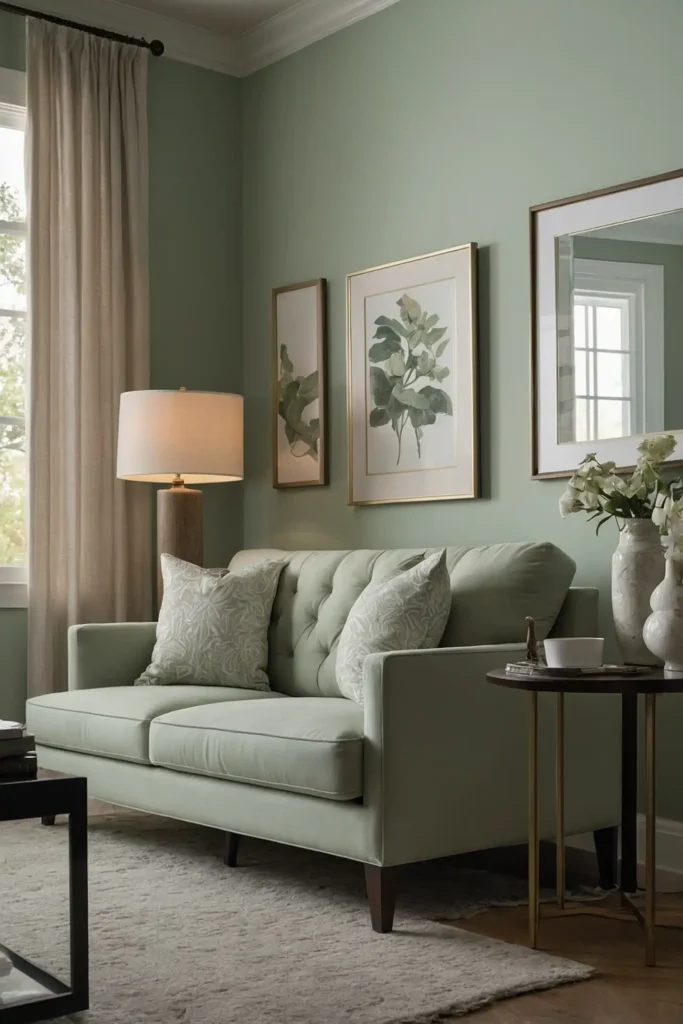
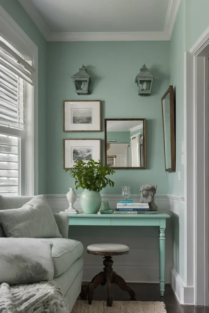
3: Soft Sage Green
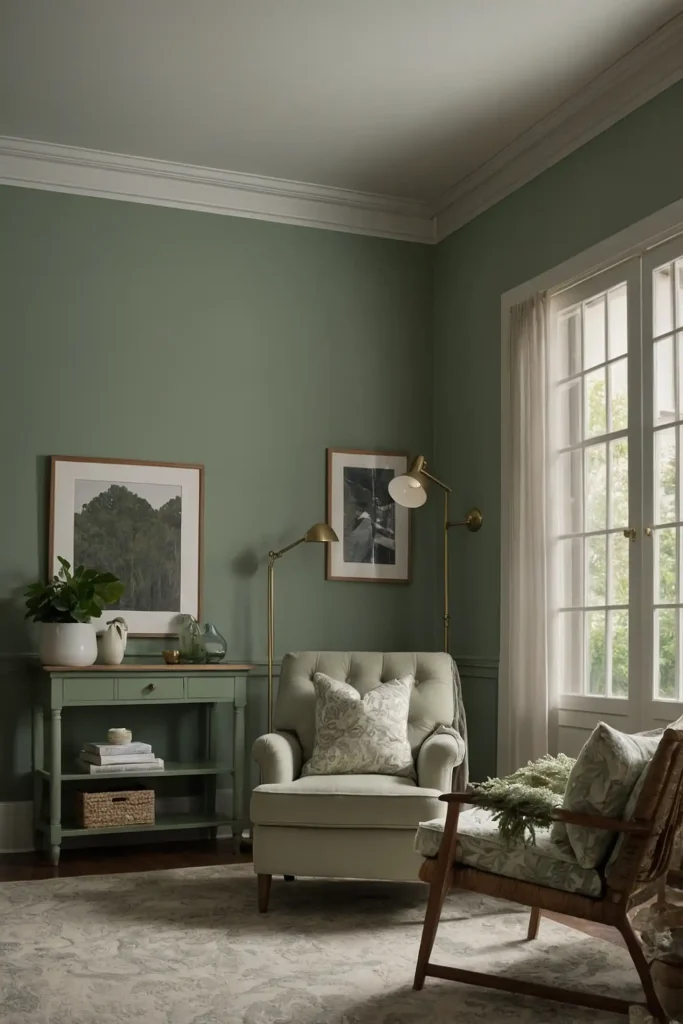
Bring natural freshness to low-light spaces with a muted sage green.
This nature-inspired hue contains enough gray to prevent it from going muddy in darker environments.
Add plenty of warm lighting to enhance its subtle undertones.
This gentle color creates a soothing atmosphere while reflecting more light than you might expect from a non-neutral shade.
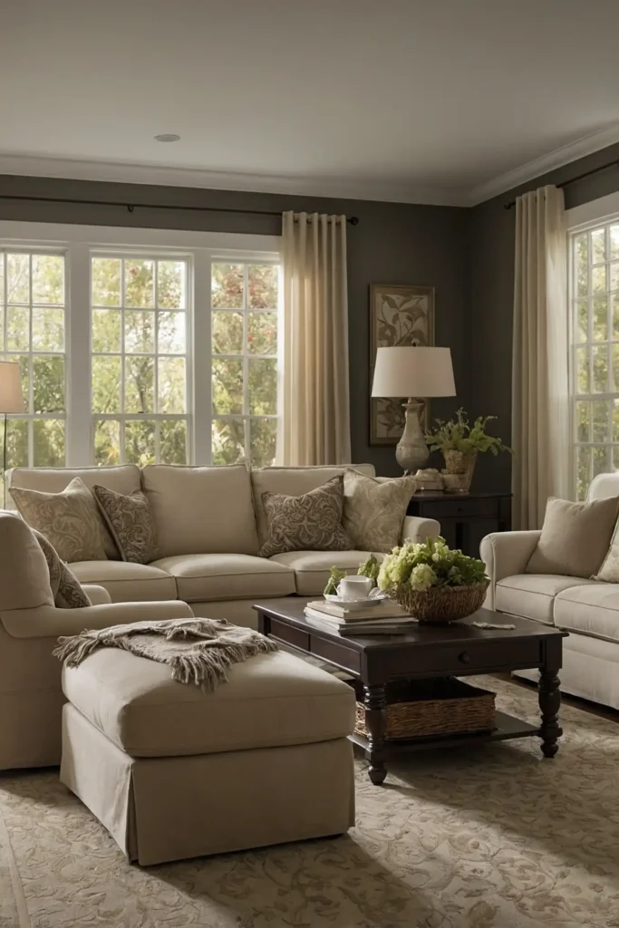
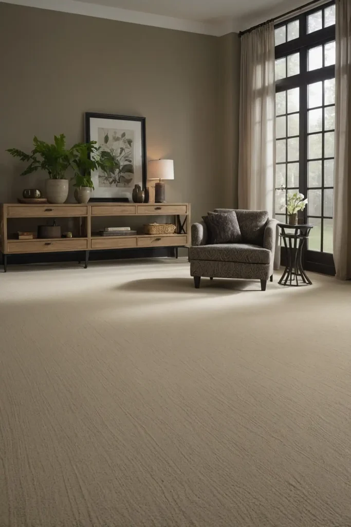
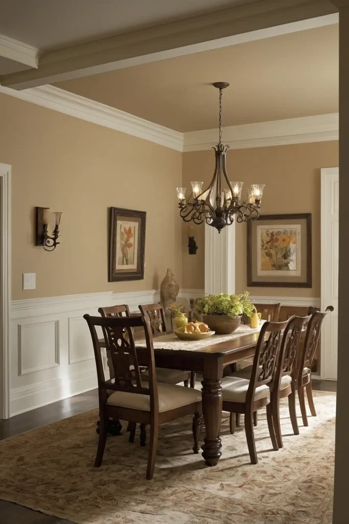
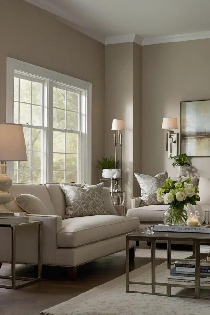
4: Warm Greige
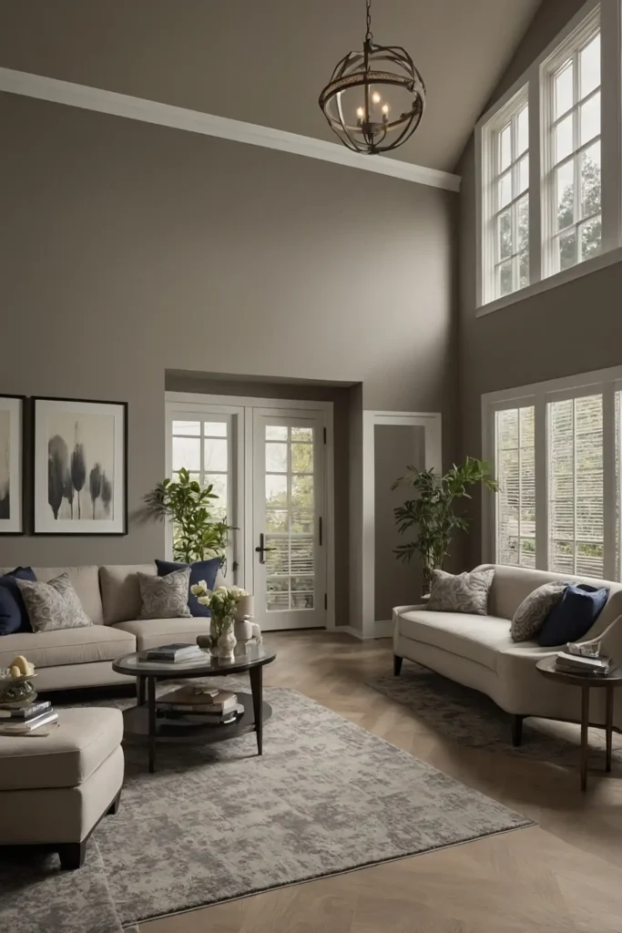
Maximize versatility with greige (gray-beige hybrid) that offers subtle warmth without yellow undertones.
This sophisticated neutral reflects light better than pure gray while remaining contemporary.
Pair with white trim and light wood accents for balance.
This practical color adapts to different lighting conditions throughout the day while maintaining a consistently welcoming appearance.
5: Pale Lavender
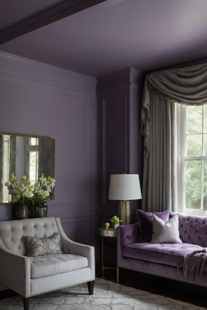
Brighten dark spaces with the unexpected lightness of pale lavender.
This subtle purple contains enough gray to appear almost neutral while reflecting available light beautifully.
Keep the lavender very subtle with significant gray influence.
This unique choice adds personality to low-light rooms while creating the illusion of more space and brightness.
6: Blush Pink
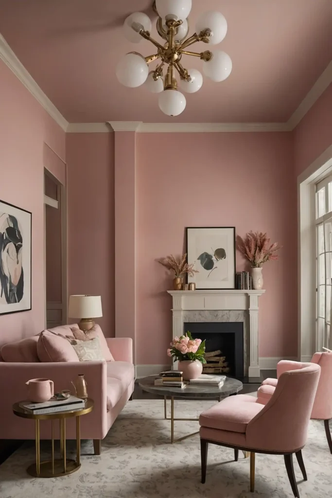
Create a warm glow with soft blush pink that contains enough beige to prevent it from looking too saturated.
This subtle color reflects light while adding gentle warmth to dark spaces.
Choose a blush with gray undertones for sophisticated appeal.
This versatile color brightens rooms with both northern and southern exposure while creating a flattering environment for all skin tones.
7: Buttery Off-White
Maximize light reflection with buttery off-white that offers more warmth than stark white. This creamy neutral creates the illusion of sunshine even in windowless spaces.
Pair with slightly brighter white trim for subtle definition.
This practical choice works in any room lacking natural light while providing more sophistication than pure white alternatives.
8: Pale Silver
Create contemporary brightness with pale silver walls that reflect both natural and artificial light.
This modern neutral offers more warmth than cool gray while maximizing luminosity.
Add metallic accents that catch and amplify available light.
This sophisticated color creates the illusion of more space while providing a perfect backdrop for artwork and furnishings.
9: Light Aqua
Bring unexpected freshness to dark rooms with pale aqua that contains plenty of gray.
This subtle blue-green reflects light beautifully while adding gentle color interest.
Keep the aqua very muted to prevent it from overpowering low-light spaces.
This unique choice creates a sense of openness while adding more personality than typical neutrals.
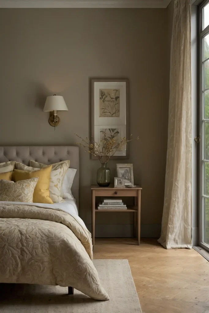
10: Creamy Mushroom
Brighten dark corners with creamy mushroom that offers earthy sophistication.
This complex neutral provides warmth without yellow undertones that can look dingy in low light.
Add white accents and adequate lighting to enhance its light-reflecting qualities.
This versatile color works in both modern and traditional spaces with limited natural illumination.
11: Oyster White
Maximize brightness with oyster white that contains subtle gray undertones.
This sophisticated neutral reflects light beautifully while offering more depth than stark white.
Pair with crisp white trim for definition and enhanced brightness.
This practical choice creates the illusion of more light while providing a more interesting alternative to pure white.
12: Pale Celestial Blue
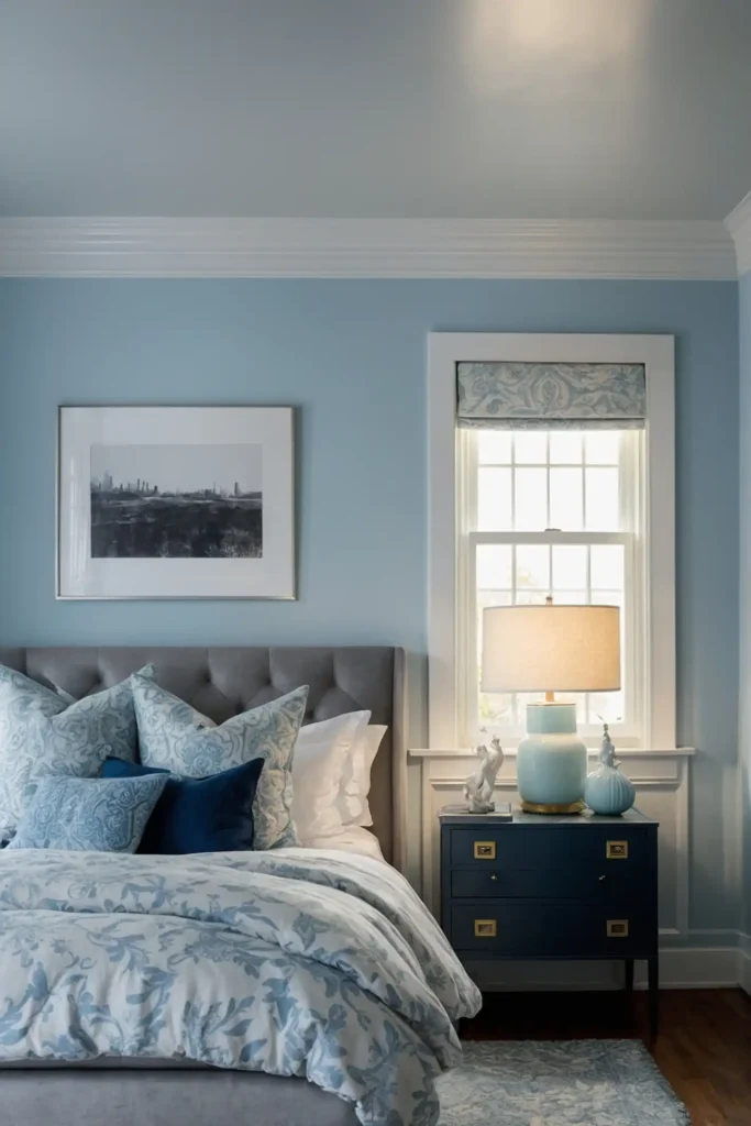
Create the illusion of daylight with pale blue that mimics clear sky.
This subtle color reflects light while adding freshness to spaces lacking natural brightness.
Keep the blue very light with significant gray influence.
This uplifting color psychologically suggests openness and air, making rooms feel both brighter and larger.
13: Soft Wheat
Bring subtle warmth to dark spaces with light wheat that contains enough gray to prevent yellowing.
This natural neutral reflects light while creating a welcoming atmosphere.
Add white trim and light-colored furnishings to enhance brightness.
This versatile color creates the illusion of sunshine in rooms with limited natural light exposure.
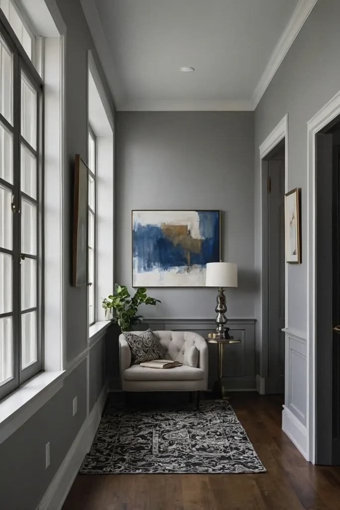
14: Misty Gray
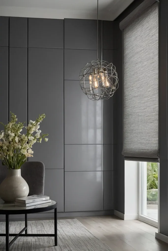
Maximize contemporary brightness with pale gray that contains warm undertones.
This sophisticated neutral reflects light while creating a soft, diffused appearance in dark spaces.
Choose a gray with slightly violet undertones to prevent it from looking flat.
This practical color adapts beautifully to changing light conditions while maintaining consistent brightness.
15: Pale Seafoam
Brighten dark corners with subtle seafoam green that contains plenty of gray.
This refreshing color reflects light surprisingly well while adding interest beyond basic neutrals.
Keep the green very subtle to prevent it from overwhelming low-light spaces.
This unique choice creates an unexpected freshness in rooms lacking natural brightness.
16: Light Peach
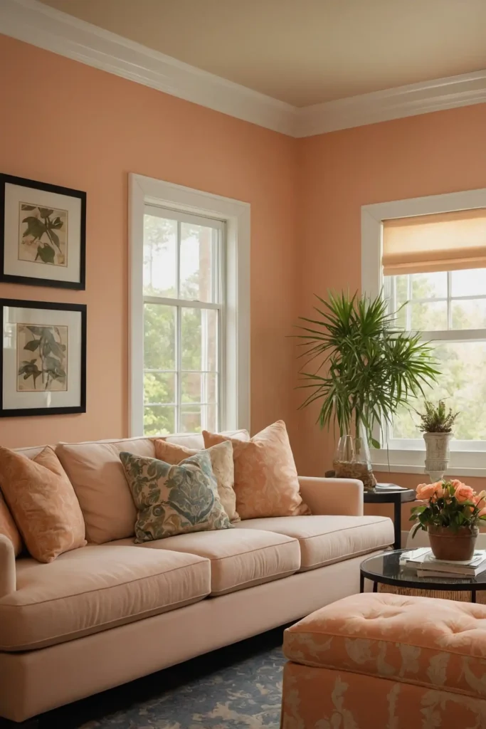
Create a subtle glow with pale peach walls that mimic early morning sunlight.
This warm neutral brightens dark spaces while creating a flattering environment for both people and furnishings.
Choose a peach with significant beige influence to prevent it from looking too saturated.
This unexpected color reflects light beautifully while adding subtle warmth to rooms with limited natural light.
17: Dove White
Maximize brightness with dove white that offers more dimension than stark white.
This sophisticated neutral contains subtle undertones that prevent it from looking flat in low light.
Pair with pure white trim for definition and enhanced light reflection.
This practical choice creates the illusion of more space while providing subtle sophistication in dark rooms.
18: Light French Gray
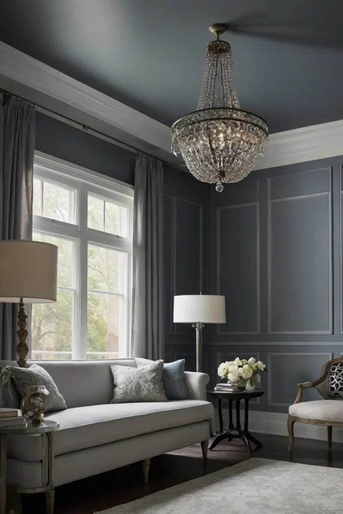
Bring airy sophistication to dark spaces with French gray that contains blue undertones.
This refined neutral reflects light while adding subtle color depth beyond typical grays.
Add plenty of white accents to enhance its light-reflecting properties.
This elegant color creates the illusion of more space while maintaining consistent appearance throughout the day.
19: Pale Celadon
Brighten low-light spaces with subtle celadon that contains more gray than green.
This sophisticated color reflects light surprisingly well while adding gentle interest beyond basic neutrals.
Keep the celadon very muted to maintain its brightening effects.
This unique choice creates subtle freshness in rooms lacking natural illumination while maintaining elegant sophistication.
20: Alabaster
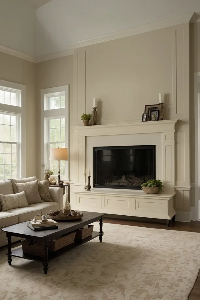
Create luminous walls with alabaster that offers creamy warmth without yellow undertones.
This sophisticated off-white reflects light beautifully while providing more depth than stark white.
Add similar-toned trim for seamless visual expansion. This practical color maximizes brightness while offering subtle sophistication that pure white alternatives lack.
21: Soft Sand
Bring natural warmth to dark spaces with light sand that contains enough gray to prevent yellowing.
This versatile neutral reflects light while creating a subtle connection to nature.
Pair with white trim and natural textures for enhanced effect.
This practical color brightens rooms with limited natural light while maintaining consistent appearance throughout the day.
22: Pale Powder Blue
Create the illusion of daylight with subtle powder blue that mimics distant sky.
This gentle color reflects light while adding freshness to spaces lacking natural brightness.
Keep the blue very subdued with significant gray influence.
This uplifting color makes ceilings feel higher and spaces larger while brightening even the darkest corners.
23: Light Mint
Brighten dark spaces with pale mint that contains plenty of gray. This refreshing color reflects light surprisingly well while adding subtle interest beyond basic neutrals.
Choose a mint with significant white and gray influence to prevent it from looking too saturated.
This unexpected choice creates freshness in rooms lacking natural brightness.
24: Creamy Bisque
Maximize warmth and brightness with bisque walls that offer subtle richness without yellow intensity.
This sophisticated neutral creates the illusion of sunshine even in north-facing rooms.
Add white accents and warm lighting to enhance its brightening effects.
This versatile color works in rooms of any size or function while maintaining consistent appearance throughout the day.
25: Soft Pearl
Create luminous walls with pearl that offers subtle iridescence and light reflection.
This sophisticated neutral contains complex undertones that add dimension to dark spaces.
Pair with crisp white trim for definition and enhanced brightness. This elegant color captures and amplifies available light while creating visual interest beyond basic whites.
26: Pale Straw
Bring subtle sunshine to dark spaces with light straw that contains enough gray to prevent yellowing.
This warm neutral creates a welcoming glow in rooms with limited natural light.
Keep the yellow very subtle with significant beige influence.
This unexpected color brightens rooms while adding more personality than typical whites and grays.
27: Cloud White
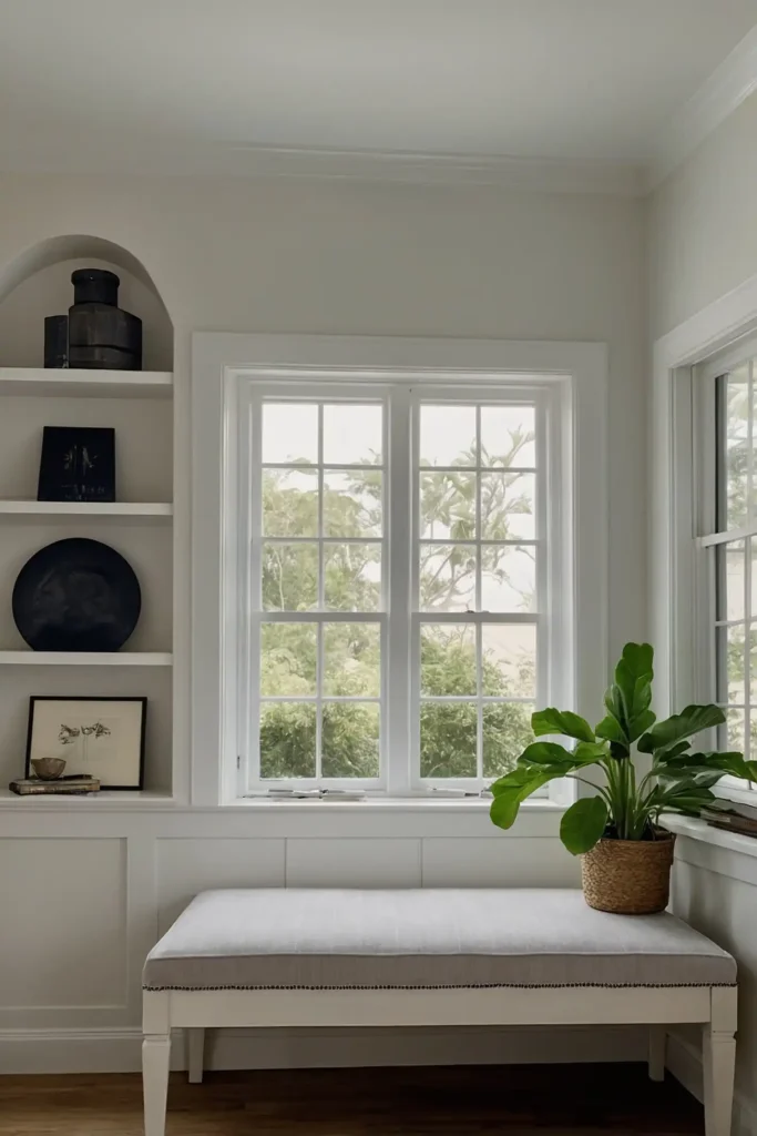
Maximize brightness with cloud white that offers subtle depth beyond stark white.
This sophisticated neutral contains minute undertones that create gentle dimension in dark spaces.
Add plenty of reflective surfaces to enhance its light-amplifying properties.
This practical color creates the illusion of more space and light while working in any room lacking natural brightness.
Conclusion
The right paint color transforms low-light spaces from dreary to inviting.
Choose hues that maximize reflection, consider the room’s specific lighting challenges, and remember that subtle color often outperforms stark white in creating perceived brightness.