27 Best Paint Colors That Perfectly Complement Cherry Wood Furniture
Cherry wood furniture brings timeless warmth and rich character to your home with its distinctive reddish-brown tones and natural luster.
Finding the perfect wall color to complement these beautiful pieces can enhance their natural beauty while creating a harmonious space.
The right paint color can either highlight cherry wood’s warm undertones or create striking contrast that makes your furniture stand out.
Your choice will significantly impact how the entire room feels and functions.
Ready to find the perfect backdrop for your cherry wood furniture?
Explore these 27 designer-approved paint colors that will showcase your investment pieces beautifully while creating the atmosphere you desire.
1: Sage Green
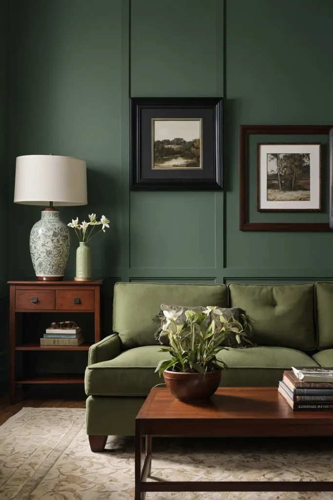
Create natural harmony with soft sage green walls that beautifully balance cherry wood’s warm red undertones.
This earthy color provides gentle contrast while maintaining a cohesive, organic feeling.
Sage contains enough gray to prevent clashing with cherry’s redness.
The nature-inspired hue creates a calming backdrop that allows your furniture’s rich tones to shine without competition.
This versatile color works particularly well in dining rooms and living spaces where you want to create a serene, welcoming environment that showcases your quality furniture.
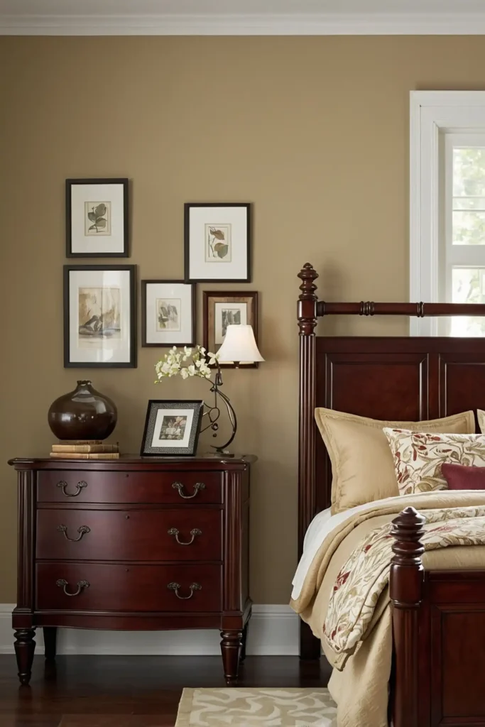
2: Creamy Off-White
Showcase your cherry furniture against creamy off-white walls that provide contrast without harshness.
This soft neutral creates a light, airy backdrop that makes wood tones appear even richer.
Off-white contains subtle yellow undertones that complement cherry’s warmth better than stark white.
The gentle color provides perfect contrast while maintaining a warm, inviting atmosphere.
This classic pairing works beautifully in any room, allowing your furniture to become the natural focal point while creating a timeless foundation that never goes out of style.
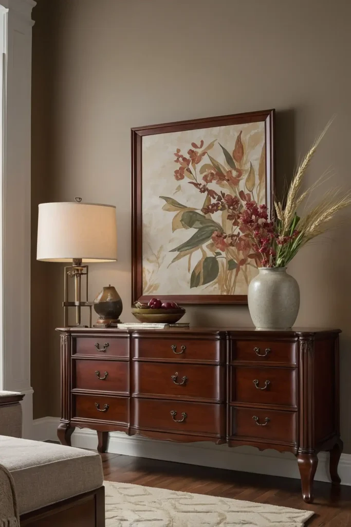
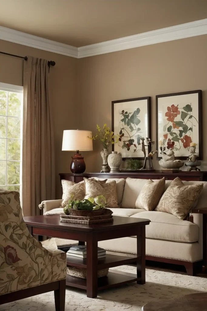
3: Warm Taupe
Balance cherry’s richness with sophisticated taupe walls that bridge gray and beige for perfect neutrality.
This complex color creates a grounded backdrop that enhances cherry wood without competing.
Taupe contains warm undertones that harmonize with cherry’s natural coloring.
The subtle depth adds dimension to your space while allowing furniture to remain the star.
This practical color adapts beautifully to changing light, maintaining its complementary relationship with cherry furniture throughout the day for consistent visual harmony.
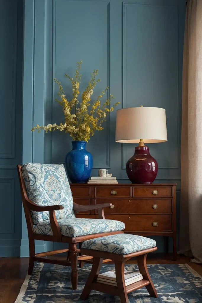
4: Soft Blue-Gray
Create refreshing contrast with gentle blue-gray walls that cool and balance cherry’s warm redness.
This sophisticated neutral adds contemporary appeal to traditional cherry pieces.
Blue-gray’s cool undertones create beautiful tension with cherry’s warmth for a visually interesting yet harmonious effect.
The subtle color prevents cherry furniture from appearing too intensely red.
This versatile pairing works particularly well in bedrooms and living spaces where you want to maintain a calm, balanced atmosphere while showcasing your furniture investment.
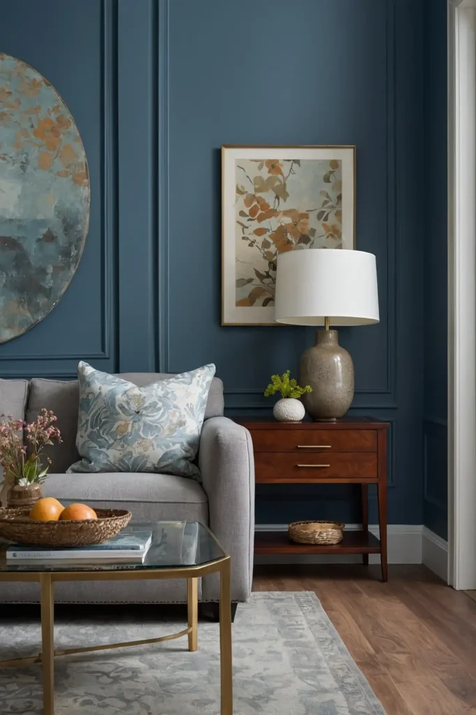
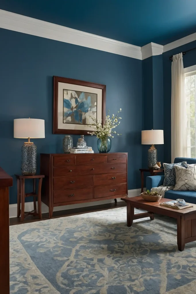
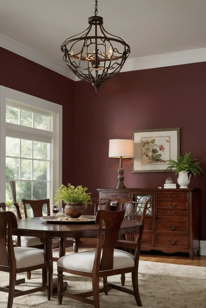
5: Rich Navy Blue

Make a dramatic statement with deep navy walls that create bold, sophisticated contrast with cherry wood.
This powerful color combination adds undeniable presence to any room.
Navy’s depth provides the perfect backdrop to make cherry wood appear luminous by comparison.
The classic blue contains enough richness to stand up to cherry’s substantial character.
Consider this bold choice for dining rooms, libraries, or offices where you want to create a memorable, impactful space centered around your quality furniture.
6: Gentle Lavender
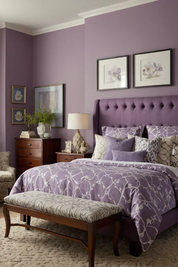
Add unexpected sophistication with soft lavender walls that create subtle contrast with cherry’s warm tones.
This nuanced pairing feels fresh and unique without being trendy or overwhelming.
Lavender contains both warm and cool properties that interact beautifully with cherry’s complex undertones.
The gentle purple hue creates enough contrast to prevent blending while maintaining harmony.
This distinctive choice works wonderfully in bedrooms, sitting rooms, or any space where you want to create a unique, refined atmosphere that complements traditional furniture.
7: Light Olive Green
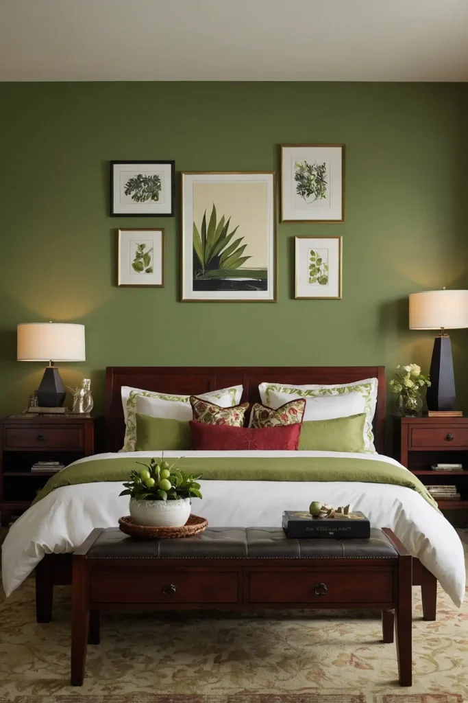
Ground your space with light olive walls that naturally complement cherry’s reddish tones.
This earthy color creates beautiful harmony through color wheel dynamics—red and green being complementary colors.
Olive contains brown undertones that connect seamlessly with wooden elements.
The natural color creates a cohesive environment where your cherry furniture feels perfectly at home.
This organic pairing works particularly well in spaces where you want to create a connection to nature while maintaining a sophisticated, timeless aesthetic.
8: Soft Wheat
Warm your space with gentle wheat-colored walls that enhance cherry’s natural glow.
This neutral adds subtle warmth without competing with your furniture’s rich character.
Wheat contains golden undertones that highlight similar tones within cherry wood.
The complementary color creates a cohesive atmosphere where wood elements appear even more luminous.
This harmonious pairing creates an inviting, sophisticated environment perfect for living rooms or dining spaces where you want to showcase cherry furniture at its most beautiful.
9: Pale Gray-Green
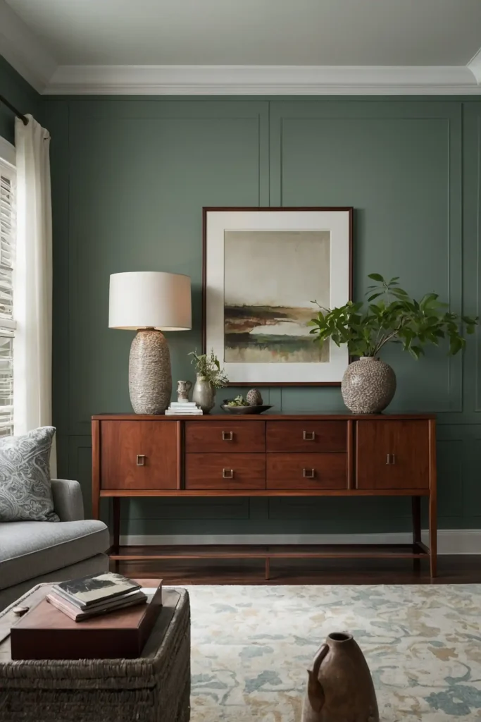
Create subtle sophistication with pale gray-green walls that provide gentle contrast to cherry’s warmth.
This complex neutral bridges cool and warm properties for perfect balance.
Gray-green contains enough gray to feel contemporary while the green undertones harmonize with cherry’s natural elements.
The muted color creates a perfect backdrop that enhances without overwhelming.
This versatile pairing works beautifully in any room, allowing your cherry furniture to command attention while maintaining a current, fresh aesthetic.
10: Classic Ivory
Highlight your cherry furniture with timeless ivory walls that provide clean contrast without starkness.
This soft white creates an elegant backdrop that enhances wood’s natural beauty.
Ivory contains subtle warmth that complements cherry’s rich tones better than bright white.
The gentle color creates enough contrast to make furniture pop while maintaining a cohesive feeling.
This enduring combination works throughout your home, creating a bright yet warm environment where your quality furniture becomes the natural focal point.
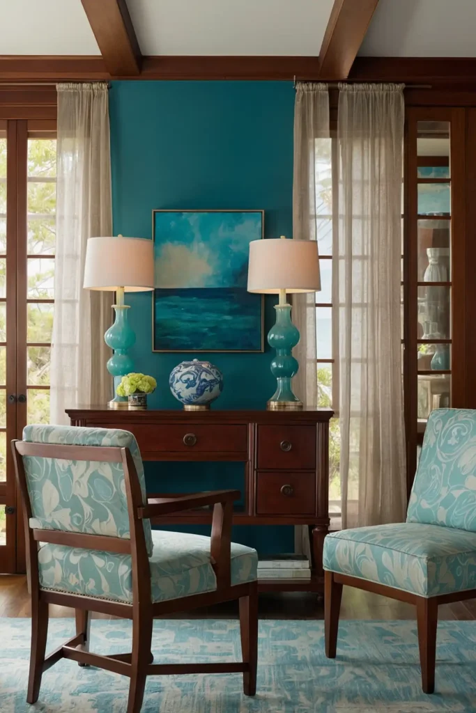
11: Deep Teal
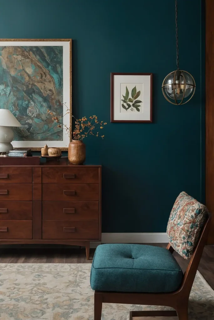
Create dramatic impact with rich teal walls that provide beautiful contrast to cherry’s warm tones.
This jewel-toned color adds depth and sophistication while making wood appear more vibrant.
Teal combines blue’s coolness with green’s natural harmony for a balanced backdrop to cherry’s warmth.
The saturated color creates a designer-worthy pairing that feels both timeless and current.
Consider this bold choice for dining rooms, home offices, or living spaces where you want to create a memorable, distinctive environment that showcases your furniture.
12: Soft Beige
Establish warm neutrality with soft beige walls that enhance cherry’s natural glow.
This subtle color creates a harmonious foundation that allows your furniture to shine without competition.
Beige contains enough warmth to connect with cherry’s undertones while providing subtle contrast.
The neutral backdrop creates a cohesive environment where wood elements feel intentional and grounded.
This practical pairing works throughout your home, creating a versatile foundation that adapts to changing accessories while consistently showcasing your cherry furniture beautifully.
13: Misty Blue
Balance cherry’s warmth with gentle misty blue walls that create refreshing contrast.
This soft color adds airy lightness that prevents cherry furniture from feeling too heavy or formal.
Misty blue’s cool undertones provide perfect counterpoint to cherry’s redness without jarring contrast.
The subtle color creates breathing space that allows furniture details to stand out clearly.
This balanced combination works particularly well in bedrooms and living spaces where you want to create a tranquil atmosphere while highlighting quality furniture.
14: Rich Chocolate
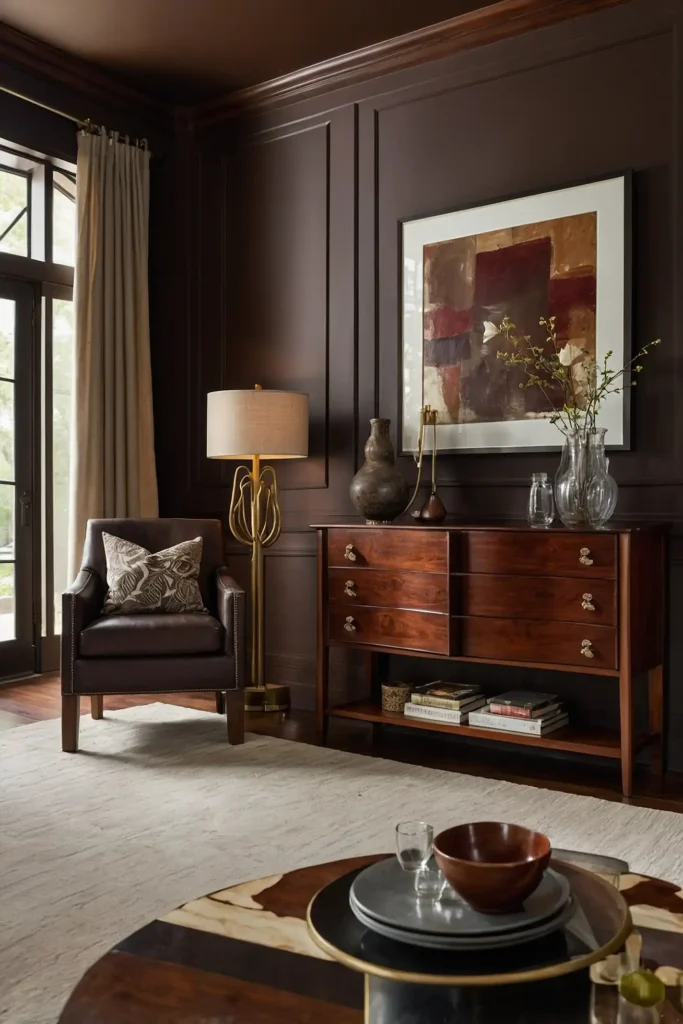
Create depth and drama with chocolate brown walls that intensify cherry’s richness.
This bold neutral creates a cocoon-like environment that showcases wood’s natural variation and beauty.
Chocolate brown shares similar depth to cherry while providing contrast through different undertones.
The rich color creates a sophisticated backdrop that makes lighter cherry pieces appear to glow.
Consider this impactful choice for dining rooms, libraries, or spaces where you want to create an intimate, formal atmosphere centered around your furniture.
15: Soft Greige
Balance cherry’s distinctive character with sophisticated greige walls that bridge warm and cool neutrals.
This chameleon-like color adapts beautifully to cherry’s complex undertones.
Greige combines the warmth of beige with the contemporary edge of gray for perfect balance.
The versatile neutral provides subtle contrast while maintaining an updated, current aesthetic.
This practical pairing works throughout your home, creating a flexible foundation that showcases your cherry furniture while adapting to changing light and decorative elements.
16: Pale Aqua
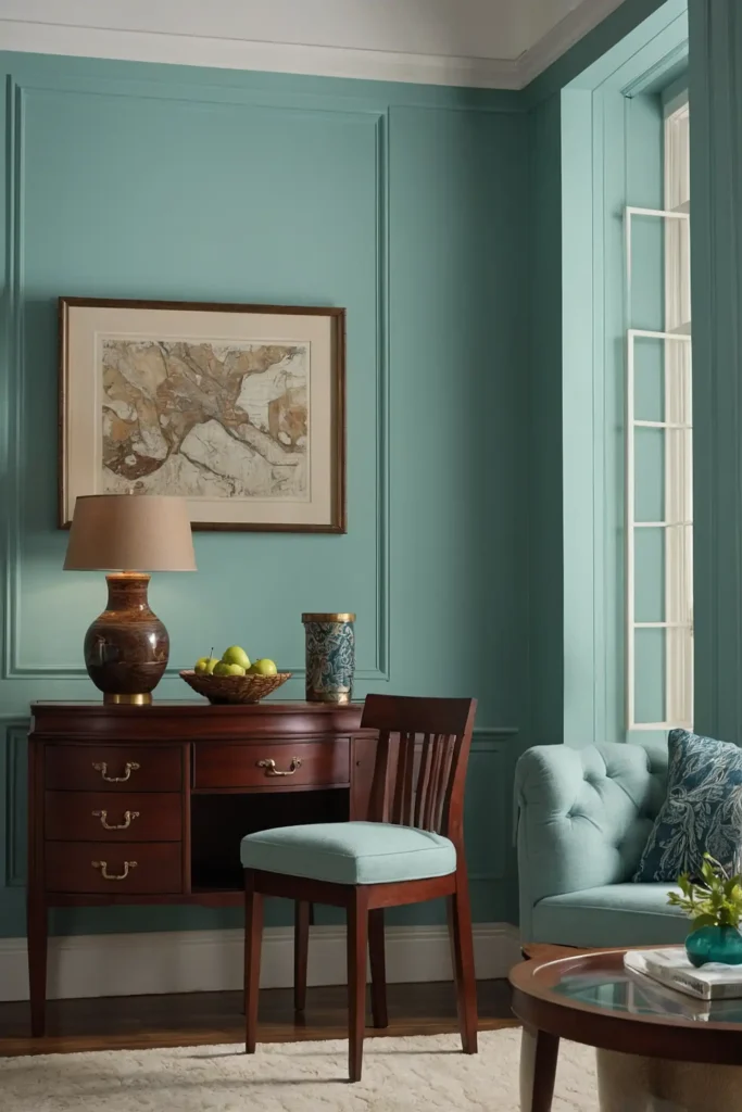
Refresh your space with light aqua walls that create crisp contrast to cherry’s warm tones.
This gentle color adds unexpected personality while enhancing wood’s natural beauty.
Aqua combines blue’s coolness with green’s natural harmony for balanced contrast.
The subtle color prevents cherry furniture from appearing too intensely red while maintaining a cohesive environment.
This distinctive pairing works beautifully in bedrooms, bathrooms, or spaces where you want to create a refreshing, spa-like atmosphere that still honors traditional furniture.
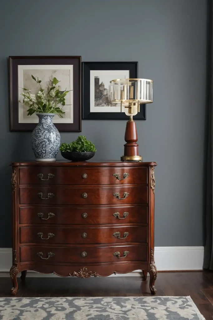
17: Warm Stone Gray
Ground your cherry furniture with warm stone gray walls that provide sophisticated neutrality.
This balanced color creates subtle contrast while maintaining connection to natural elements.
Stone gray contains brown undertones that harmonize with cherry’s warmth.
The natural color creates a backdrop reminiscent of actual stone, enhancing the organic quality of wood furniture.
This versatile pairing works throughout your home, creating a contemporary yet timeless foundation that allows your cherry pieces to remain the stars of your space.
18: Buttery Yellow
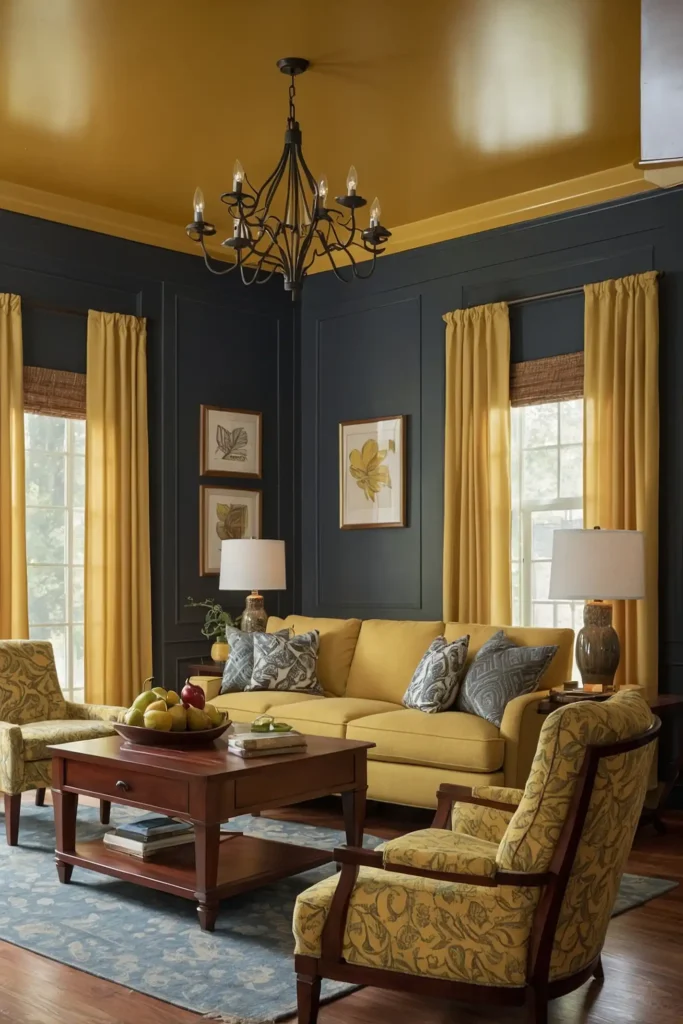
Brighten your space with soft buttery yellow walls that enhance cherry’s warm glow.
This cheerful color creates a welcoming atmosphere while complementing wood’s natural undertones.
Buttery yellow shares similar warm properties with cherry for a harmonious relationship.
The gentle color adds brightness that prevents darker cherry pieces from feeling too heavy or dominant.
This uplifting combination works particularly well in kitchens, breakfast nooks, or spaces where you want to create an inviting, hospitable environment that still showcases fine furniture.
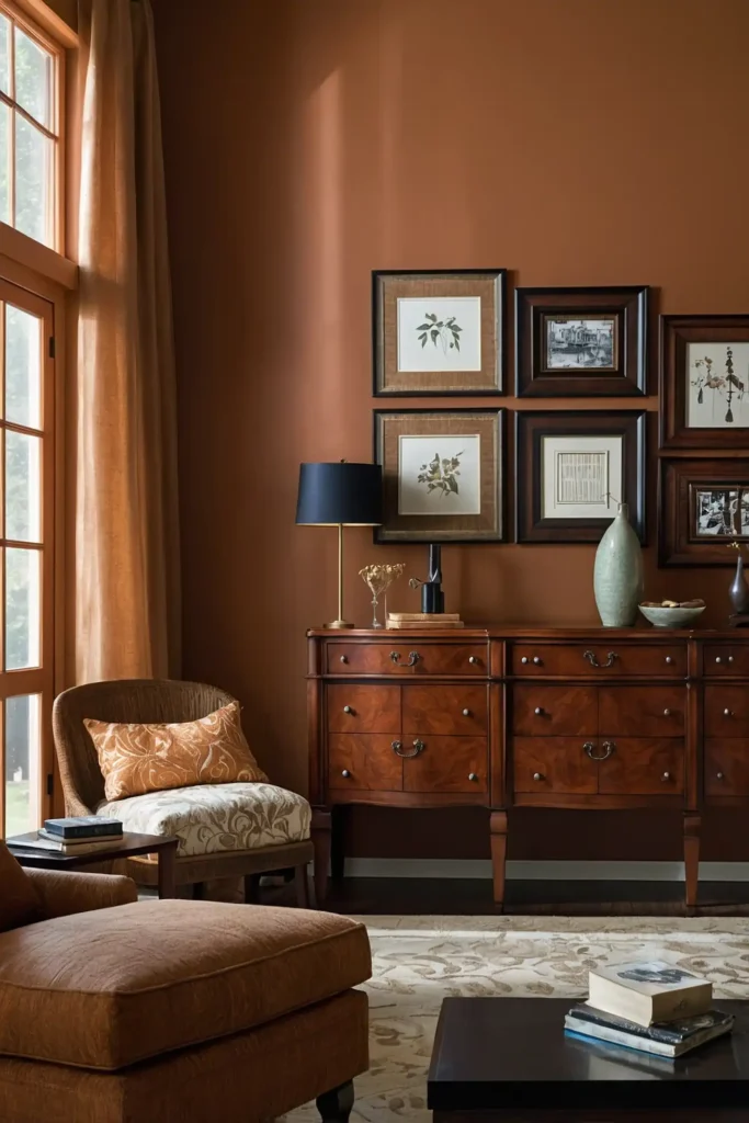
19: Muted Terracotta
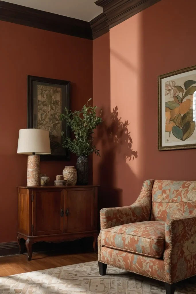
Embrace warmth with subtle terracotta walls that enhance cherry’s natural richness.
This earth-toned color creates a Mediterranean-inspired backdrop that celebrates wood’s natural beauty.
Terracotta shares similar warm undertones with cherry for a cohesive color story.
The natural pigment creates a handcrafted quality that pairs beautifully with the craftsmanship of quality furniture.
This distinctive choice works wonderfully in dining rooms, living spaces, or areas where you want to create a warm, gathered atmosphere with timeless appeal.
20: Soft Pewter

Balance cherry’s warmth with sophisticated pewter walls that add contemporary edge.
This complex gray creates subtle contrast that highlights wood’s natural character and beauty.
Pewter contains warm undertones that prevent disconnect from cherry’s richness.
The multifaceted color shifts beautifully throughout the day, maintaining consistent harmony with wood elements.
This versatile pairing works throughout your home, creating an updated backdrop that allows traditional cherry furniture to feel fresh and current rather than dated.
21: Pale Blush Pink
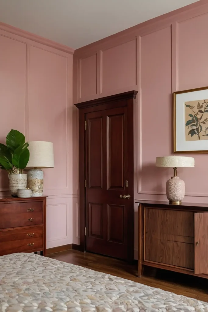
Create unexpected sophistication with subtle blush walls that complement cherry’s reddish tones.
This nuanced pairing feels fresh and distinctive without being overwhelming or trendy.
Blush contains similar warm undertones to cherry but in a paler, softer expression.
The gentle color creates a refined atmosphere that enhances the luxury of quality wood furniture.
This distinctive choice works beautifully in bedrooms, sitting rooms, or spaces where you want to create a unique, elegant environment that honors traditional furniture in a fresh way.
22: Deep Forest Green
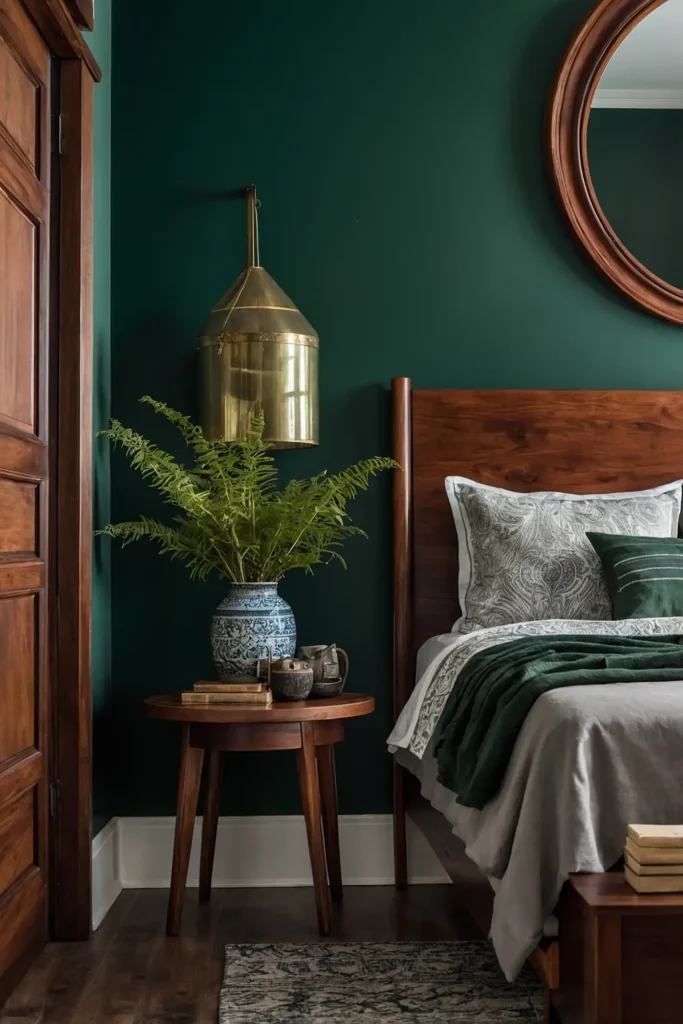
Ground your space with rich forest green walls that create dramatic backdrop for cherry’s warmth.
This classic color pairing draws from traditional design while feeling timelessly relevant.
Forest green provides complementary contrast to cherry’s reddish tones through color wheel dynamics.
The deep color creates a sophisticated envelope that showcases wood’s natural luster.
Consider this bold choice for dining rooms, libraries, or formal living spaces where you want to create a distinctive, memorable environment with undeniable presence.
23: Soft Mushroom
Balance cherry’s richness with sophisticated mushroom walls that provide perfect neutrality.
This complex taupe-gray creates subtle contrast while maintaining connection to natural elements.
Mushroom contains mauve undertones that interact beautifully with cherry’s reddish qualities.
The natural color creates a cohesive backdrop that enhances without competing with fine furniture.
This versatile pairing works throughout your home, creating a current yet timeless foundation that allows your cherry pieces to command appropriate attention.
24: Pale Sky Blue
Lighten your space with soft sky blue walls that create refreshing contrast to cherry’s warmth.
This airy color prevents wood furniture from feeling too heavy or dominant.
Sky blue’s cool properties balance cherry’s warm redness for visual harmony.
The gentle color creates breathing space around substantial furniture pieces for better proportion and balance.
This balanced combination works particularly well in bedrooms and living spaces where you want to create a tranquil atmosphere while showcasing quality furniture.
25: Warm Caramel
Enhance cherry’s natural glow with rich caramel walls that create a luxurious, cohesive environment.
This warm neutral intensifies wood’s beauty while maintaining sophisticated harmony.
Caramel shares similar warm properties with cherry while providing enough contrast through depth variation.
The golden-brown color creates a cocooning effect that celebrates wooden elements.
This harmonious pairing works beautifully in dining rooms, studies, or spaces where you want to create an embracing, rich atmosphere centered around quality furniture.
26: Soft French Gray
Balance cherry’s warmth with refined French gray walls that add European sophistication.
This complex neutral contains subtle lavender undertones that complement cherry’s richness.
French gray provides enough contrast to prevent blending while maintaining cohesive harmony.
The elegant color creates a timeless backdrop that allows furniture to become the natural focal point.
This classic pairing works throughout your home, creating a versatile foundation that adapts to changing accessories while consistently enhancing your cherry furniture.
27: Gentle Sea Glass
Refresh your space with soft sea glass walls that create subtle contrast with cherry’s warmth.
This pale blue-green adds unexpected personality while maintaining sophisticated harmony.
Sea glass combines the natural compatibility of green with the refreshing contrast of blue.
The soothing color prevents cherry furniture from appearing too intensely red while creating visual interest.
This distinctive choice works beautifully in bedrooms, living spaces, or areas where you want to create a tranquil, slightly coastal atmosphere that still honors traditional furniture.
Conclusion
The perfect paint color enhances your cherry furniture’s natural beauty while creating the atmosphere you desire.
Choose a shade that complements rather than competes with wood tones, creating a harmonious space that showcases your quality pieces for years to come.