27 Best Whole House Paint Colors: Your Complete Guide to a Cohesive Home
Choosing a cohesive paint color palette for your entire home creates visual harmony and flow from room to room.
The right whole-house color scheme can make your space feel more expansive, pulled together, and professionally designed.
Finding colors that work throughout different spaces with varying light conditions can feel overwhelming.
You need shades versatile enough to complement multiple design styles while creating the right mood in each specific room.
This curated list highlights the best whole-house paint colors that professional designers consistently recommend for their adaptability, timelessness, and ability to create a seamless transition between spaces.
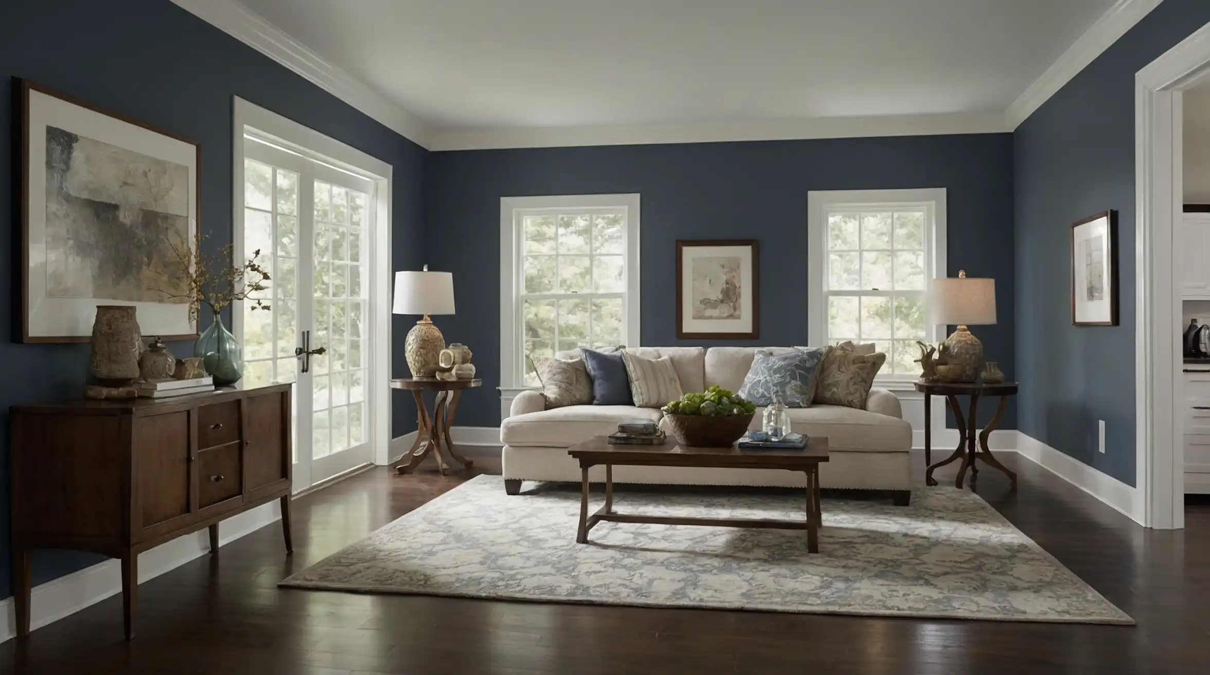
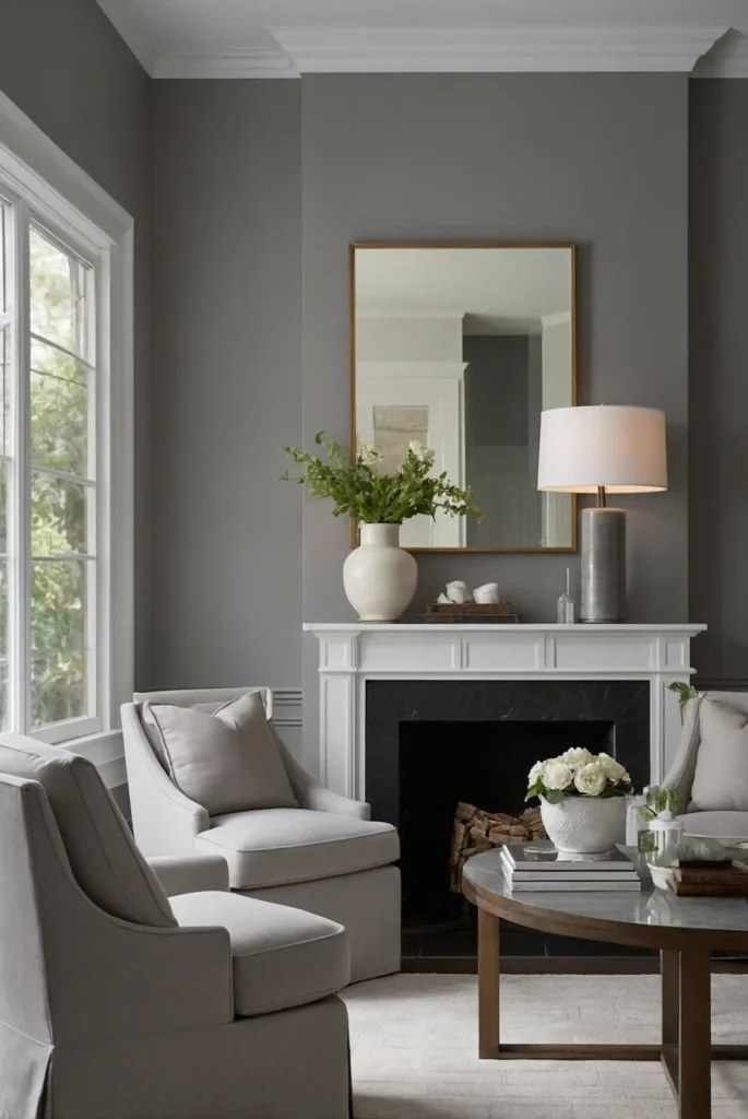
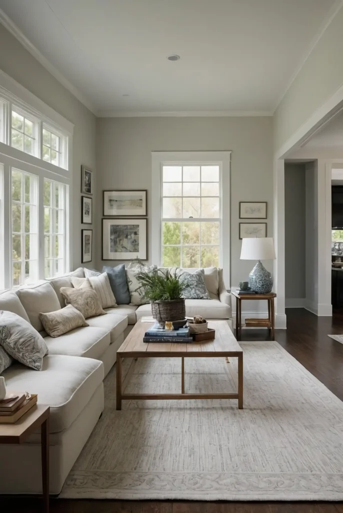
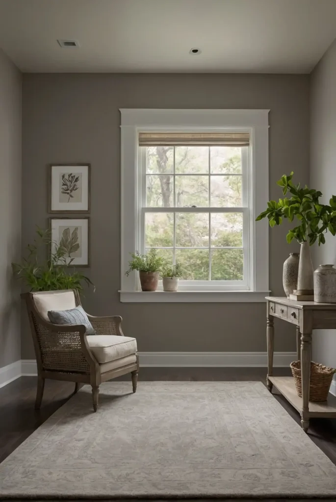
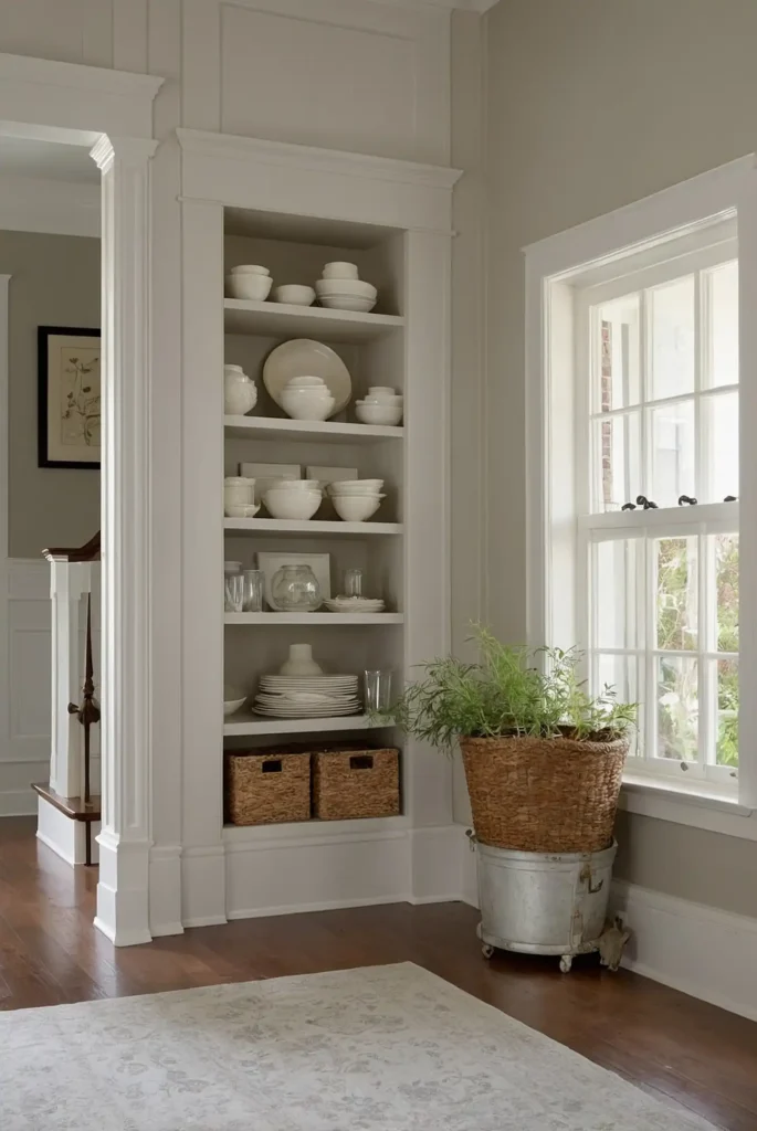
1: Agreeable Gray (Sherwin-Williams SW 7029)
This perfectly balanced greige (gray-beige hybrid) has become a designer favorite for whole-house color schemes.
It provides warmth without feeling yellow and reads as a true neutral in most lighting conditions.
You’ll appreciate how it shifts subtly throughout the day, appearing cooler in north-facing rooms and warmer in south-facing spaces.
This chameleon-like quality makes it remarkably versatile.
Pair it with pure white trim for a clean, contemporary look or cream trim for a softer, more traditional aesthetic.
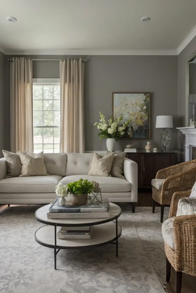
2: Edgecomb Gray (Benjamin Moore HC-173)
This light, warm-leaning gray creates a soft, welcoming backdrop that works beautifully throughout connected spaces.
It reads as a distinctive color rather than stark white while remaining subtle enough to complement any décor style.
The slight beige undertone prevents it from feeling cold or sterile like many grays can.
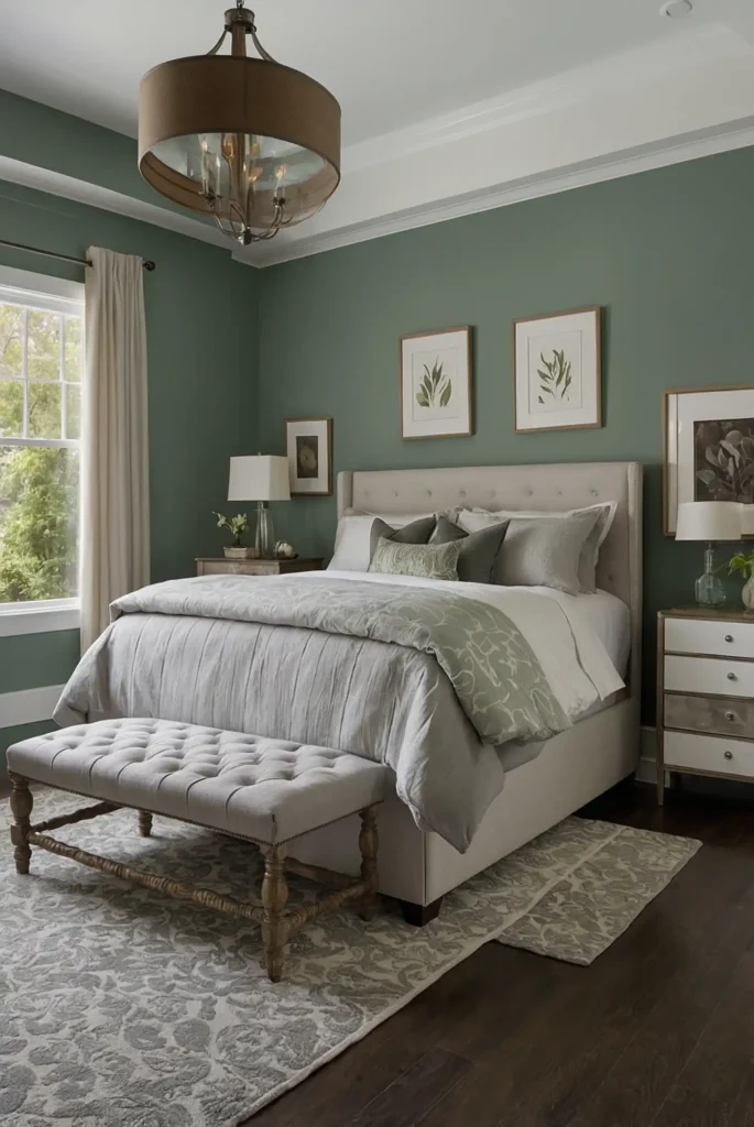
You’ll find it particularly flattering in bedrooms and living spaces.
This shade pairs exceptionally well with both cool and warm accent colors, making it ideal for open-concept homes.
3: Pure White (Sherwin-Williams SW 7005)
This clean white strikes the perfect balance – bright without being stark, soft without yellowing.
It works as both a wall color and trim color throughout your home, simplifying your whole-house color scheme.
The subtle warmth prevents that institutional feeling that can come with brighter whites. It creates a beautiful canvas for artwork and furnishings to stand out.
Use it confidently in both modern and traditional homes, as it adapts beautifully to either aesthetic.
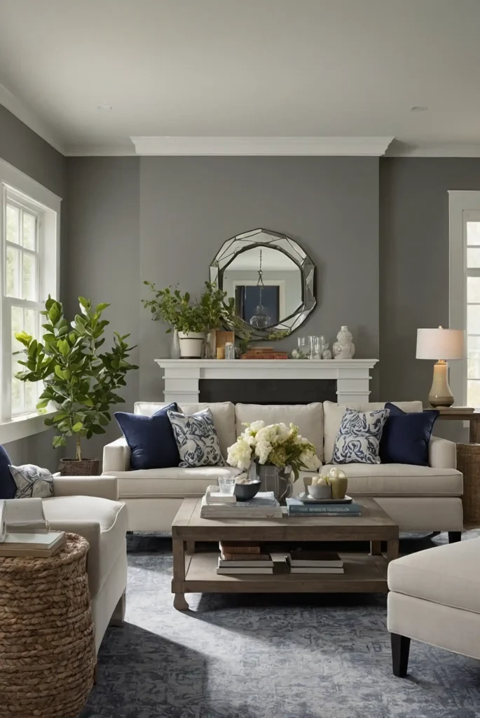
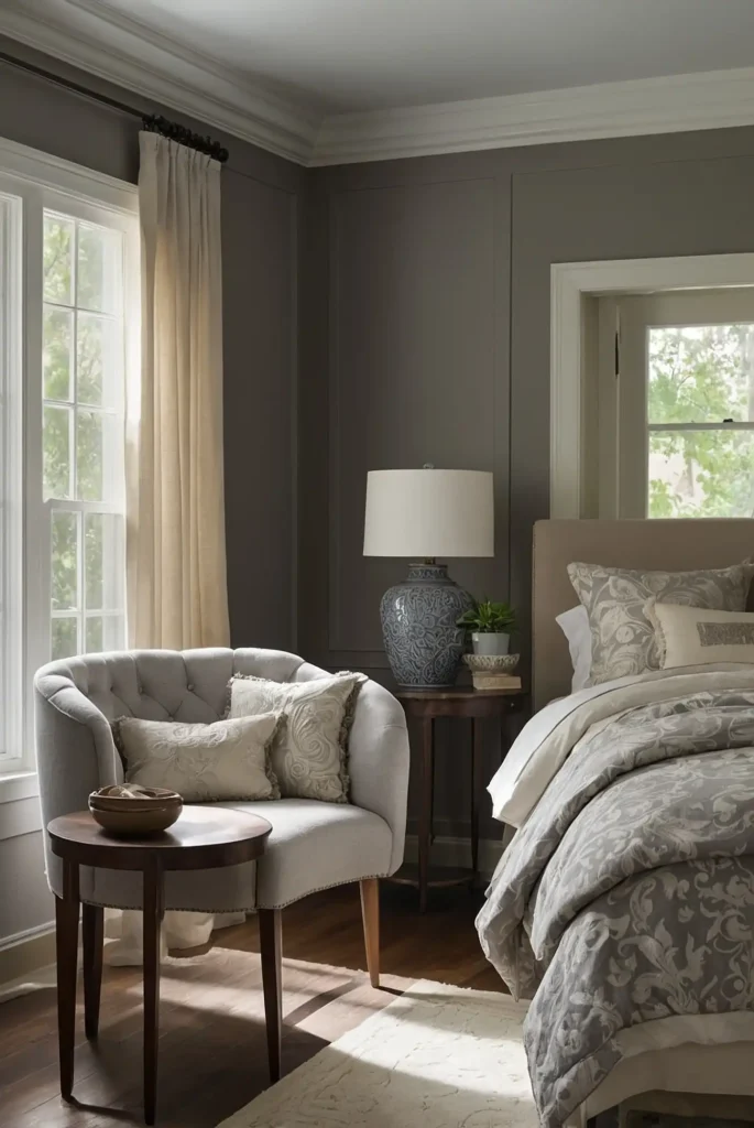
4: Classic Gray (Benjamin Moore OC-23)
This whisper-soft warm gray provides depth without dominating your space.
It reads as a sophisticated neutral that allows architectural details and furnishings to take center stage.
You’ll notice how it shifts beautifully throughout the day, maintaining its warmth even in cooler, north-facing rooms. The subtle color creates seamless transitions between spaces.
Pair it with crisp white trim for a timeless look that works in every room of your home.
5: Accessible Beige (Sherwin-Williams SW 7036)
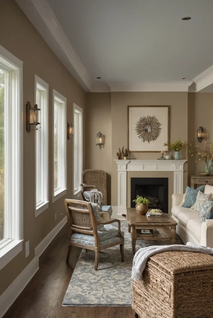
This versatile mid-tone beige delivers warmth without the yellow undertones that can make some beiges feel dated.
It creates a cozy, inviting atmosphere throughout connected spaces.
You’ll appreciate its ability to complement both cool and warm accent colors.
This adaptability makes it ideal for coordinating with existing furniture and décor.
The depth provides enough contrast with white trim to create definition while remaining light enough for smaller spaces.
6: Pale Oak (Benjamin Moore OC-20)
This delicate, warm-leaning neutral blends soft gray and beige to create a sophisticated backdrop.
It appears almost luminous in natural light, bringing a gentle glow to your spaces.
The subtle depth makes it more interesting than a standard off-white while remaining light enough to use throughout your entire home.
It’s particularly beautiful in spaces with limited natural light.
This shade complements both cool and warm accents, making it exceptionally versatile for whole-house applications.
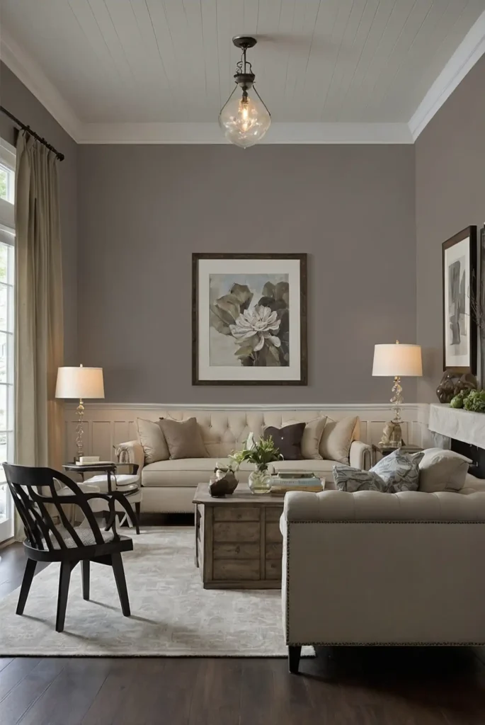
7: Revere Pewter (Benjamin Moore HC-172)
This classic greige has earned its reputation as a perfect whole-house color for its remarkable balance.
It provides warmth and sophistication without leaning too brown or too gray.
You’ll notice how well it adapts to different lighting conditions throughout your home, maintaining its appeal regardless of exposure. The depth gives walls subtle definition.
This shade pairs beautifully with both traditional and contemporary furnishings, making it ideal for transitional homes.
8: Snowbound (Sherwin-Williams SW 7004)
This soft, slightly warm white creates bright, clean spaces without the stark quality of pure whites.
It works throughout your home as both a wall and trim color, simplifying your whole-house scheme.
The subtle warmth feels welcoming rather than clinical, particularly in spaces with cooler exposures. You’ll appreciate its clean appearance in both natural and artificial lighting.
Use it confidently as your primary neutral, accent color, or as a companion to deeper hues throughout your home.
9: Collingwood (Benjamin Moore OC-28)
This sophisticated taupe-gray creates subtle definition with its perfect balance of warm and cool undertones.
It reads as distinctly neutral without leaning definitively gray or beige.
You’ll appreciate how it maintains its character throughout different times of day and in varying light conditions.
This consistency makes it ideal for open floor plans.
The color’s depth creates beautiful shadow play, highlighting architectural details throughout your home.
10: Repose Gray (Sherwin-Williams SW 7015)
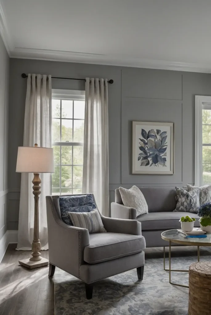
This versatile light gray maintains its true gray character without shifting purple or blue like many gray paints can.
It provides sophisticated contrast with white trim while still reading as a neutral.
You’ll find it works beautifully in both contemporary and traditional settings, adapting to your furnishings rather than competing with them.
The balanced undertones prevent it from feeling cold.
This shade creates seamless transitions between spaces, making it ideal for open-concept homes.
11: Simply White (Benjamin Moore OC-117)
This versatile soft white delivers warmth without yellow undertones, creating bright, fresh spaces throughout your home.
It works as both a wall and trim color, offering flexibility in your overall scheme.
You’ll notice its almost luminous quality that enhances natural light while remaining soft enough for comfortable living. It makes smaller rooms feel more spacious.
Use it confidently in both traditional and modern homes for a timeless backdrop that highlights your furnishings and architectural details.
12: Alpaca (Sherwin-Williams SW 7022)
This sophisticated mid-tone greige provides more depth than lighter neutrals while remaining versatile enough for whole-house use.
It reads as distinctively warm gray with subtle taupe undertones.
You’ll appreciate how it grounds spaces without feeling heavy, creating cozy, inviting rooms. The balanced undertones prevent it from shifting dramatically in different lighting conditions.
This shade creates beautiful contrast with white trim and pairs well with both cool and warm accent colors.
13: Balboa Mist (Benjamin Moore OC-27)
This ethereal light gray with subtle lavender undertones creates serene, sophisticated spaces throughout your home.
It reads as a true neutral in most lighting conditions while maintaining its gentle character.
You’ll notice its chameleon-like quality, shifting subtly with the changing light throughout the day. This adaptability helps it transition smoothly from room to room.
This shade works beautifully in bedrooms and living spaces where its calming influence supports relaxation.
14: Alabaster (Sherwin-Williams SW 7008)
This creamy off-white delivers warmth without looking yellow, creating soft, luminous walls throughout your home.
It works beautifully as both a wall and trim color, providing flexibility in your scheme.
You’ll appreciate its ability to highlight architectural details while creating a cohesive backdrop for different design styles. It feels particularly elegant in traditional homes.
This shade provides just enough contrast with pure white trim for definition while maintaining a bright, open feeling.
15: Swiss Coffee (Benjamin Moore OC-45)
This classic soft white with subtle beige undertones creates a warm, inviting atmosphere throughout your home.
It avoids the starkness of brighter whites while providing a clean, fresh appearance.
You’ll find it particularly flattering in spaces with northern exposure, where its warmth counteracts cool light. The subtle depth makes it more interesting than a standard white.
This versatile shade works beautifully in both contemporary and traditional homes, adapting to your existing furnishings.
16: Useful Gray (Sherwin-Williams SW 7050)
This versatile green-gray creates subtle interest while functioning as a neutral throughout your home.
It brings a connection to nature indoors without making an overt color statement.
You’ll notice how it shifts subtly in different lighting, sometimes reading more green, sometimes more gray.
This variation adds depth to your spaces without creating disjointed transitions.
This shade works exceptionally well in homes with open views to nature, extending the outdoor connection.
17: Silver Satin (Benjamin Moore 856)
This luminous pale gray with subtle warmth creates bright, sophisticated spaces throughout your home.
It provides more depth than white while maintaining an airy, open feeling.
You’ll appreciate its reflective quality that enhances natural light without glare.
This brightening effect makes it ideal for hallways and spaces with limited windows.
The color’s versatility allows it to complement both cool and warm accent colors throughout your home.
18: City Loft (Sherwin-Williams SW 7631)
This delicate greige creates a soft, sophisticated backdrop throughout your home with its perfect balance of warm and cool undertones.
It reads as distinctly neutral without feeling bland.
You’ll notice how it maintains its character in different lighting conditions without shifting dramatically.
This consistency makes it ideal for connecting spaces with different exposures.
This shade creates beautiful, subtle contrast with white trim while remaining light enough for smaller rooms.
19: Paper White (Benjamin Moore 1590)
This crisp gray-white delivers brightness with a subtle cool undertone that prevents it from looking stark. It creates a fresh, contemporary feeling throughout your home.
You’ll find it particularly effective in spaces with warm southern exposure, where it counterbalances yellow-tinted light.
The subtle gray undertone adds sophistication without heaviness.
This shade works beautifully in modern homes, creating a gallery-like backdrop for artwork and furnishings.
20: Worldly Gray (Sherwin-Williams SW 7043)

This balanced mid-tone greige with subtle green undertones creates a sophisticated, earthy backdrop throughout your home.
It provides more depth than lighter neutrals while remaining versatile.
You’ll appreciate how it grounds spaces without dominating them, allowing your furnishings and décor to shine.
The complex undertones add interest without creating a distinct color statement.
This shade creates beautiful shadow play, highlighting architectural details throughout different spaces.
21: White Dove (Benjamin Moore OC-17)
This perennial designer favorite delivers the perfect soft white with subtle warm undertones that prevent it from feeling stark.
It creates a clean, timeless backdrop throughout your home.
You’ll notice its almost luminous quality in natural light, brightening spaces without glare. It works beautifully as both a wall and trim color, offering flexibility in your overall scheme.
This versatile shade complements both traditional and contemporary styles, adapting to your existing furnishings.
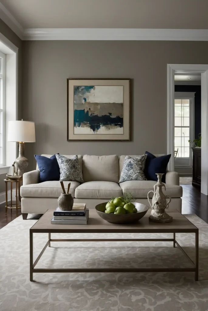
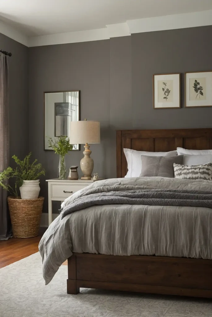
22: Amazing Gray (Sherwin-Williams SW 7044)
This rich mid-tone greige creates cozy, sophisticated spaces with its perfect balance of warm and cool undertones.
It provides noticeable depth while functioning as a neutral throughout your home.
You’ll appreciate how it grounds rooms without feeling heavy, creating inviting spaces that encourage relaxation.
The balanced undertones prevent it from shifting dramatically in different lights.
This shade pairs beautifully with both crisp white and cream trim, offering flexibility in your overall design scheme.
23: Pale Smoke (Benjamin Moore 1584)
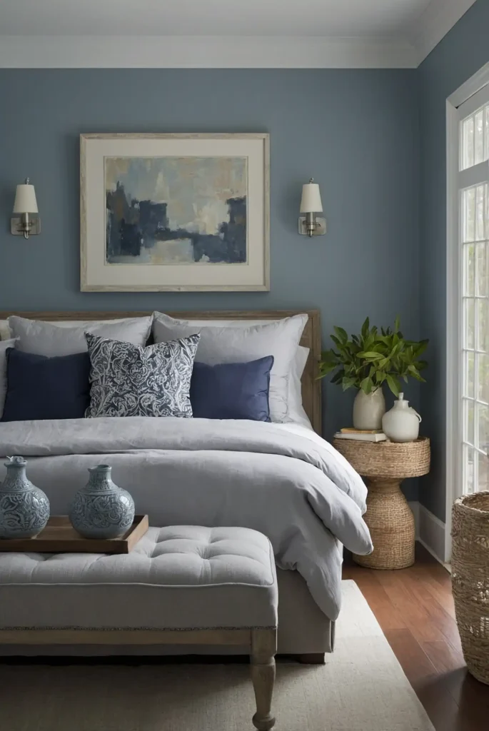
This ethereal blue-gray creates serene, sophisticated spaces with its subtle color presence. It functions as a “colored neutral” throughout your home, adding interest without overwhelming.
You’ll notice how it shifts throughout the day, sometimes reading more blue, sometimes more gray.
This subtle variation adds depth to your spaces without creating jarring transitions.
This shade works particularly well in bedrooms and bathrooms, where its spa-like quality enhances relaxation.
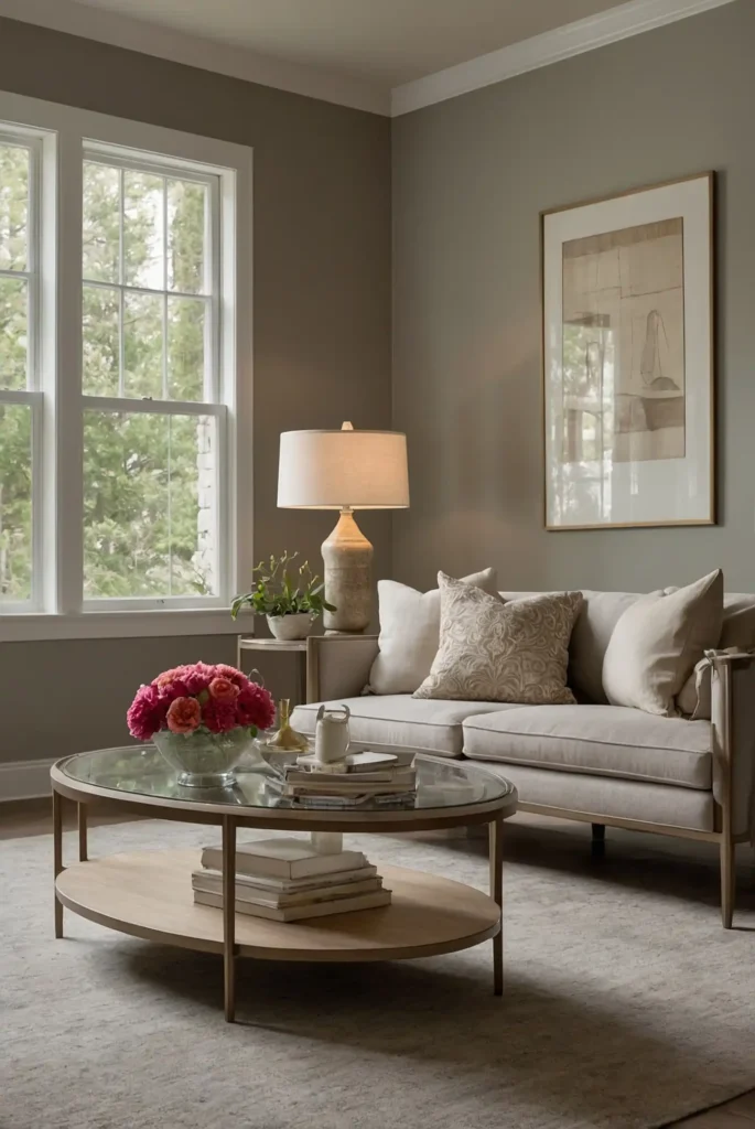
24: Agreeable Greige (Sherwin-Williams SW 7028)
This versatile deeper greige provides rich, sophisticated color while maintaining its function as a neutral throughout your home.
It offers more depth than lighter options for those who want defined walls.
You’ll appreciate how it creates a cozy, grounded feeling in larger spaces while remaining light enough for smaller rooms.
The balanced undertones work with varying light conditions.
This shade creates beautiful contrast with white trim and pairs well with both cool and warm accent colors.
25: Gray Owl (Benjamin Moore 2137-60)
This versatile light gray with subtle green undertones creates bright, sophisticated spaces throughout your home.
It reads as distinctly gray without the purple or blue undertones that can make grays feel cold.
You’ll notice its chameleon-like quality that shifts with changing light, sometimes appearing more green, sometimes more gray. This subtle variation adds depth to your spaces.
This shade works beautifully in homes with natural views, extending the connection to the outdoors.
26: Mindful Gray (Sherwin-Williams SW 7016)
This balanced mid-tone gray creates sophisticated definition throughout your home with its true gray character that avoids obvious undertones.
It provides noticeable depth while functioning as a neutral.
You’ll appreciate how it grounds spaces without feeling heavy, creating cozy, inviting rooms.
Its consistent appearance in varying light conditions makes it ideal for connecting spaces.
This shade creates beautiful contrast with white trim while complementing both cool and warm accent colors.
27: Ballet White (Benjamin Moore OC-9)
This delicate warm neutral blends soft beige and gray to create a sophisticated backdrop throughout your home.
It provides subtle depth without making a distinct color statement.
You’ll notice its luminous quality in natural light, bringing a gentle warmth to your spaces.
It’s particularly beautiful in rooms with northern exposure, where it counteracts cool light.
This versatile shade complements both contemporary and traditional furnishings, adapting to your existing décor.
Conclusion
Selecting the perfect whole-house paint color simplifies your decision-making while creating a cohesive, professional look.
These versatile shades provide the perfect backdrop for your unique style while ensuring seamless flow between all your spaces.