27 Perfect Paint Colors For Your Media Room: Ultimate 2025 Guide
Selecting the right paint color for your media room dramatically impacts both the viewing experience and the room’s overall ambiance.
The perfect shade enhances screen contrast, reduces eye strain, and creates the immersive atmosphere you crave.
Unlike standard living spaces, media rooms benefit from specific color considerations that support their primary function: an optimal viewing experience.
This curated list of 27 media room paint colors will help you create the perfect backdrop for your home entertainment space, balancing technical performance with aesthetic appeal.
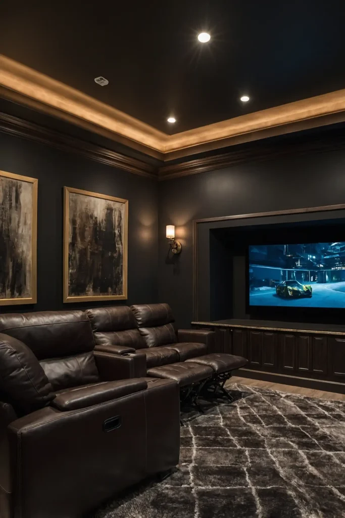
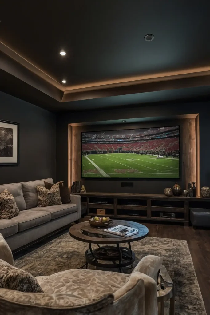
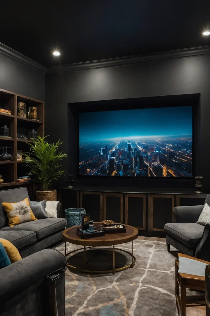
1: Matte Black
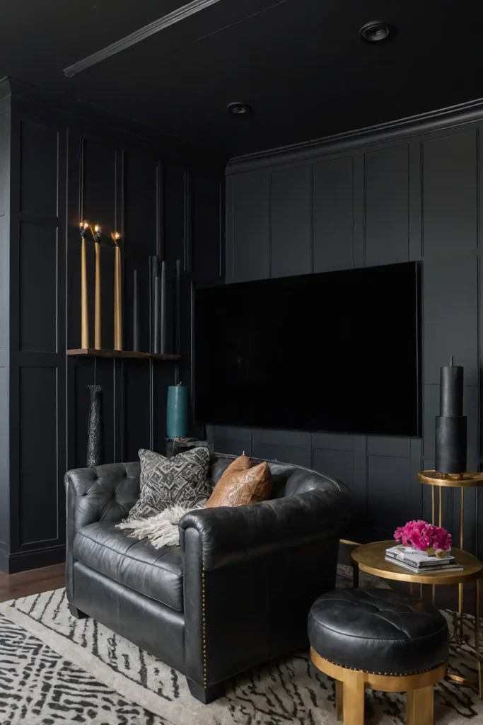
Transform your media room with true matte black for the ultimate movie theater experience at home.
This dramatic choice absorbs light reflections from your screen, enhancing contrast and color saturation in your viewing experience.
Pair with strategic accent lighting and perhaps one lighter accent wall to prevent the space from feeling too cave-like when the lights are on.
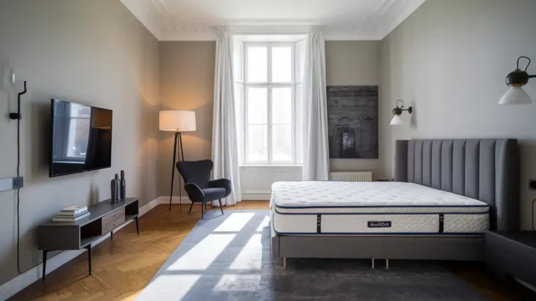
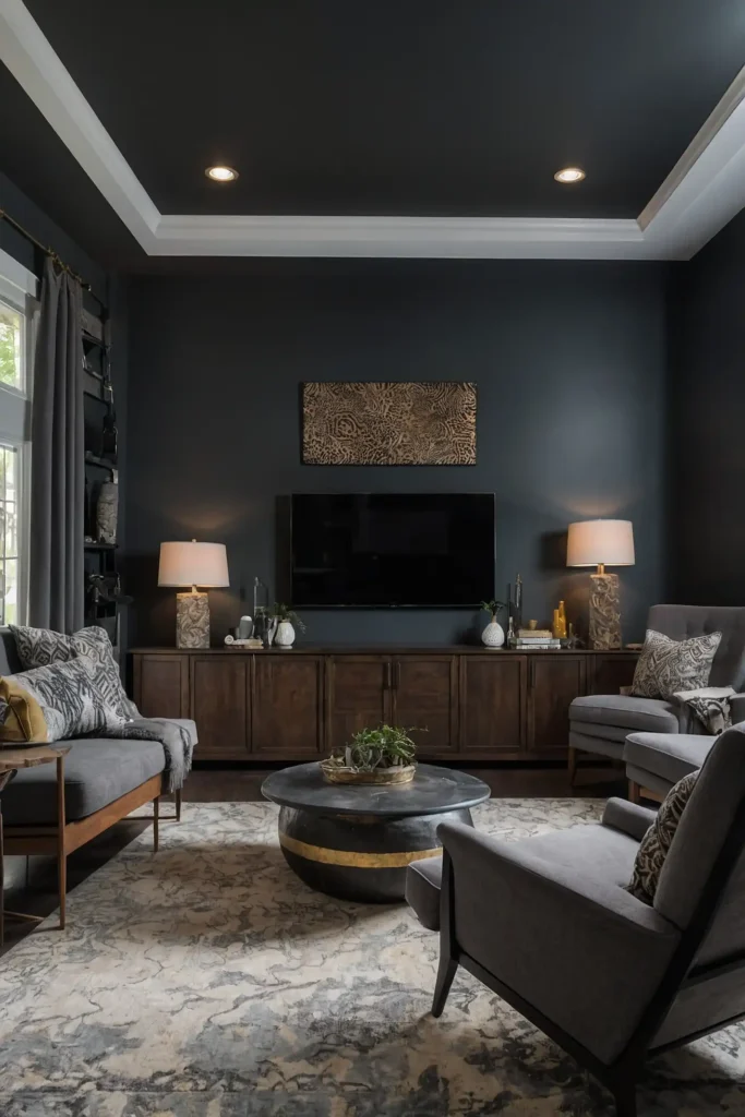
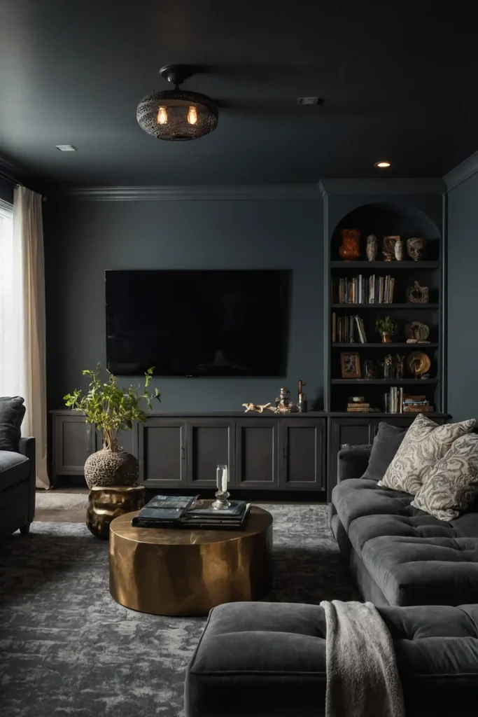
2: Charcoal Gray
Create sophisticated depth with charcoal gray, offering many of black’s light-absorbing benefits with a slightly softer aesthetic.
This versatile dark neutral reduces screen glare while maintaining a more conventional room appearance when not watching content.
Add metallic or light-colored accents to prevent the space from feeling too heavy or one-dimensional.
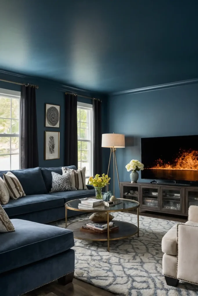
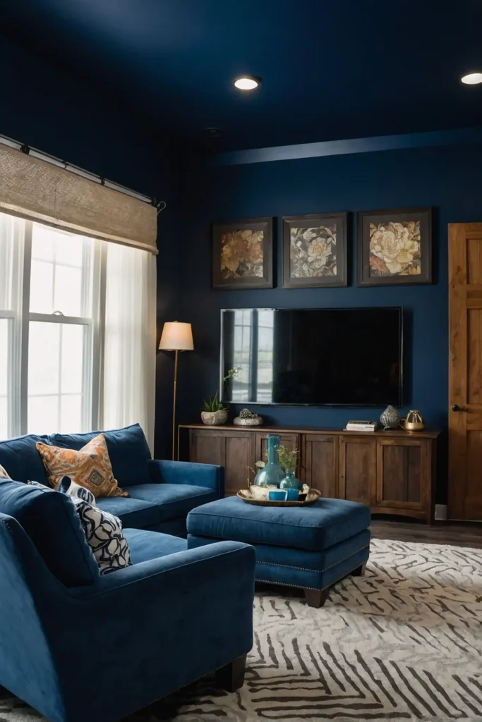
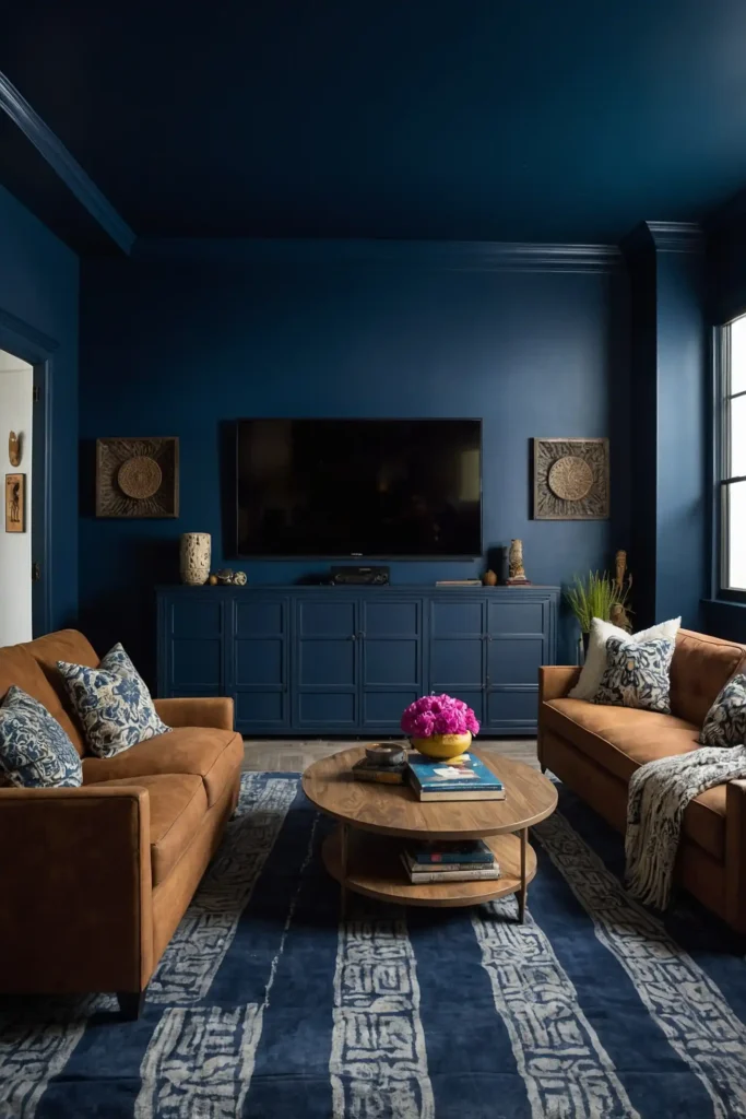
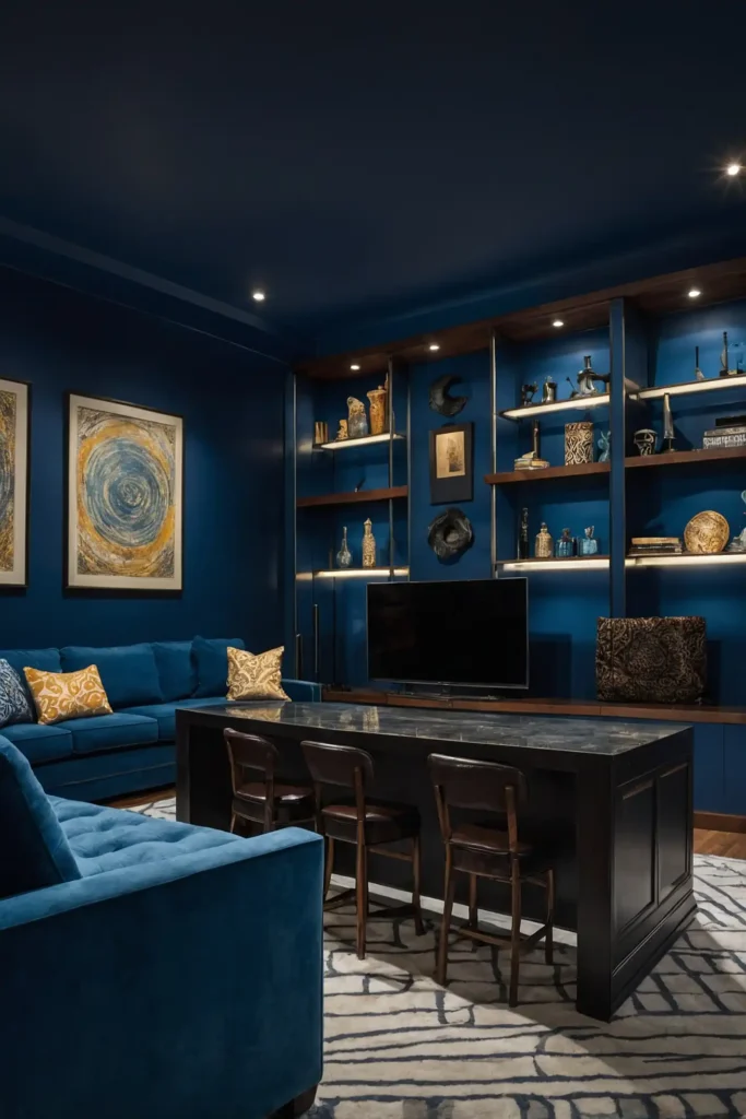
3: Navy Blue
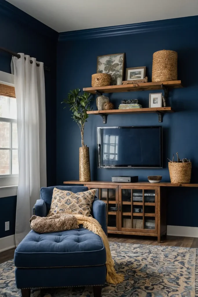
Transform your media room with deep navy blue for a rich, immersive atmosphere that enhances the viewing experience.
This sophisticated alternative to black still absorbs light effectively while adding color depth and character to your space.
Pair navy with warm wood tones and brass accents for a media room that doubles as an elegant lounge area.
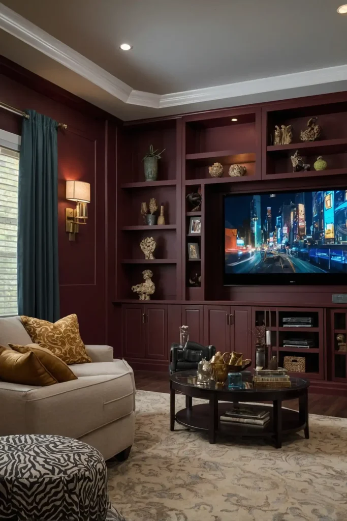
4: Deep Burgundy
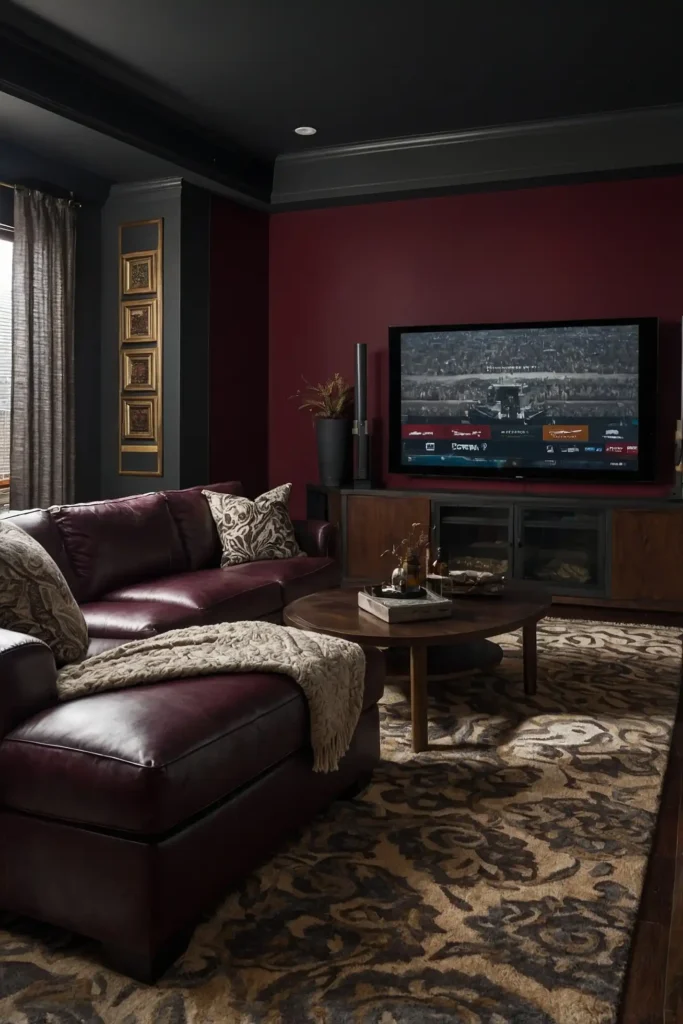
Create a luxurious, traditional theater feel with deep burgundy walls that recall classic cinema interiors.
This rich red-brown absorbs light while adding warmth and sophistication that basic dark neutrals can’t provide.
The color looks almost black when lights are dimmed but reveals its complex character when fully illuminated.
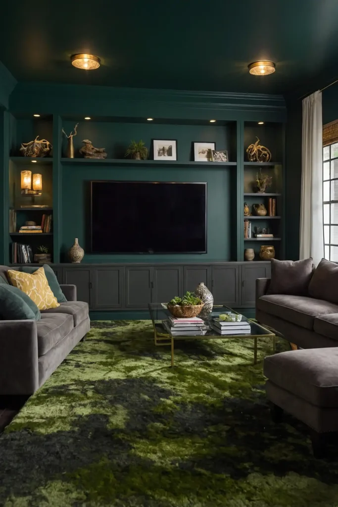
5: Forest Green
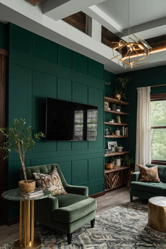
Embrace biophilic design with forest green, offering excellent light absorption while connecting your space to nature.
This deep, complex hue creates a cocooning effect that enhances immersion in your media experience.
Add warm wood elements and brass accents to highlight the color’s rich undertones when the room is fully lit.
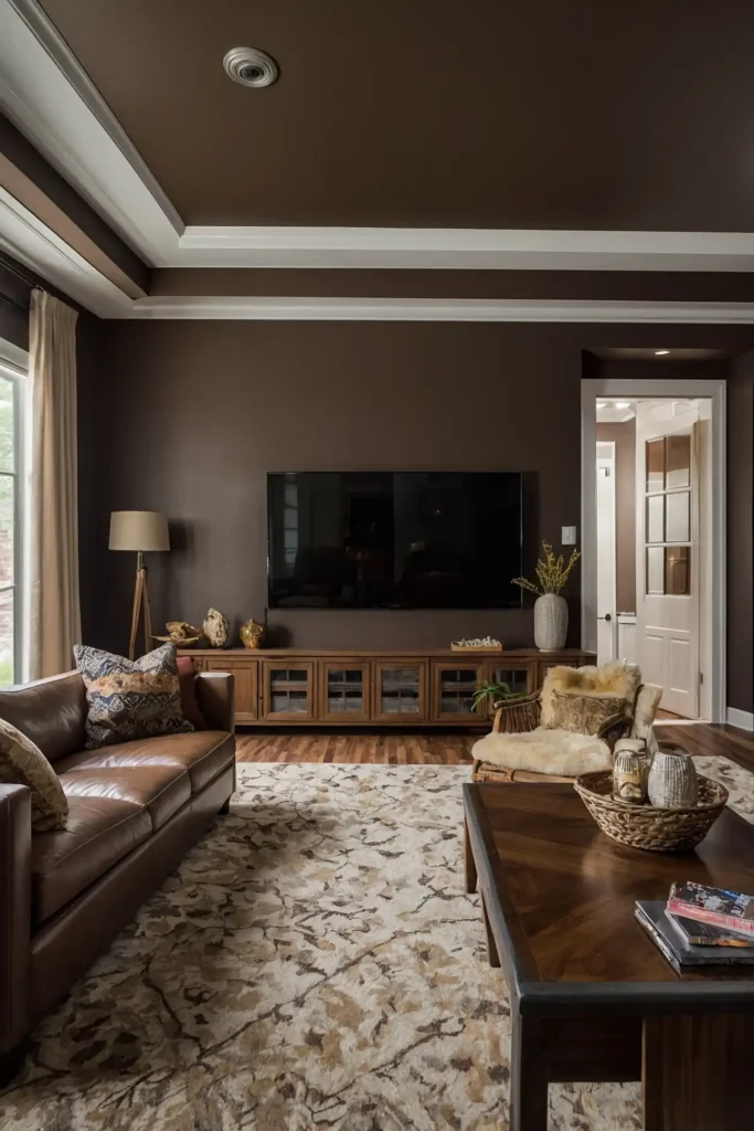
6: Dark Espresso
Transform your media room with dark espresso brown for a warm, sophisticated alternative to pure black.
This rich neutral absorbs light effectively while creating a more inviting atmosphere than cooler dark tones.
Pair with cream or tan accents for necessary contrast that prevents the space from feeling flat or one-dimensional.
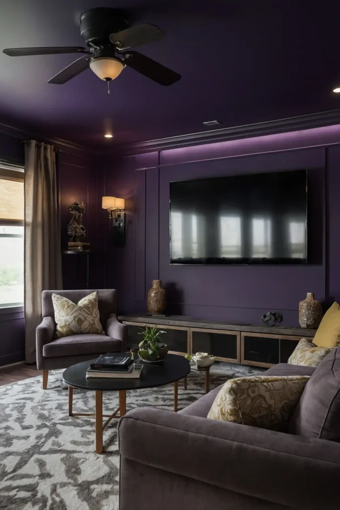
7: Deep Aubergine
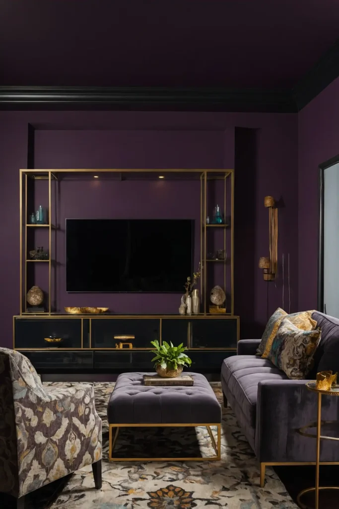
Create dramatic sophistication with deep aubergine, a complex purple-black that absorbs light while adding unexpected character.
This rich hue appears almost black during viewing but reveals its depth and complexity when lights are raised.
Use brushed gold or brass hardware and accents to complement aubergine’s inherent luxury and warmth.
8: Slate Blue
Balance functionality with style using slate blue, a muted blue-gray that reduces reflections without the starkness of darker options.
This versatile color creates a relaxed, contemporary atmosphere that works beautifully for multipurpose media spaces.
The blue undertones contribute to a calm, focused viewing environment that enhances the immersive experience.
9: Dark Olive
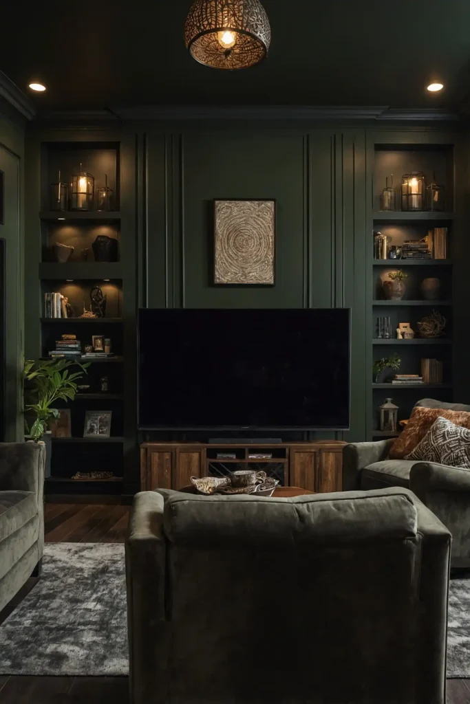
Introduce natural sophistication with dark olive, absorbing light effectively while adding complex, earthy character to your media room.
This deep green-brown creates a cocooning effect that enhances screen contrast without the starkness of black.
Pair with natural materials like leather and wood for a media room that feels both timeless and connected to nature.
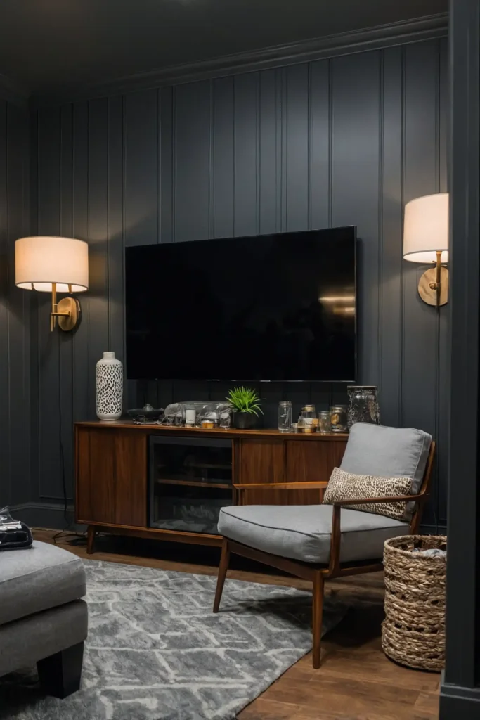
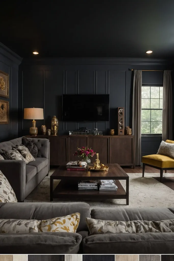
10: Gunmetal Gray
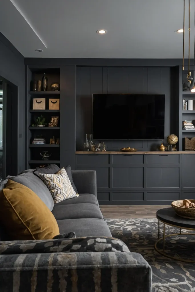
Create technical precision with gunmetal gray, a deep metallic tone that reduces reflections while adding contemporary sophistication.
This complex neutral contains subtle blue undertones that create depth without the heaviness of charcoal or black.
Add brushed metal accents and clean-lined furniture to complement this color’s inherent modern, slightly industrial character.
11: Taupe Brown
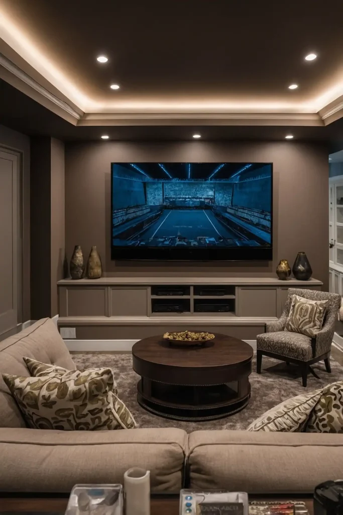
Balance viewing performance with versatility using taupe brown, a sophisticated neutral that works in multipurpose media spaces.
This complex color contains enough depth to minimize reflections while remaining versatile enough for rooms that serve multiple functions.
Pair with cream accents and textural elements to enhance the warm, layered look when the room is fully illuminated.
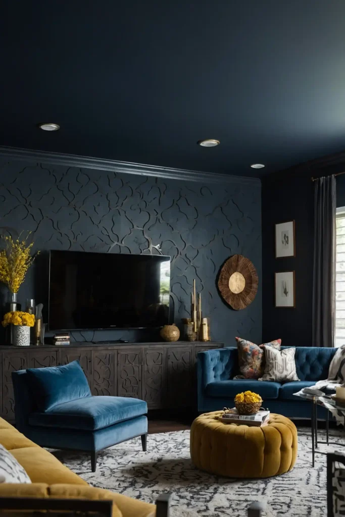
12: Midnight Blue
Transform your media room with midnight blue, creating dramatic depth that enhances the viewing experience while adding character.
This near-black blue absorbs light effectively while offering more sophistication than flat black or charcoal options.
Add silver or chrome accents to complement the color’s cool undertones when the room is used for socializing.
13: Dark Teal

Create biophilic luxury with dark teal, offering excellent light absorption while adding unexpected depth and character.
This sophisticated blue-green appears almost black during viewing but reveals its complex personality when fully lit.
Use natural woods and perhaps coral or terra cotta accents to highlight teal’s rich undertones during non-viewing times.
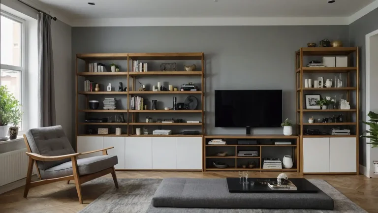
14: Graphite
Balance technical performance with design versatility using graphite, a deep gray with subtle warm undertones.
This refined neutral effectively reduces screen reflections while maintaining a more conventional room appearance than black.
Add textural elements and perhaps subtle patterns in upholstery to prevent the space from feeling flat or one-dimensional.
15: Dark Bronze
Elevate your media room with dark bronze, a metallic-inspired brown that absorbs light while adding warmth and sophistication.
This rich neutral creates an enveloping atmosphere that enhances immersion in your media experience.
Pair with cream or ivory textiles to create necessary contrast that prevents the space from feeling too dark or heavy.
16: Deep Indigo
Transform viewing experiences with deep indigo, a rich navy with purple undertones that adds drama while absorbing reflections.
This complex color creates a cocooning effect that enhances screen contrast without the starkness of pure black.
Add light wood accents and perhaps mustard yellow accessories to brighten the space when not in viewing mode.
17: Walnut Brown
Create warm sophistication with walnut brown, offering good light absorption while maintaining a timeless, versatile aesthetic.
This rich neutral draws inspiration from fine furniture, adding inherent warmth and character to your media space.
The deep brown tones enhance the cozy, immersive feeling essential for an engaging viewing experience.
18: Dark Pewter
Balance technical needs with design versatility using dark pewter, a sophisticated gray with subtle metallic undertones.
This complex neutral effectively reduces screen reflections while offering more warmth than typical cool grays.
Add textural elements in similar tones for a layered monochromatic look that feels both contemporary and comfortable.
19: Smoky Quartz

Introduce subtle warmth with smoky quartz, a deep gray-brown that absorbs light while adding more dimension than flat dark colors.
This sophisticated neutral bridges warm and cool tones, working well with diverse decorative palettes and styles.
Pair with cream, taupe, or sage green accents to highlight the color’s complex undertones when the room is fully lit.
20: Dark Amethyst
Create dramatic luxury with dark amethyst, a near-black purple that adds unexpected depth to your media room.
This rich color absorbs light effectively during viewing while revealing its jewel-toned character when illuminated.
Use brushed gold accents and perhaps emerald green textiles to complement this color’s inherent richness.
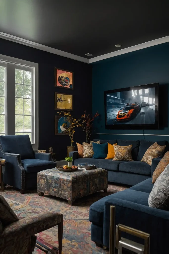
21: Carbon Blue
Balance technical performance with aesthetic appeal using carbon blue, a deep blue-gray that minimizes reflections effectively.
This complex neutral creates a cocooning effect without the stark contrast or heaviness of pure black.
Add silver or brushed nickel accents to complement the color’s cool undertones for a cohesive design scheme.
22: Deep Mahogany
Transform your media room with deep mahogany, a rich red-brown that absorbs light while adding traditional warmth.
This sophisticated color creates an immersive viewing environment while maintaining a classic, timeless aesthetic.
Pair with cream trim and perhaps navy accents for a media room that feels both comfortable and elegant.
23: Wrought Iron
Create technical precision with wrought iron, a deep gray with subtle blue-green undertones that reduce reflections effectively.
This complex neutral offers more character than basic dark gray while still providing excellent viewing conditions.
Use textural elements and perhaps one lighter accent wall to prevent the space from feeling too dark or closed-in.
24: Deep Moss
Embrace biophilic design with deep moss, a sophisticated green-brown that absorbs light while connecting to nature.
This complex color creates a cocooning effect that enhances immersion in your media experience.
Add warm wood elements and perhaps burnt orange accents to highlight the color’s rich natural character.
25: Dark Charterhouse
Balance viewing performance with unique character using dark charterhouse, a complex gray with subtle green undertones.
This sophisticated neutral effectively reduces screen reflections while offering more depth than basic dark colors.
Pair with brushed brass accents and natural textiles for a media room that feels both functional and design-forward.
26: Onyx
Create dramatic impact with onyx, a deep black with subtle blue undertones that maximize viewing contrast.
This rich color absorbs light most effectively during screening while maintaining sophistication when the room is fully lit.
Add strategic lighting and perhaps one accent wall in midnight blue or deep burgundy to add dimension to the space.
27: Dark Truffle
Transform your media room with dark truffle, a rich brown-gray that reduces reflections while adding unexpected warmth.
This complex neutral bridges cool and warm palettes, working beautifully with diverse decorative styles.
Use cream or ivory accents to create necessary contrast and prevent the space from feeling too heavy or one-dimensional.
Conclusion
Selecting the right media room color dramatically impacts your viewing experience and the room’s versatility.
Choose darker shades for dedicated theaters and medium tones for multipurpose spaces to create your perfect entertainment environment.