27 Stunning Paint Colors That Transform Ordinary Furniture Into Designer Pieces
The right paint color can completely reinvent a tired piece of furniture, turning garage sale finds and family hand-me-downs into stunning focal points.
With just a few coats of paint, you can create custom pieces that perfectly match your vision.
Whether you’re refreshing a dated dresser or completely reimagining a thrift store chair, choosing the perfect color makes all the difference.
The transformation goes beyond aesthetics—it gives old pieces new purpose.
Ready to breathe new life into your furniture?
These 27 paint colors will help you create pieces that look custom-made for your space without the designer price tag.
1: Classic Navy Blue
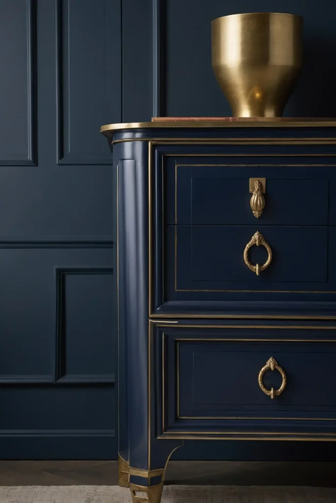
Create timeless elegance with a rich navy blue that adds depth and sophistication to any furniture piece.
This versatile color works beautifully on everything from bookshelves to dressers.
Navy provides dramatic impact while still functioning as a neutral in your design scheme. It pairs perfectly with brass or gold hardware for a luxe, high-end look.
This enduring color choice stands the test of time, meaning your refreshed piece won’t quickly look dated or trendy.
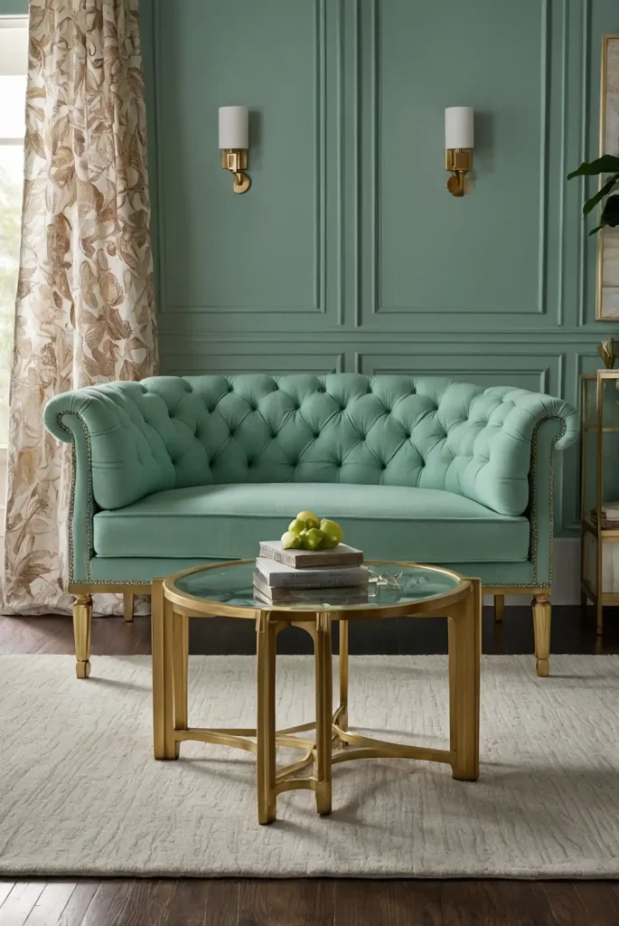
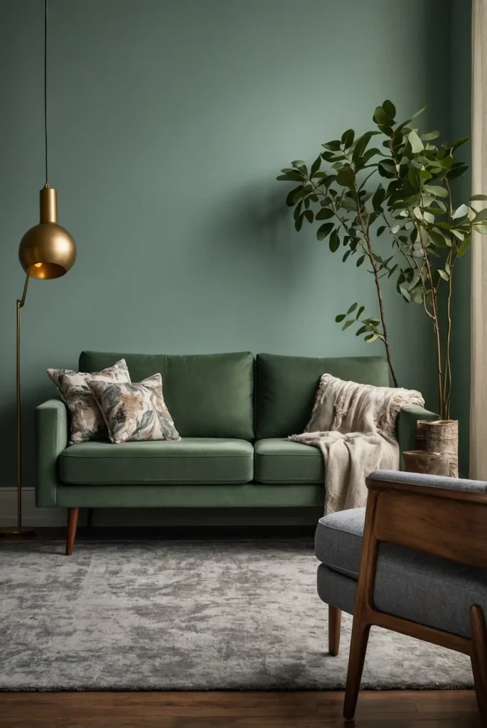
2: Soft Sage Green
Transform your furniture with a gentle sage green that brings natural, organic appeal to any room.
This soothing color works particularly well on larger pieces like armoires or buffets.
The gray undertones in sage prevent it from feeling too trendy or overwhelming.
This versatile hue complements both warm and cool color schemes throughout your home.
This nature-inspired color brings a fresh, updated feel while maintaining enough neutrality to blend with changing decor styles.
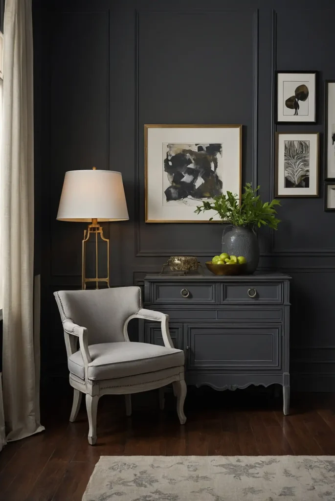
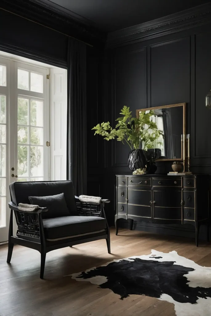
3: Matte Black

Add dramatic sophistication with matte black paint that turns ordinary pieces into striking statement furniture.
The flat finish adds contemporary edge while minimizing surface imperfections.
Black creates beautiful contrast in spaces with light walls and floors. Add interesting hardware in brass, copper, or crystal for an extra touch of elegance.
This bold choice works surprisingly well in almost any design style, from modern farmhouse to urban industrial.
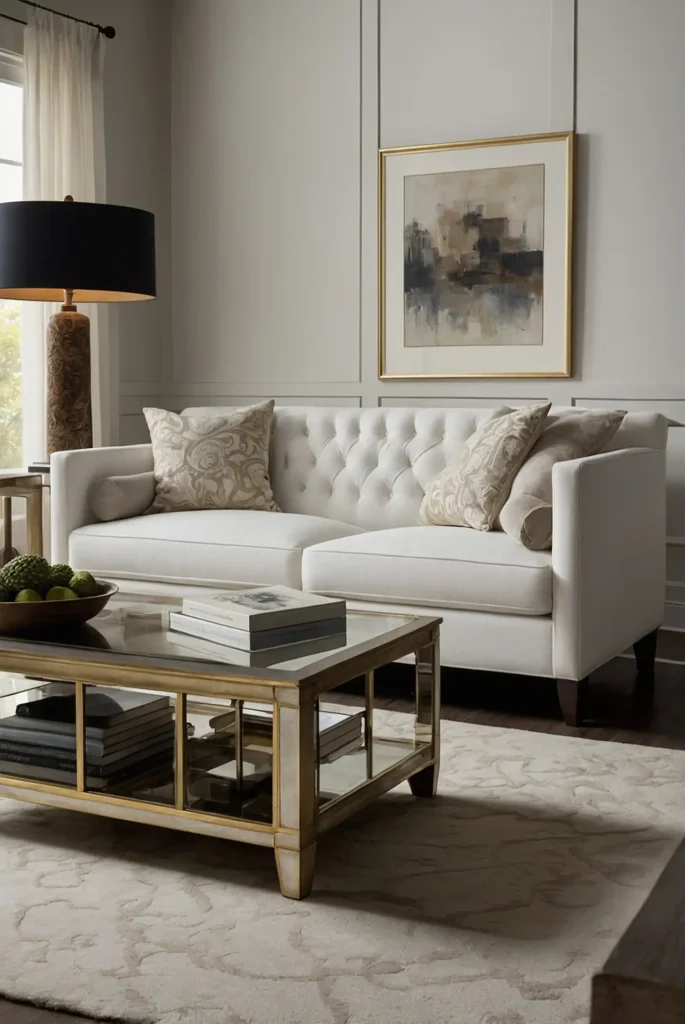
4: Antique White
Create timeless charm with a warm antique white that brightens spaces without the stark effect of pure white.
This versatile neutral works on virtually any furniture silhouette.
The subtle cream undertones add dimension and prevent the piece from feeling cold or sterile.
This forgiving color also helps hide minor imperfections in older furniture.
This classic choice coordinates effortlessly with any color scheme, making it perfect for pieces that might move between rooms.
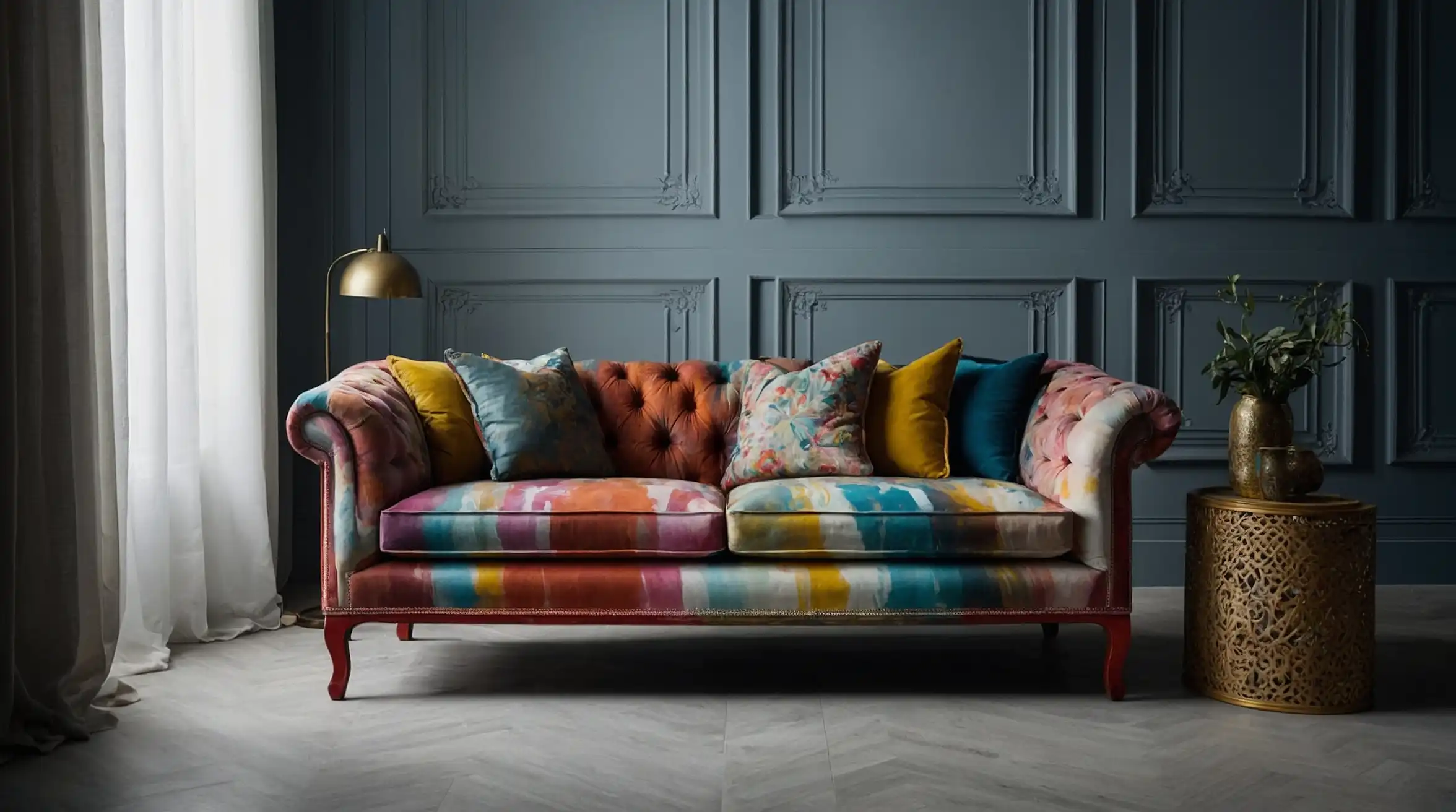
5: Rich Emerald Green
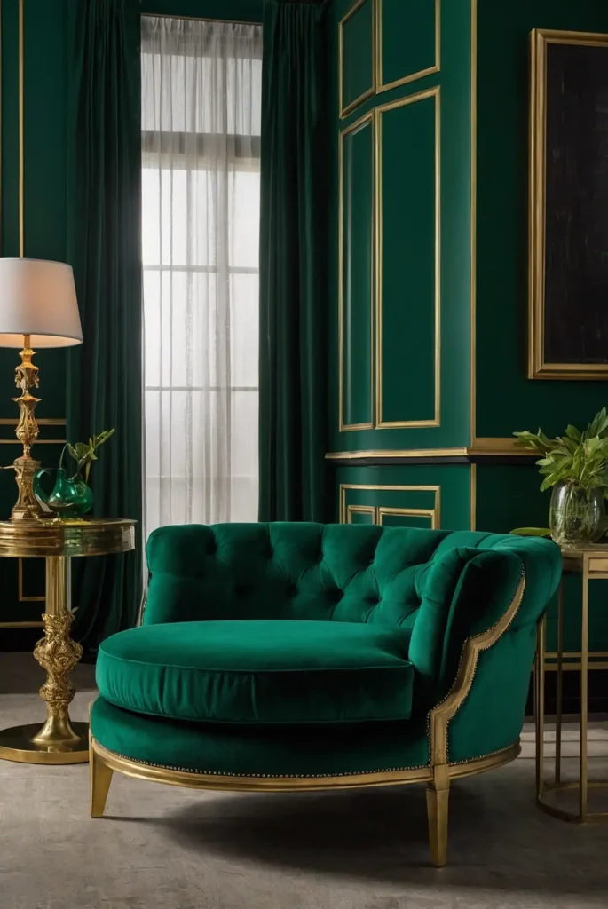
Make a bold statement with a jewel-toned emerald green that instantly elevates ordinary furniture. This luxurious color brings energy and life to basic pieces.
The depth of emerald creates a sense of opulence that makes even inexpensive furniture look high-end. Pair with brass or gold hardware for maximum impact.
This sophisticated choice works particularly well on accent pieces like side tables, chairs, or small chests.
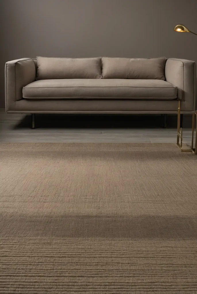
6: Warm Greige
Modernize your furniture with a perfect greige—that ideal blend of gray and beige that creates depth without committing to either color family.
This chameleon-like neutral adapts to any space.
The versatility of greige makes it an excellent choice for larger investment pieces that need to work in multiple settings.
It coordinates effortlessly with both warm and cool color schemes.
This designer favorite creates a contemporary foundation that lets your accessories and art take center stage.
7: Dusty Blush Pink
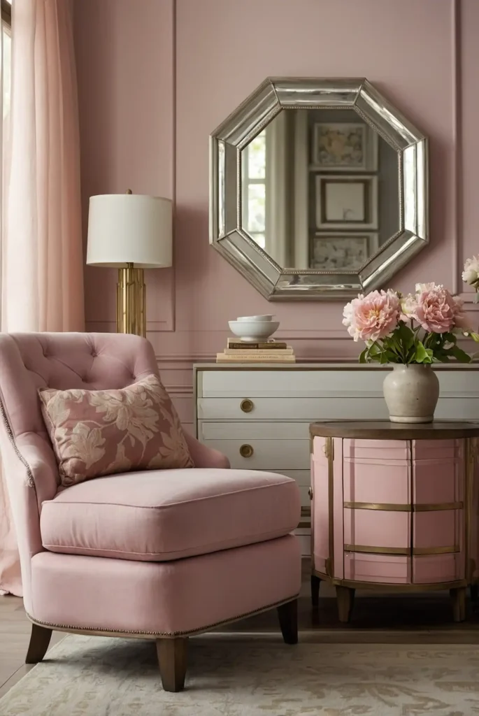
Add unexpected sophistication with a muted blush that functions almost like a neutral.
This subtle color brings warmth and personality to furniture without overwhelming your space.
The gray undertones keep this pink firmly in grown-up territory—nothing childish or overtly feminine.
It works beautifully on accent pieces like nightstands or side chairs.
This versatile color creates a perfect balance of interest and restraint that complements many design styles.
8: French Blue
Transform ordinary furniture with a muted French blue that brings timeless European charm to any piece. This historical color adds character without feeling trendy.
The subtle gray undertones create sophistication that pure blue lacks. It works beautifully on everything from dressers to dining chairs, adding interest without overwhelming.
This versatile color bridges traditional and contemporary styles, making it perfect for transitional homes.
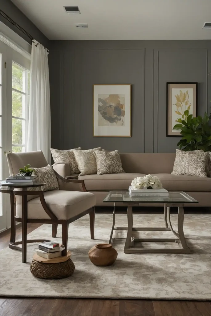
9: Charcoal Gray
Create architectural impact with a deep charcoal that adds drama without the severity of black.
This sophisticated neutral makes furniture pieces look intentionally selected rather than coincidental.
The warm undertones in charcoal prevent it from feeling cold or unwelcoming. It provides the perfect backdrop for interesting hardware or detailed woodwork.
This adaptable color works across design styles, from modern to traditional, making it an excellent choice for investment pieces.
10: Terracotta
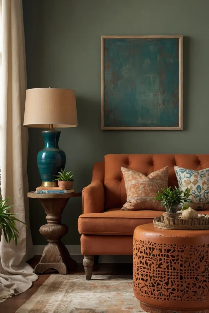
Embrace earthy warmth with a rich terracotta that brings Mediterranean and Southwestern influence to your furniture.
This organic color adds instant character to basic pieces.
The orange-brown quality creates a natural focal point without appearing artificially bright.
It works particularly well on smaller accent pieces like side tables or benches.
This grounding color brings international flair while connecting your space to natural elements and textures.
11: Crisp Mint Green
Refresh your furniture with a cool mint green that adds vintage charm with modern appeal.
This invigorating color works beautifully on pieces with interesting details or curves.
The crisp quality of mint brightens spaces while adding personality. It pairs particularly well with brass hardware for a perfect retro-meets-contemporary look.
This cheerful color transforms unremarkable furniture into memorable statement pieces that spark joy every day.
12: Warm Camel
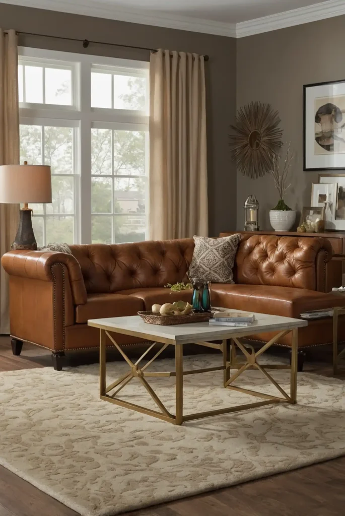
Add rich sophistication with a warm camel tone that brings timeless appeal to furniture.
This neutral creates the leather-like warmth of cognac without the shine or expense.
The golden undertones add warmth without appearing yellow or dated.
This versatile color complements both cool and warm design schemes throughout your home.
This elevated neutral adds maturity and permanence to furniture without limiting your other design choices.
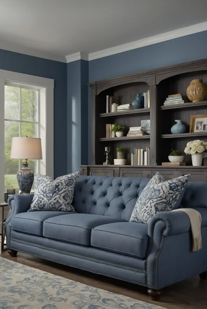
13: Slate Blue
Transform furniture with a complex slate blue that bridges gray and blue for sophisticated appeal.
This chameleon-like color adapts beautifully to different lighting conditions.
The gray undertones prevent it from feeling overly colorful or themed.
This versatile hue works equally well on statement pieces or supporting furniture.
This designer favorite creates subtle interest while maintaining the versatility needed for long-term satisfaction with your painted piece.
14: Soft Black
Create dramatic sophistication with a soft black that offers slightly less contrast than pure black.
This nuanced neutral transforms ordinary furniture into designer-worthy pieces.
The subtle warmth prevents the color from feeling harsh or stark.
This forgiving finish conceals imperfections while adding architectural weight to your furniture.
This timeless choice works with virtually any design style, making it perfect for pieces you plan to keep for many years.
15: Mustard Yellow
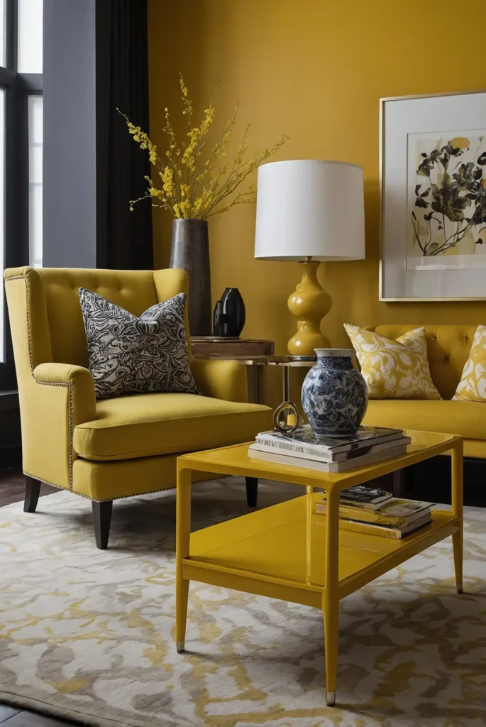
Add unexpected energy with a rich mustard yellow that brings vintage charm and contemporary appeal to furniture.
This complex color adds personality without appearing childish.
The earthy undertones create sophistication that brighter yellows lack.
It works particularly well on smaller accent pieces like chairs, stools, or side tables.
This distinctive choice creates instant focal points and conversation starters in otherwise neutral rooms.
16: Warm Mushroom
Transform furniture with a sophisticated mushroom tone that bridges taupe and gray. This complex neutral adds depth without committing to a definite color family.
The warm undertones create versatility that works with both cool and warm design schemes.
This chameleon-like quality makes it perfect for pieces that might move between rooms.
This designer favorite provides subtle interest while maintaining enough neutrality to adapt to changing decorating trends.
17: Deep Teal
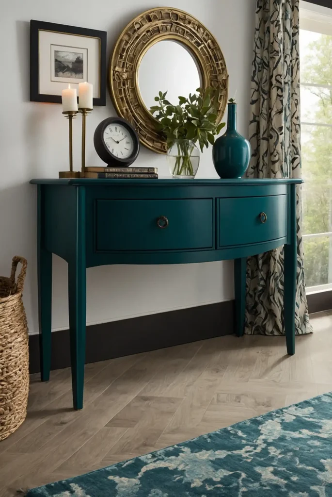
Create rich, dramatic impact with a jewel-toned teal that adds depth and personality to furniture.
This complex blue-green brings sophisticated energy to basic pieces.
The depth of teal creates a sense of luxury that elevates even inexpensive furniture. Pair with brass, gold, or matte black hardware for maximum impact.
This distinctive choice works particularly well on statement pieces like buffets, islands, or larger accent tables.
18: Cloud White
Brighten your furniture with a soft cloud white that offers warmth without the yellow undertones of cream. This versatile neutral works on virtually any furniture silhouette.
The subtle gray undertones create sophistication that pure white often lacks. This forgiving color helps minimize imperfections in older or damaged furniture.
This timeless choice provides the perfect blank canvas for decorative hardware, allowing those details to take center stage.
19: Muted Coral
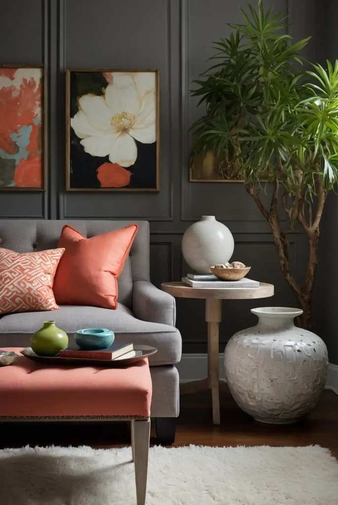
Add unexpected warmth with a grayish coral that brings subtle energy without overwhelming your space.
This nuanced color transforms ordinary furniture into distinctive pieces.
The gray undertones keep this coral firmly in sophisticated territory—nothing too bright or tropical.
It works beautifully on accent pieces like nightstands or side chairs.
This versatile color creates a perfect balance of interest and restraint that complements many design styles.
20: Olive Green
Transform furniture with a complex olive green that brings natural, organic appeal to any room.
This earthy color works particularly well on larger pieces and wooden furniture.
The brown undertones in olive create versatility that works in both traditional and contemporary spaces.
This adaptable quality makes it an excellent choice for investment pieces.
This grounding color brings natural sophistication while maintaining enough neutrality to blend with changing decor styles.
21: Soft Denim Blue
Refresh your furniture with a faded denim blue that offers nostalgic comfort with contemporary appeal.
This familiar color adds character without feeling themed or overwhelming.
The gray undertones create sophistication that brighter blues lack.
It works beautifully on everything from bookshelves to dining chairs, adding interest without dominating.
This versatile color bridges casual and refined aesthetics, making it perfect for homes that balance formal and relaxed elements.
22: Rich Burgundy
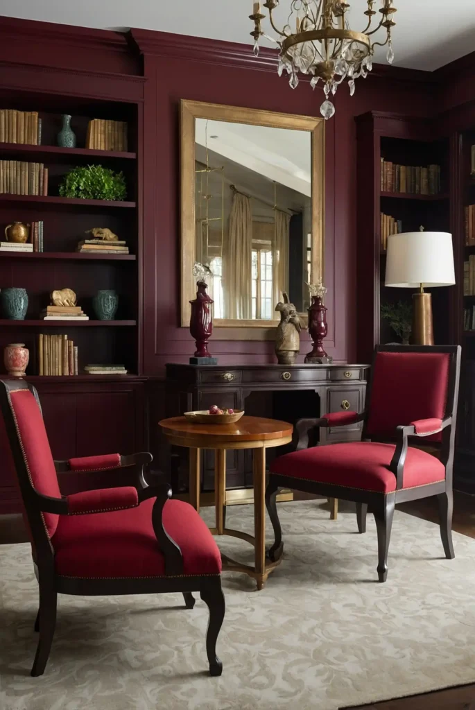
Add dramatic depth with a sophisticated burgundy that brings timeless elegance to furniture. This complex red creates instant focal points with mature appeal.
The brown undertones prevent it from appearing too bright or seasonal. This rich color transforms unremarkable furniture into statement pieces with historical resonance.
This classic choice works particularly well on formal pieces like dining chairs, library furniture, or traditional accent pieces.
23: Graphite Gray
Transform furniture with a deep graphite that offers architectural impact without the harshness of black.
This sophisticated neutral adds intentional drama to any piece.
The subtle blue undertones create cool sophistication that pairs beautifully with both warm and cool color schemes.
It provides the perfect backdrop for interesting hardware.
This versatile color works across design styles, from industrial to traditional, making it an excellent choice for long-term satisfaction.
24: Soft Eucalyptus
Create natural appeal with a gentle eucalyptus green that brings organic freshness to furniture.
This soothing color works particularly well on pieces with interesting details or curves.
The gray undertones prevent it from feeling too trendy or overwhelming.
This versatile hue complements both warm and cool color schemes throughout your home.
This nature-inspired color brings calm, updated appeal while maintaining enough neutrality to blend with changing decor styles.
25: Warm Taupe
Add sophisticated neutrality with a perfect taupe that creates depth without committing to a definite color family.
This chameleon-like neutral adapts to any space.
The warm undertones create versatility that works with both cool and warm design schemes. This adaptable quality makes it perfect for larger investment pieces.
This designer favorite provides subtle interest while maintaining the neutrality needed for pieces that might move between different rooms.
26: Matte Red
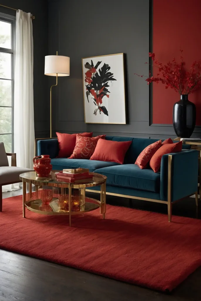
Make a bold statement with a rich matte red that instantly transforms ordinary furniture into dramatic focal points.
The flat finish adds contemporary edge to this classic color.
Choose a red with slight brown undertones for greater sophistication and versatility. This creates a color that reads as intentional rather than overwhelming.
This powerful choice works best on smaller accent pieces where its energy can shine without dominating the entire space.
27: Chalky Lavender
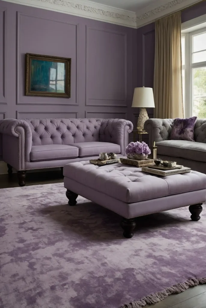
Add unexpected sophistication with a muted lavender that offers subtle color without overwhelming your space.
This nuanced hue transforms furniture with distinctive character.
The gray undertones keep this purple firmly in grown-up territory—nothing childish or overly feminine. It works beautifully on accent pieces and smaller furniture.
This distinctive choice creates subtle interest while still functioning nearly as a neutral in most design schemes.
Conclusion
With these versatile paint colors, you can transform ordinary furniture into custom pieces that perfectly complement your home.
The right paint choice breathes new life into forgotten items, creating personal, budget-friendly design solutions with professional results.