27 Transformative Paint Colors That Brighten Even the Darkest Rooms
Dark rooms present unique decorating challenges, but choosing the right paint color can dramatically transform these spaces.
The perfect shade can reflect available light, create the illusion of brightness, and make small, dim areas feel more open.
With strategic color selection, you can work with your room’s lighting conditions rather than fighting against them.
Sometimes the most counterintuitive choices create the most successful results.
Ready to brighten your dark space?
These 27 paint colors will help you create a room that feels light, airy, and welcoming—even with minimal natural light.
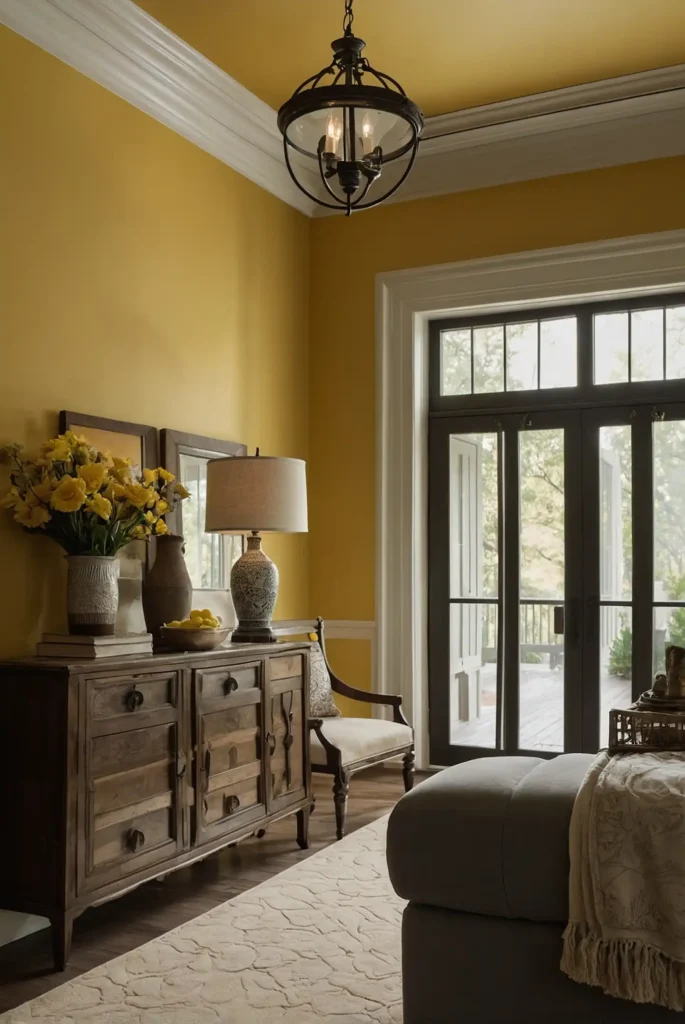
1: Buttery Yellow
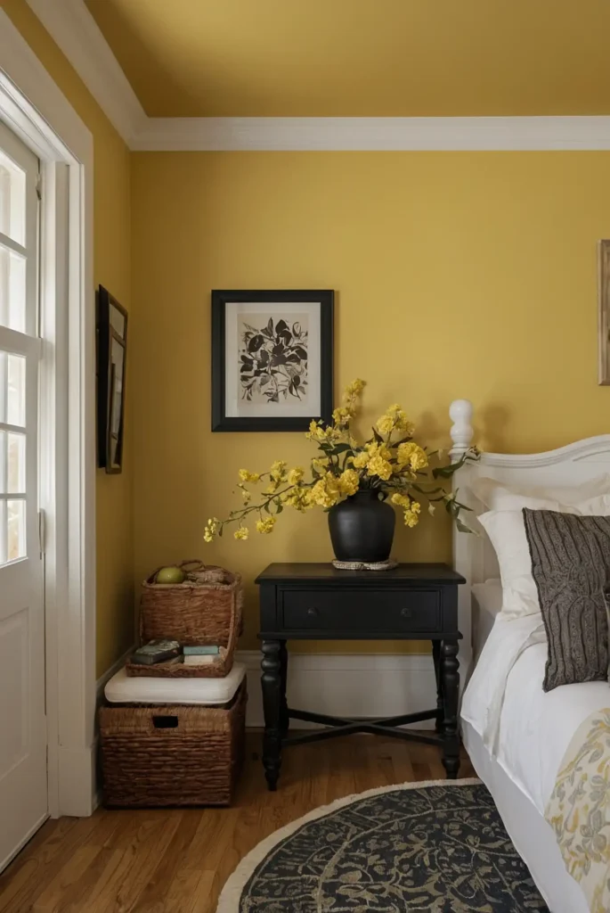
Infuse warmth and brightness with a soft, buttery yellow that mimics natural sunlight. This cheerful color instantly makes dark corners feel sun-drenched and inviting.
Choose a yellow with subtle cream undertones rather than acidic brightness. This creates a sophisticated glow rather than an overwhelming intensity.
This sunny shade works particularly well in north-facing rooms where cool light needs warming balance.
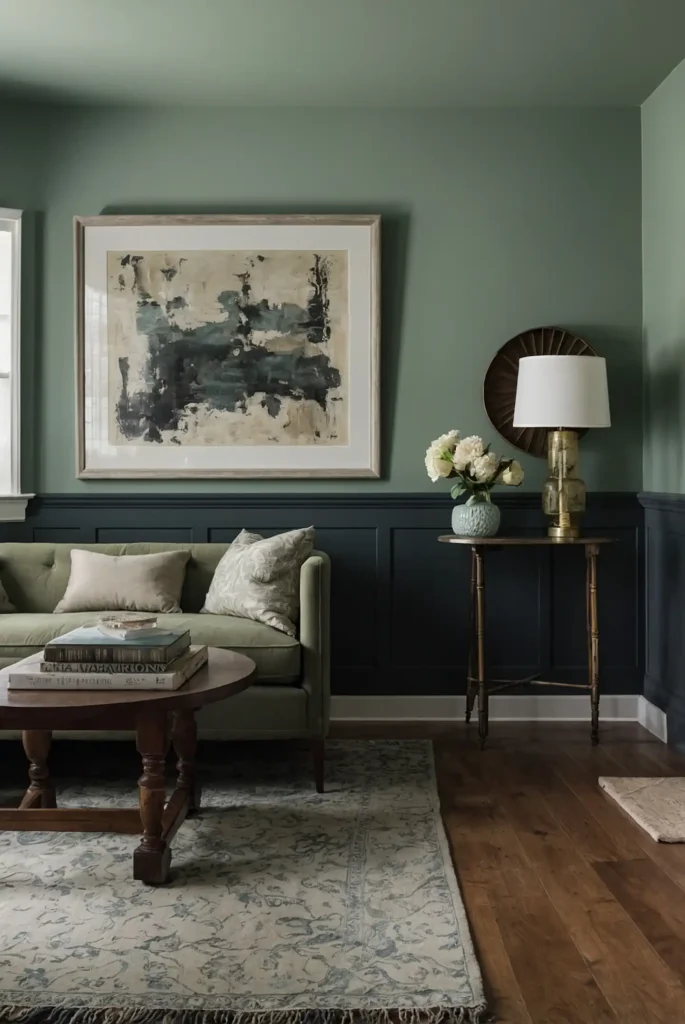
2: Silver Sage
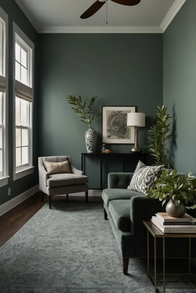
Brighten dark spaces with a luminous silver sage that reflects available light beautifully. This complex color shifts throughout the day, creating subtle dimension.
The silver undertones enhance light reflection while the sage component adds organic warmth. This balance prevents the cool colors that can make dark rooms feel colder.
This sophisticated neutral brings natural tranquility while maximizing brightness in challenging lighting conditions.
3: Pale Blush Pink
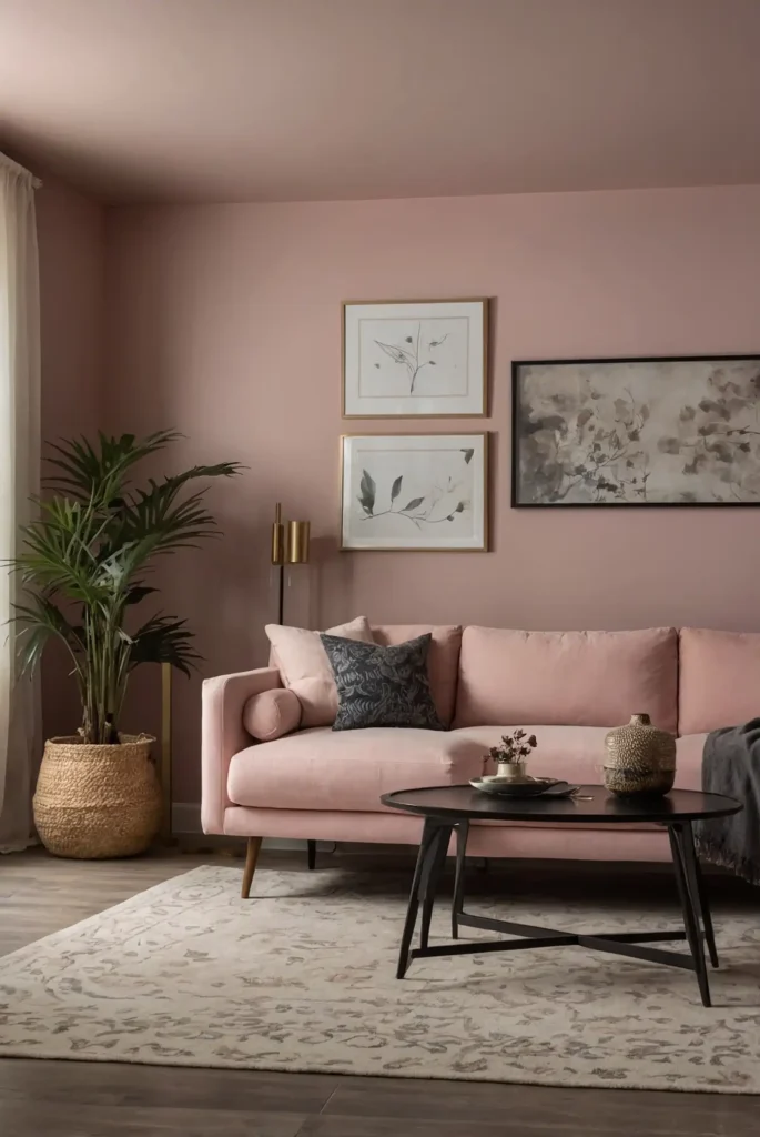
Create a flattering glow with a delicate blush pink that adds warmth without darkening the space. This subtle color wraps the room in soft, reflected light.
Choose a blush with gray undertones to keep it sophisticated rather than sweet or childish. This barely-there color functions almost like a neutral.
This surprisingly versatile shade enhances skin tones, making both the room and its occupants look their best even in dim light.
4: Soft Coral
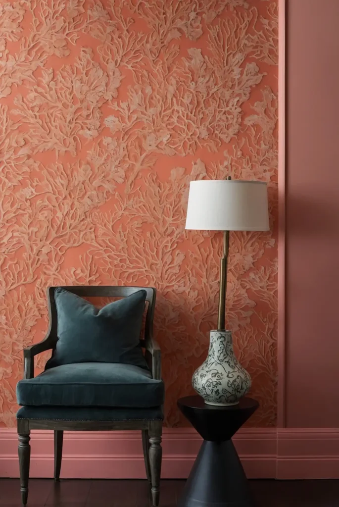
Warm up dim spaces with a gentle coral that brings energizing warmth without overwhelming the room. This flattering color creates a welcoming atmosphere in any light.
The subtle orange undertones counteract the grayness often found in poorly lit spaces. Choose a muted version rather than a bright tropical tone for sophisticated appeal.
This mood-lifting color works particularly well in windowless bathrooms or dark hallways that need energizing presence.
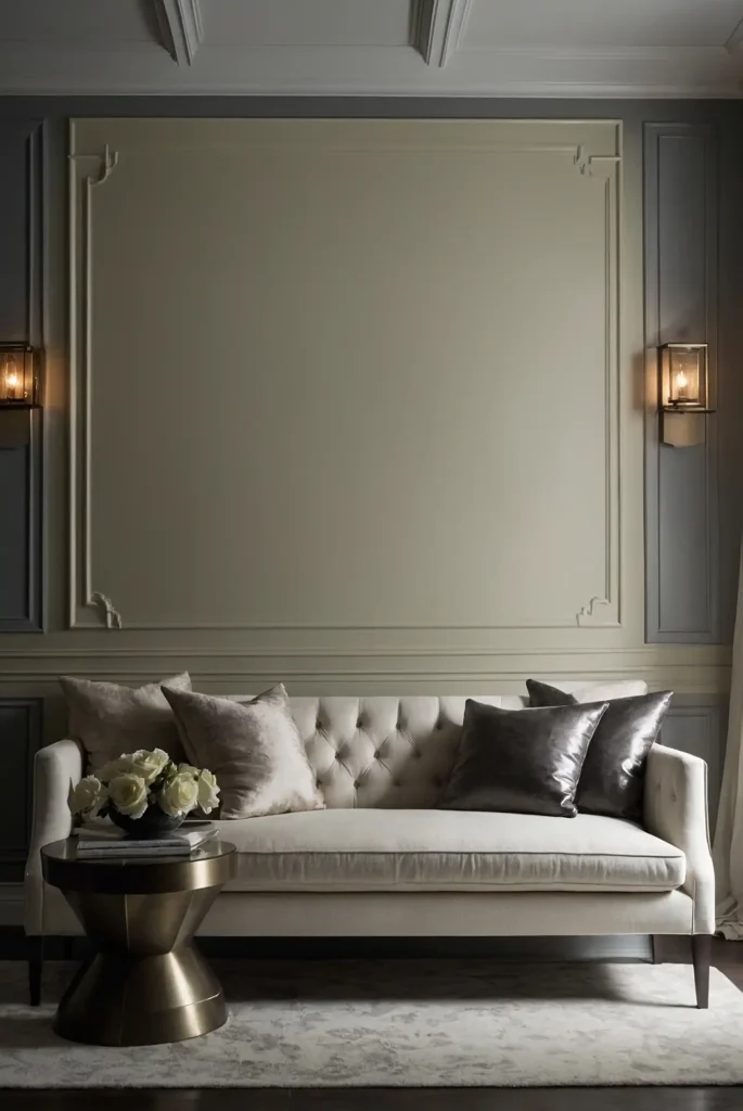
5: Creamy Off-White
Maximize light reflection with a warm off-white that brightens without the starkness of pure white. This versatile neutral creates an expansive feeling in confined spaces.
Choose a cream with yellow undertones rather than pink or blue bases. This subtle warmth counteracts the cold feeling that can plague dark rooms.
This classic choice provides the perfect backdrop for artwork and furniture while bouncing available light around the room.
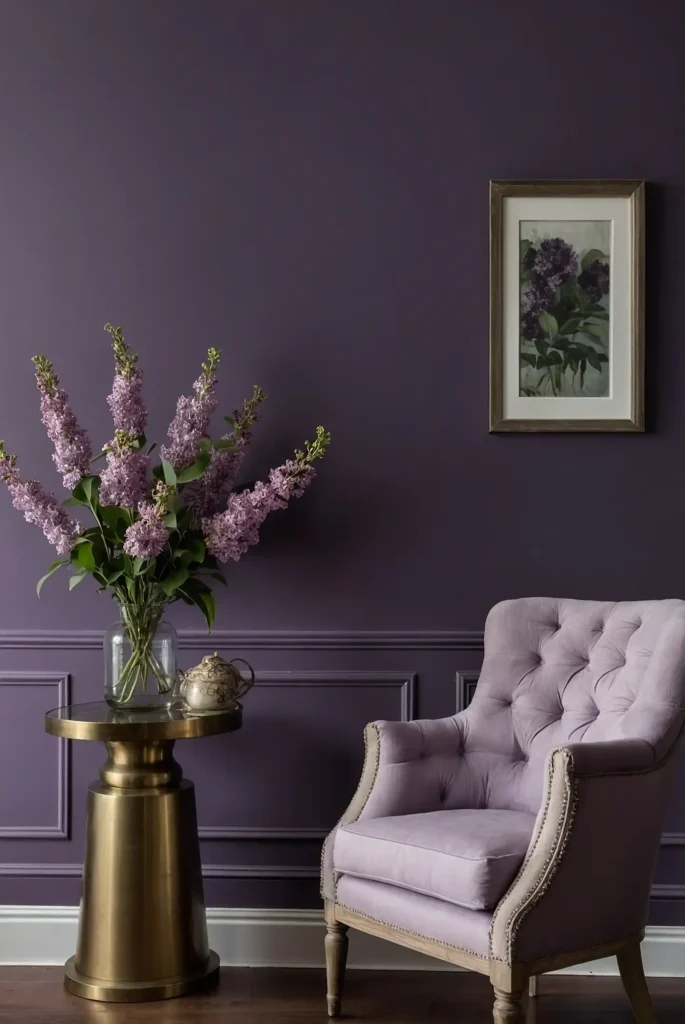
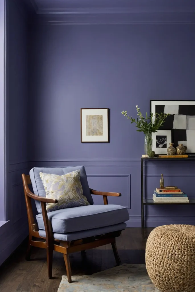
6: Pale Lavender
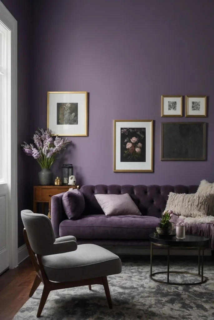
Add unexpected brightness with a barely-there lavender that reflects light beautifully.
This subtle purple creates dimension while maintaining an airy, open feeling.
Choose a highly muted, grayed-out lavender rather than a sweet, saturated purple.
This sophisticated approach provides interest without consuming precious light.
This unique choice adds personality while creating a surprisingly effective light-enhancing environment.
7: Silvery Blue
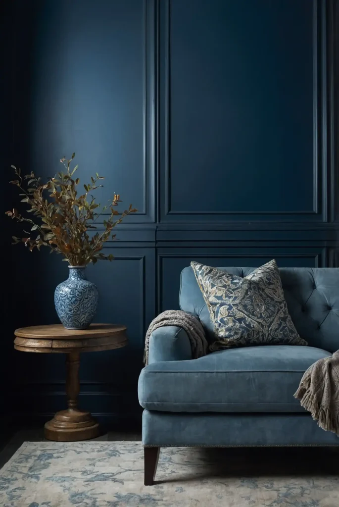
Create an ethereal glow with a silvery blue that captures and amplifies available light.
This luminous color makes walls seem to recede, expanding the perceived space.
The metallic undertones reflect light better than flat colors, creating brightness even in dim conditions.
Choose a very pale version for maximum illuminating effect.
This cool but welcoming shade creates a serene atmosphere while functionally brightening challenging spaces.
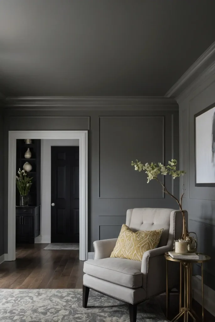
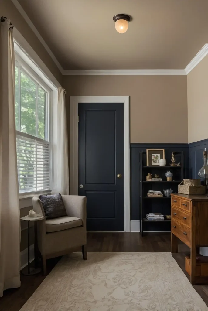
8: Warm Greige
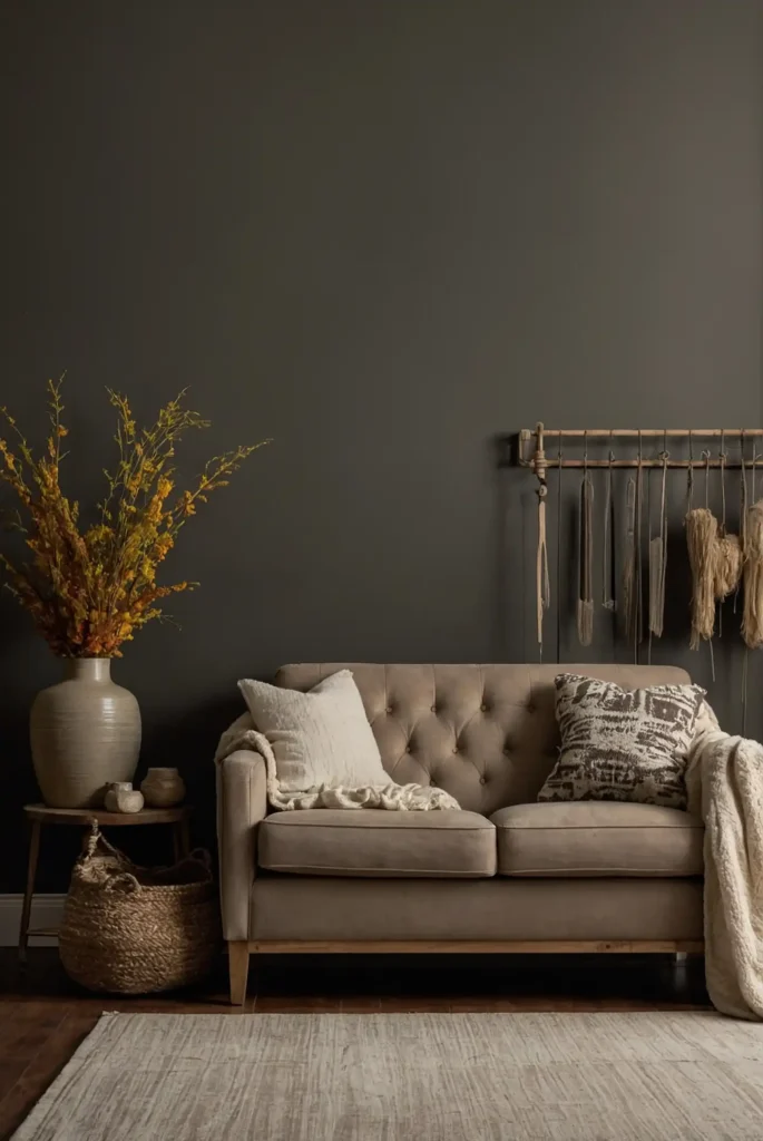
Balance light reflection with cozy warmth using a perfect greige—that ideal blend of gray and beige.
This chameleon color adapts beautifully to changing light conditions.
Choose a greige that leans slightly warm rather than cool to counteract the natural coolness of dark spaces.
This creates a sophisticated envelope that feels intentional rather than dim.
This designer favorite provides depth without darkness, making poorly lit rooms feel purposefully designed rather than problematically dark.
9: Celery Green
Brighten dark corners with a light celery green that adds organic freshness while reflecting available light.
This nature-inspired hue creates a lively atmosphere.
The yellow undertones in celery prevent it from feeling cold or clinical.
This creates a welcoming environment even in rooms with minimal natural light.
This invigorating color connects your space to nature while providing a surprisingly effective light-enhancing solution.
10: Pale Apricot

Transform dim spaces with a delicate apricot that brings the warmth of sunset into your home.
This subtle orange-pink creates a flattering glow in any lighting condition.
Choose a highly muted version rather than a bright, saturated tone.
This sophisticated approach provides warmth without overwhelming the space.
This mood-lifting color enhances skin tones beautifully, making both the room and its occupants look their best even in challenging light.
11: Reflective Pearl
Maximize light with a pearlescent paint that contains subtle light-reflecting particles.
This luminous finish bounces even minimal light around the room for enhanced brightness.
The dimensional quality creates gentle shifts as lighting changes throughout the day.
This prevents the flat, dead feeling that can plague dark spaces.
This specialty finish brings quiet luxury while functionally improving the lighting conditions in challenging rooms.
12: Muted Aqua
Create a refreshing oasis with a soft aqua that brings spatial openness to dark rooms.
This water-inspired hue suggests light and air even in dim conditions.
Choose a grayed-out aqua rather than a bright turquoise to maintain sophistication. The subtle blue-green balance creates dimension without consuming light.
This tranquil color evokes open skies and clear water, psychologically expanding the perceived space.
13: Warm Ivory
Brighten your space with a rich ivory that reflects light while creating a warmer atmosphere than stark white.
This classic choice works in any architectural style.
The yellow undertones counteract the coolness often found in dim lighting. This creates a welcoming glow rather than a harsh brightness.
This timeless neutral provides the perfect canvas for both artwork and furniture while maximizing available light.
14: Soft Butter Yellow
Create sunny cheerfulness with a gentle butter yellow that brings perpetual daylight to dark spaces. This warm tone instantly brightens north-facing or windowless rooms.
Choose a yellow with cream undertones rather than acidic brightness. This creates sophisticated warmth rather than overwhelming intensity.
This mood-enhancing color creates a perpetually sunny atmosphere even on the dreariest days.
15: Pale Silver
Reflect maximum light with a sophisticated silver that bounces illumination throughout the space. This contemporary neutral creates brightness without cold starkness.
The subtle metallic quality enhances light reflection better than flat paints. Choose a warm-based silver rather than a cool blue-based one for the most welcoming effect.
This modern choice brings quiet luxury while functionally improving the lighting conditions in challenging rooms.
16: Soft Peach
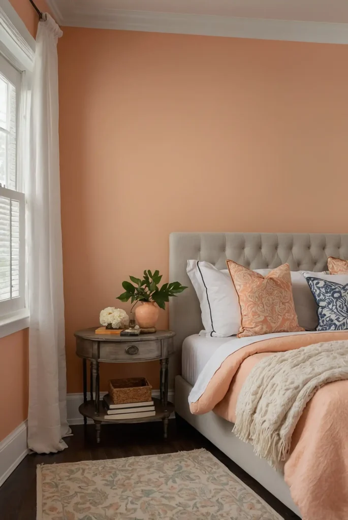
Warm up dim spaces with a delicate peach that creates a perpetual sunset glow.
This flattering color enhances both the room and its occupants in any light.
Choose a muted, sophisticated peach rather than a bright or saturated tone.
This subtle approach provides warmth without overwhelming the space.
This complexion-enhancing color makes everyone look their best while creating a welcoming atmosphere in challenging lighting conditions.
17: Light Mint Green
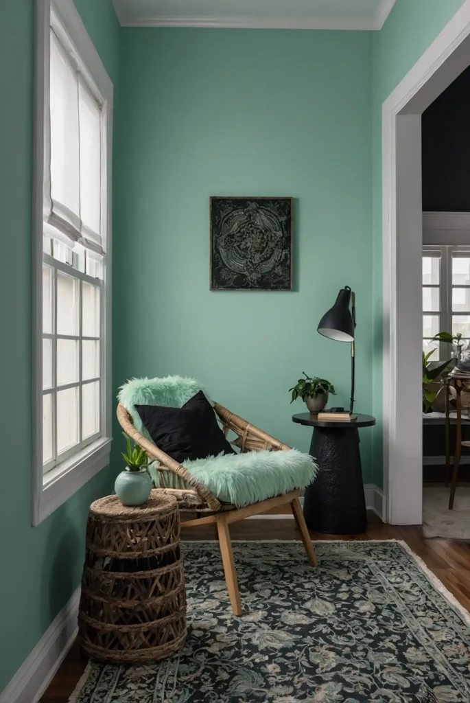
Refresh dark corners with a pale mint green that brings crisp brightness to dim spaces. This invigorating color creates an atmosphere of cleanliness and light.
The subtle green undertones add just enough personality without consuming precious reflective quality.
Choose a highly muted version for the most sophisticated effect.
This revitalizing color psychologically suggests freshness while physically brightening challenging spaces.
18: Luminous Alabaster
Maximize reflectivity with a glowing alabaster that captures and amplifies available light.
This barely-there color creates an airy, expansive feeling in confined spaces.
The subtle warmth prevents the clinical feeling stark whites can create. This creates a welcoming atmosphere even in windowless or north-facing rooms.
This versatile neutral adapts beautifully to any decorating style while functionally improving light conditions.
19: Pale Wheat
Create golden warmth with a light wheat tone that brings perpetual sunshine to dark corners.
This natural neutral enhances even the dimmest lighting conditions.
The yellow undertones counteract the coolness often found in poorly lit spaces. This creates a welcoming glow rather than a flat, gray feeling.
This organic color connects to nature while providing a surprisingly effective light-enhancing solution.
20: Soft Lilac
Add unexpected brightness with a barely-there lilac that reflects light beautifully while adding subtle personality.
This unique choice creates dimension without darkness.
Choose a highly muted, grayed-out lilac rather than a sweet, saturated purple. This sophisticated approach maintains maximum light reflection while adding interest.
This distinctive color creates a peaceful atmosphere while brightening challenging spaces more effectively than expected.
21: Champagne
Bring sparkling luminosity with a champagne tone that contains subtle reflective qualities.
This effervescent color brightens dark corners with understated elegance.
The golden undertones create warmth while the reflective nature maximizes available light.
This combination works beautifully in rooms with minimal natural illumination.
This sophisticated neutral adds quiet luxury while functionally improving the lighting conditions in challenging spaces.
22: Cloud White
Create airy openness with a soft cloud white that brightens without the clinical feeling of stark white.
This classic choice maximizes light in any architectural style.
The subtle gray undertones add sophistication while maintaining excellent reflective qualities.
This prevents the harsh contrast that can make furnishings appear darker.
This versatile neutral provides the perfect backdrop for artwork and furniture while bouncing available light throughout the room.
23: Pale Celadon
Brighten dark rooms with a gentle celadon that brings historical sophistication and subtle color. This complex green-gray adds interest without consuming light.
The gray undertones keep this green firmly in the neutral family while the subtle color adds personality. This balance makes it perfect for light-challenged spaces.
This timeless color brings quiet elegance while maintaining the reflective qualities needed in darker rooms.
24: Light Sand
Create natural brightness with a warm sand tone that evokes sun-washed beaches. This organic neutral enhances even the dimmest lighting conditions.
The golden undertones counteract the coolness often found in poorly lit spaces. This creates a welcoming atmosphere rather than a cold, shadowy feeling.
This versatile color connects to nature while providing an effective light-enhancing solution that works with any decorating style.
25: Soft Periwinkle
Add unexpected brightness with a delicate periwinkle that combines the reflective qualities of blue with the warmth of purple.
This unique choice creates dimension without darkness.
Choose a highly muted, grayed-out periwinkle rather than a saturated tone. This sophisticated approach maintains light reflection while adding subtle personality.
This distinctive color creates a peaceful atmosphere while brightening challenging spaces more effectively than pure neutrals.
26: Pale Buttercream
Maximize warmth and light with a delicate buttercream that creates a perpetual glow. This versatile neutral enhances even north-facing or windowless rooms.
The yellow undertones counteract the coolness often found in dim lighting without reading as overtly yellow.
This creates sophisticated warmth rather than themed intensity.
This timeless choice works with any decorating style while bringing consistent brightness to challenging spaces.
27: Silvery Sage
Create luminous sophistication with a silvery sage that reflects light while adding subtle natural color. This complex neutral shifts beautifully as lighting changes.
The metallic undertones enhance light reflection while the sage component adds organic warmth.
This balance prevents the cool sterility that can make dark rooms feel unwelcoming.
This designer favorite brings natural tranquility while maximizing brightness in challenging lighting conditions.
Conclusion
With these strategically chosen colors, you can transform even the darkest rooms into bright, welcoming spaces. The right paint creates the illusion of light, maximizes reflection, and turns lighting challenges into design opportunities.